March 2021
(Note: all the previous SPC Knowledge Base in the control chart examples category are listed on the right-hand side. Select this link for information on the SPC for Excel software.)

This month’s publication takes a look at the data to see what we can learn about the situation from the data itself. The data are messy as you will see.
Data are interesting. There are so many ways you can spin the data to try to make your point. The data most commonly examined for the southern border crossings is the number of border encounters by the US Customs and Protection patrol. One article said that the number of encounters is up by 28% from January to February of 2021. In 2019, the number from January to February was up by 31%. The claim was that the jump in 2019 was more than in 2021. Yes, 31% is more than 28%, but is it really significant?
It is easy to compare two data points. Rarely are they identical; one will be “better” than the other. So, is it just a matter of finding the right two data points to support your position? Sometimes it seems that way. It is always interesting to see two completely different interpretations of a situation where there are data that can be analyzed.
Now, this is a tough topic to address because people tend to feel strongly about it one way or the other. This publication is looking at the data. There is no attempt to look for what causes the data to look how it does. The reader may look into those details.
In this issue:
- Introduction
- The Data Source
- Plotting the Data as a Time Series
- Were 2019 and 2020 Outlier Years?
- Is There a Seasonal Effect?
- What About Unaccompanied Minors?
- Summary
- Quick Links
You may download a pdf version of this publication at this link. Please feel free to leave a comment at the end of the publication.
Introduction
One measure of how many people are trying to enter the United States without going through proper channels is the number of border encounters by the US Customs and Border Protection (CBP) agents along the southern border of the United States. An encounter is essentially an apprehension by the CBP. The vast majority of the time, those apprehended are sent back. In recent months, the number of border encounters has increased significantly. These are the data used in this publication.
As shown below, a control chart is a of limited usefulness in analyzing this data because the process is not consistent and predictable. There are many forces acting on it from the outside. But the main tool to start with continues to be the time series chart. Plot the results over time and see what it tells you to start with.
The Data Source
The data use in this publication comes from the US Customs and Border Protection website. The data comes from southwest land border encounters for the following demographics:
- Accompanied Minors
- Family Unit Aliens (FMUA)
- Single Adults
- Unaccompanied Alien Children (UAC) / Single Minors
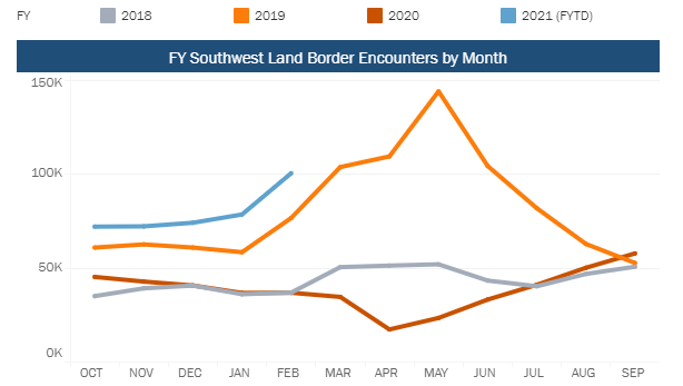
The data can be seen at this link. This link gives monthly tabular data for the number of border encounters and the chart shown below in Figure 1.
Figure 1: US Customs and Border Protection: Number of Border Encounters
This type of chart is not always the easiest to read. You can see that the largest spike occurred in 2019, approaching 150,000 border encounters in one month. And that 2021 (through February) appears to be the highest for the last four years. The data are based on the fiscal year (FY), which for the CPB starts in October. So, the FY 2021 data starts with October 2020 data. This can cause some confusion sometimes, but the first 5 months of the fiscal year are higher than the first five months in FY2019. This would imply that FY2021 could well have more border encounters than FY2019.
Figure 1 is a time series chart, but it is difficult to see the underlying process from month to month. So, let’s start with a simple time series chart on the monthly number of border encounters. There are links to previous years of data on the webpage. Below are the data taken from the website for the number of border encounters going back to October 2011
Table 1: Number of Border Encounters: 10/2011 to 2/2021
| Month | Number | Month | Number | Month | Number | Month | Number | |||
|---|---|---|---|---|---|---|---|---|---|---|
| Oct-11 | 31,323 | Mar-14 | 57,405 | Aug-16 | 46,909 | Jan-19 | 58,317 | |||
| Nov-11 | 28,601 | Apr-14 | 59,119 | Sep-16 | 51,893 | Feb-19 | 76,545 | |||
| Dec-11 | 24,630 | May-14 | 68,804 | Oct-16 | 66,842 | Mar-19 | 103,731 | |||
| Jan-12 | 30,758 | Jun-14 | 66,541 | Nov-16 | 63,218 | Apr-19 | 109,415 | |||
| Feb-12 | 36,990 | Jul-14 | 48,819 | Dec-16 | 58,379 | May-19 | 144,116 | |||
| Mar-12 | 48,520 | Aug-14 | 39,758 | Jan-17 | 42,359 | Jun-19 | 104,311 | |||
| Apr-12 | 46,660 | Sep-14 | 34,003 | Feb-17 | 23,557 | Jul-19 | 81,777 | |||
| May-12 | 42,995 | Oct-14 | 35,895 | Mar-17 | 16,794 | Aug-19 | 62,707 | |||
| Jun-12 | 36,794 | Nov-14 | 33,023 | Apr-17 | 15,798 | Sep-19 | 52,546 | |||
| Jul-12 | 32,801 | Dec-14 | 34,238 | May-17 | 19,966 | Oct-19 | 45,139 | |||
| Aug-12 | 33,686 | Jan-15 | 30,180 | Jun-17 | 21,673 | Nov-19 | 42,643 | |||
| Sep-12 | 32,375 | Feb-15 | 32,550 | Jul-17 | 25,069 | Dec-19 | 40,565 | |||
| Oct-12 | 34,836 | Mar-15 | 39,162 | Aug-17 | 30,582 | Jan-20 | 36,585 | |||
| Nov-12 | 33,153 | Apr-15 | 38,296 | Sep-17 | 31,280 | Feb-20 | 36,687 | |||
| Dec-12 | 29,075 | May-15 | 40,683 | Oct-17 | 34,871 | Mar-20 | 34,460 | |||
| Jan-13 | 32,481 | Jun-15 | 38,619 | Nov-17 | 39,051 | Apr-20 | 17,106 | |||
| Feb-13 | 40,632 | Jul-15 | 38,611 | Dec-17 | 40,519 | May-20 | 23,237 | |||
| Mar-13 | 54,009 | Aug-15 | 42,415 | Jan-18 | 35,905 | Jun-20 | 33,049 | |||
| Apr-13 | 54,761 | Sep-15 | 41,165 | Feb-18 | 36,751 | Jul-20 | 40,929 | |||
| May-13 | 50,481 | Oct-15 | 45,516 | Mar-18 | 50,347 | Aug-20 | 50,014 | |||
| Jun-13 | 40,785 | Nov-15 | 45,755 | Apr-18 | 51,168 | Sep-20 | 57,674 | |||
| Jul-13 | 39,993 | Dec-15 | 48,742 | May-18 | 51,862 | Oct-20 | 71,948 | |||
| Aug-13 | 41,110 | Jan-16 | 33,657 | Jun-18 | 43,180 | Nov-20 | 72,111 | |||
| Sep-13 | 38,182 | Feb-16 | 38,311 | Jul-18 | 40,149 | Dec-20 | 74,018 | |||
| Oct-13 | 41,828 | Mar-16 | 46,118 | Aug-18 | 46,719 | Jan-21 | 78,442 | |||
| Nov-13 | 38,685 | Apr-16 | 48,511 | Sep-18 | 50,568 | Feb-21 | 100,441 | |||
| Dec-13 | 36,695 | May-16 | 55,386 | Oct-18 | 60,781 | |||||
| Jan-14 | 35,181 | Jun-16 | 45,671 | Nov-18 | 62,469 | |||||
| Feb-14 | 42,399 | Jul-16 | 46,909 | Dec-18 | 60,794 |
These data will be used to analyze the results as a time series chart.
Plotting the Data as a Time Series
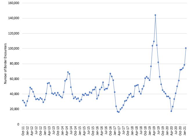
Figure 2 is a time series plot of the monthly border encounters. Remember Figure 2 covers a longer time frame that Figure 1.
Figure 2: Monthly Number of Border Encounters (CBP Data)
There is one thing for certain about this process – it is not consistent and predictable. It is not in control in the sense that control charts are in statistical control. From October 2011 until January 2017, the data bounces around, but not too bad. Then in early 2017, the number began to increase pretty steadily until it erupted in the time frame from February 2019 to May 2019. Then the number steadily decreased until April 2020. There the number reversed course and has increased through last month (February 2021).
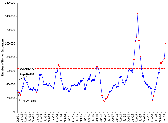
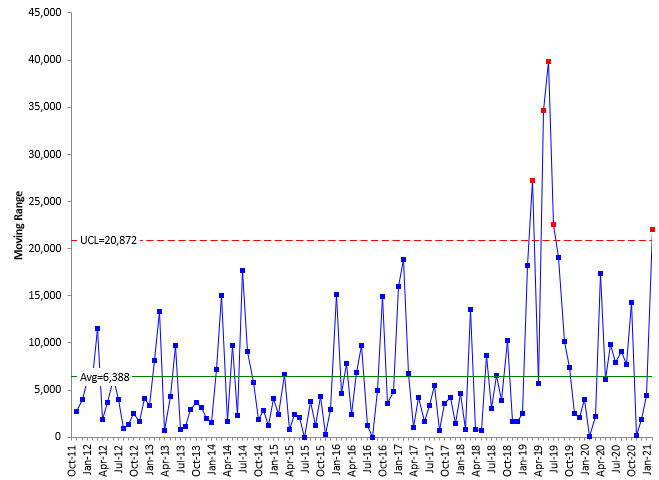
A control chart is not going to give you too many insights into this process. There are trends up, trends down and wild fluctuations over time. Just to show that this is the case, Figures 3 and 4 are the X and moving range control charts for the data in Figure 2. The only out of control test used for these two charts is points beyond the control limits. What do these charts tell you?
Figure 3: X Control Chart for the Number of Border Encounters
Figure 4: Moving Range Chart for the Number of Border Encounters
The control charts don’t add a lot of understanding to the process. The moving range chart does show the increase in variation that started to occur in 2019. The first part of the moving range chart is very consistent, meaning the variation from month to month was the same. The out of control points started in 2019 and the moving range for the last month of data (February 2021) is out of control.
The control chart is often used to determine if a point is out of control – an outlier – something happened to make that point outside the normal range of variation as defined by the control limits. There are clearly out of control points in 2019 and now in 2021. Are those two years outliers? What about 2020 – the year the pandemic started? We return to control charts to answer these questions.
Were 2019 and 2020 Outlier Years?
The time series chart clearly show high months of border encounters in 2019. Six of the months in 2019 were higher than anytime in the past. 2020 was the start of the pandemic. So, are those two years outliers? One way of determining this is to look at the total number of border encounters per year. The data are shown in Table 2 (based on the calendar year, not the fiscal year used by CBP).
Table 2: Number of Border Encounters per Year
| Year | Total |
|---|---|
| 2012 | 438,643 |
| 2013 | 509,642 |
| 2014 | 555,185 |
| 2015 | 481,694 |
| 2016 | 601,804 |
| 2017 | 341,522 |
| 2018 | 590,693 |
| 2019 | 921,812 |
| 2020 | 547,820 |
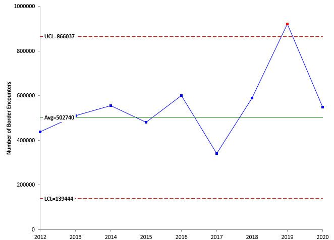
These yearly data were analyzed using a individuals control chart with the control limits based on the years from 2012 to 2018. The X chart is shown in Figure 5. The moving range chart is not shown here.
Figure 5: X Control Chart for Yearly Border Encounters
The X chart has one out of control point – 2019. The number of border encounters for that year is significantly different than the previous years when those previous years are used as a baseline.
What about 2020? Should that be considered an outlier because of the pandemic? Look back at Figure 2. You can see some low periods in 2020 in the April and May time periods. However, this low period has been seen before in 2017. Unlike the high months in 2019, there have been low months like in 2020 before. Plus, the X control chart shows the year 2020 back within the control limits. 2020 is not an outlier based on the yearly results even with the pandemic. The last three months of 2020 showed significant increases in the number of border encounters.
Is There a Seasonal Effect?
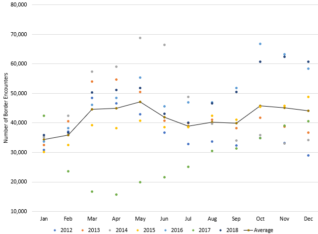
There have been media reports that what is being seen at the border is, in part, a seasonal effect. To examine this, the data from 2012 to 2018 was examined by month. 2019 was left out of the analysis because it is clearly an outlier. 2020 was left out so the baseline period would be the seven years from 2012 through 2018. The data by month are shown in Figure 6.
Figure 6: Border Encounters per Month (2012 to 2018)
The non-connected dots represent the individual monthly border encounters. The dots connected by the line give the averages for the months. There is a lot of overlap in the monthly data from month to month. If you just examine the average monthly, you can see that the lowest month for border encounters is January. The seasonal thought process goes like this: as winter ends, the migrants start coming. The number of encounters does increase monthly from January through May. There is a drop-off as the hotter summer months make the journey more difficult and deadly. Then there is an increase again as the winter months arrive.
The average values in Figure 6 seem to confirm that seasonal thought process is valid – despite the wide variation in individual month results. However, the seasonal effect does not explain what the data are showing in late 2020 and early 2021. For the month of January from 2012 through 2018, the average number of border encounters was 34,360 while it was 35,884 for the month of February. That means there is, on average, an increase of about 1,500. From January to February in 2021, the increase was from 78,442 to 100,441 or about an increase of 22,000. This increase is not explained by the seasonal effect alone. The average seasonal increase accounts for about 7% of the 22,000 increase in 2021 going from January to February. 2021 appears to be on its way to be an outlier like 2019.
What About Unaccompanied Minors?
There is concern about the number (and safety) of unaccompanied minors (UAC) trying to cross the border. Is the number increasing, staying the same, or decreasing? The CBP website has data on unaccompanied minors. Table 3 contains the data from October 2017 through February 2021 for UAC and the % UAC based on the total number of border encounters given in Table 1.
Table 3: Unaccompanied Minors Data
| Month | UAC | % UAC | Month | UAC | % UAC | |
|---|---|---|---|---|---|---|
| Oct-17 | 3808 | 10.9% | Jul-19 | 5846 | 7.1% | |
| Nov-17 | 4696 | 12.0% | Aug-19 | 4119 | 6.6% | |
| Dec-17 | 4995 | 12.3% | Sep-19 | 3543 | 6.7% | |
| Jan-18 | 3922 | 10.9% | Oct-19 | 3201 | 7.1% | |
| Feb-18 | 3759 | 10.2% | Nov-19 | 3677 | 8.6% | |
| Mar-18 | 5244 | 10.4% | Dec-19 | 3639 | 9.0% | |
| Apr-18 | 5331 | 10.4% | Jan-20 | 3076 | 8.4% | |
| May-18 | 7192 | 13.9% | Feb-20 | 3490 | 9.5% | |
| Jun-18 | 5606 | 13.0% | Mar-20 | 3221 | 9.3% | |
| Jul-18 | 4408 | 11.0% | Apr-20 | 741 | 4.3% | |
| Aug-18 | 4880 | 10.4% | May-20 | 1008 | 4.3% | |
| Sep-18 | 4819 | 9.5% | Jun-20 | 1891 | 5.7% | |
| Oct-18 | 5418 | 8.9% | Jul-20 | 2509 | 6.1% | |
| Nov-18 | 5662 | 9.1% | Aug-20 | 3103 | 6.2% | |
| Dec-18 | 5104 | 8.4% | Sep-20 | 3883 | 6.7% | |
| Jan-19 | 5515 | 9.5% | Oct-20 | 4821 | 6.7% | |
| Feb-19 | 7243 | 9.5% | Nov-20 | 4600 | 6.4% | |
| Mar-19 | 9380 | 9.0% | Dec-20 | 4993 | 6.7% | |
| Apr-19 | 9265 | 8.5% | Jan-21 | 5858 | 7.5% | |
| May-19 | 11861 | 8.2% | Feb-21 | 9457 | 9.4% | |
| Jun-19 | 7678 | 7.4% |
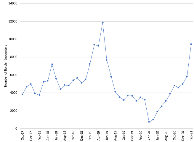
The time series chart for the number of UAC border encounters is shown in Figure 7.
Figure 7: Number of Border Encounters with UAC
The number of UAC show a similar pattern to the last four years in Figure 2. The number reached a high in mid-2019 and then decreased. The number has been increasing since April 20. But you would expect this to occur as the total number of border encounters increases. February 2021 is the second highest month for UAC border encounters in the last four years. This then asks the question – is the percentage of border encounters with UACs each month changing significantly?
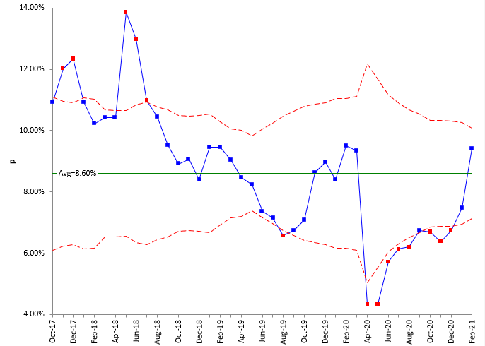
To find this out, a Laney p control chart was used. This control chart plots the % of UAC monthly and is shown in Figure 8.
Figure 8: Laney p Control Chart for % UAC
This process is not stable either. The % UAC decreased from 2017 until late 2019. It then increased for several months, before dropping to low values in April and May 2020 – most likely due to the pandemic. It is now increasing again, heading back to 2019 levels.
Summary
This publication attempted to answer the question about what the immigration data from the southern border of the United States shows us. The key points are given below:
- 2019 was an outlier year for the number of border encounters
- 2021 appears to be headed for even higher numbers than 2019
- There may be a seasonal effect, but it is small compared to the increases being seen in 2021
- The number of unaccompanied minors is also increasing again
As seen from above, the data are messy- the data are not predictable and consistent. All you can say is that, if current trends continue, 2021 will be the largest for the number of border encounters in history. That is a big “if” of course.
No effort has been made to find the underlying causes – just to see what the data says. No doubt, part of the causes is due to the policies of the United States government. Another cause of recent increases may be that people have been waiting for some time south of the border to get into the United States. There is a long list of potential causes. We will leave that analysis to those who want to dig deeper.
But remember, when looking at data over time, start with a time series chart and go from there.
Thank you very much for the nice application of control chart in a very interesting social problem. It is sad, but a nice view of the situation. Congratulations. Well done.