January 2021
(Note: all the previous SPC Knowledge Base in the control chart examples category are listed on the right-hand side. Select this link for information on the SPC for Excel software.)

Continuing the planet’s long-term warming trend, the year’s globally averaged temperature was 1.84 degrees Fahrenheit (1.02 degrees Celsius) warmer than the baseline 1951-1980 mean, according to scientists at NASA’s Goddard Institute for Space Studies (GISS) in New York. 2020 edged out 2016 by a very small amount, within the margin of error of the analysis, making the years effectively tied for the warmest year on record.
“The last seven years have been the warmest seven years on record, typifying the ongoing and dramatic warming trend,” said GISS Director Gavin Schmidt. “Whether one year is a record or not is not really that important — the important things are long-term trends. With these trends, and as the human impact on the climate increases, we have to expect that records will continue to be broken.”
So, it looks like the earth continues to get hotter and hotter. We have looked at global warming before. The last time we took an in-depth look was January of 2018. We did look at trends versus step changes in the data in 2020. We will take another look at the data through the end of 2020. Has anything changed? What can we predict about 2021?
In this issue:
- Control Charts and Plotting Global Temperatures
- Past Global Temperature Publications
- Global Temperature Deviations as a Run Chart
- 1880 – 1902 Period
- 1903 – 1913 Period
- 1914 – 1936 Period
- 1937 – 1976 Period
- 1977 – 1986 Period
- 1987 – 2020 Period
- All Data
- Summary
- Quick Links
You may download a pdf version of this publication at this link. Please feel free to leave a comment at the end of the publication.
Control Charts and Plotting Global Temperatures
One purpose of a control chart is to determine if a process is in statistical control – if it is consistent and predictable over time. This is accomplished by plotting the data over time and adding the average and control limits. As long as there are no points beyond the control limits or patterns in the data, then the process is in statistical control.
What can control charts tell us about global warming? This publication takes an in-depth look at the global temperature deviations from 1880 through 2020. We first did this in 2015, but the data we are using in this publication is slightly different. It might surprise you that, over the time span from 1880 to 2020, there have only been stable periods. The first five stable periods had consistent, predictable temperatures. The last period has also been consistent – except the global temperature is trending up in a fairly predictable pattern.
The individuals control chart (X-mR) is used to analyze the data in this publication. Only the X chart is shown though. All the control charts were produced using the SPC for Excel software.
Past Global Temperature Publications
We have five previous publications on using control charts to analyze global temperature. These are briefly described below.
1. SPC and Global Warming (December 2015): This publication used global temperature data referred to as dTs data. These are data based on the meteorological station data. This publication showed the periods where the global temperature was essentially stable. There were five such periods, each followed by a sudden increase in the global temperature. It also showed the trend that began in 1997. This trend was used to predict the global temperature for 2016.
2. Trend Control Charts and Global Warming (January 2016): This publication expanded on how to use trend control charts and the calculations involved.
3. SPC and Global Warming Update (February 2017): This publication updated the results with the 2016 data. The data used in this analysis was the LOTI (land-ocean temperature index) data. The LOTI data are considered more accurate than the dTs data used in the first publication listed above. This is also where it was discovered that the historical data had changed somewhat since it was examined in 2015. Our predicted global temperature for 2016 was quite a bit lower than the actual.
4. SPC and Global Warming – 2017 Update (March 2018): This publication updated the results through 2017 data. It used the trend control chart to predict a 2018 temperature change of 0.849. The actual was 0.85. Pretty close this time.
5. Global Warming: A Trend or Step Changes? (June 2020): This publication focused on if it was better to use a trend control chart for the period since 1997 or to use a series of step changes in the process.
The data used in all our publications so far were downloaded from the Goddard Institute for Space Studies (GISS) website at this link. GISS is part of the National Aeronautics and Space Administration (NASA). The data are given as a deviation from the baseline period from 1951 – 1980. For example, the temperature deviation for 2020 is 1.02 °C. This means that 2020 was 1.02 °C higher than the baseline mean from 1951 to 1980. You may download the data used at this link.
This current publication is similar to our first one in December 2015. The control charts have been updated to reflect using the LOTI data instead of the dTs data. There are differences between the two datasets, and it does not appear that GISS uses the dTs data anymore. Our current publication has also been updated to include the data since 2015.
Global Temperature Deviations as a Run Chart
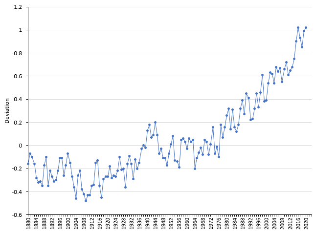
Figure 1 is a plot of the global temperature deviation as run chart over time from 1880 to 2020 using the current data as deviations in °C from the baseline period.
Figure 1: Global Temperature Deviations Run Chart
As discussed in previous publications, there are periods of “constant” temperature that is followed by a step change upward through most of the chart. The last part of the chart shows the general upward trend in global temperature.
The challenge in looking at the global temperature data is finding periods of temperature deviations that are consistent and predictable, i.e., in statistical control. During these periods, the temperature is the “same” each year. One way to do that is to simply look at the run chart, starting from the left, and look for periods that are stable. The first stable period appears to be from 1880 to 1902.
1880 – 1902 Period
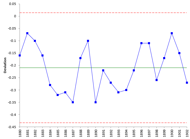
The control chart for the period from 1880 to 1902 is shown below in Figure 2.
Figure 2: Global Temperature Deviations from 1880 to 1902
Temperature deviations from 1880 to 1902 are plotted on the chart with the average (the solid line) and control limits added (the dotted lines). Look at this chart. There are no points beyond the control limits and no patterns. The process is in statistical control. The next stable period appears to occur from 1903 to 1912. This can be added to the control chart in Figure 2 to see the impact.
1903 – 1912 Period
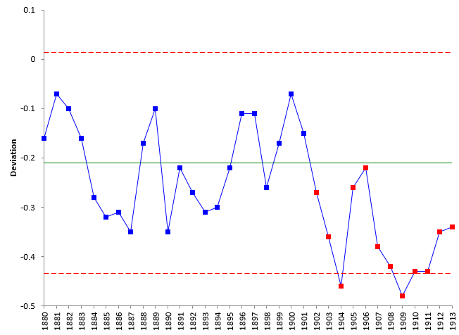
The data for 1903 to 1912 has been added to the data from Figure 2, using control limits based on the 1880 to 1902 data. The resulting control chart is shown in Figure 3.
Figure 3: Global Temperature Deviations with 1903 to 1912 Data Added
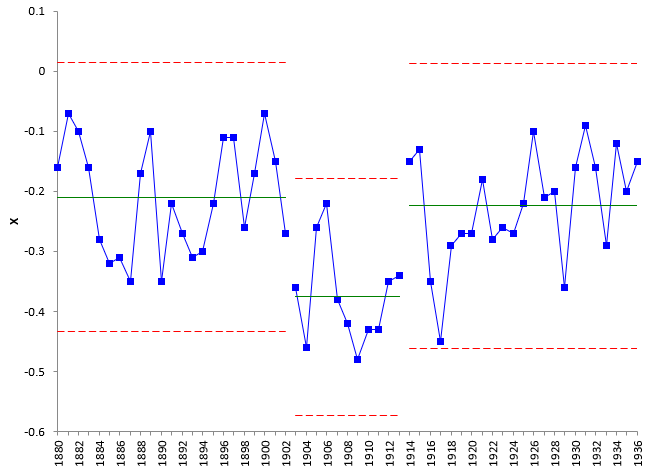
You can see that there is a run of global temperature deviations below the average, starting in 1902. This is an out of control situation – there are 12 points in a row below the average (8 is often used to signal that a run below or above the average is an out of control situation). So, the process has changed. The temperature deviation is not the same as it was from 1880 to 1902.
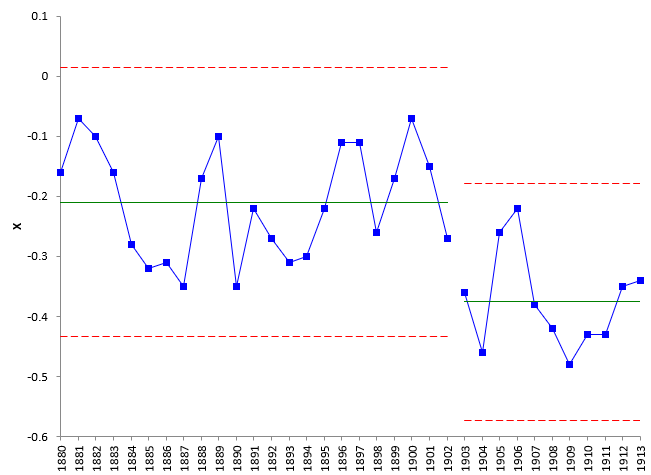
You can split the control limits to show the change in the temperature deviations. The year 1903 is the lowest global temperature since 1880 and this is the point selected to split the control limits. This is shown in Figure 4.
Figure 4: Global Temperature Deviations with Split Control Limits 1880 – 1912
The period from 1880 to 1913 is characterized by two periods of stable global temperatures, 1880 to 1902 that had an average deviation of -0.21 and the period from 1903 to 1913 that dropped the average deviation to -0.38. This is the approach used for the rest of data as shown below.
1914 – 1936 Period
The next stable period is from 1914 to 1936. This time period is just about the same as the first time period from 1880 to 1902 in terms of the average temperature deviation. The control chart with the split control limits for the three periods is shown in Figure 5.
Figure 5: Global Temperature Deviations with 1914 – 1936 Period Added
1937 – 1976 Period
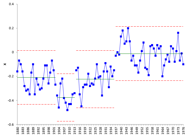
The next stable period is from 1937 to 1976. Note that this contains most of the baseline period (1951 to 1980) used to calculate the global temperature deviations. The control chart with the data from 1937 to 1976 is given in Figure 6. Now there are four stable periods on the control chart.
Figure 6: Global Temperature Deviations with 1937 – 1976 Period Added
1977 – 1986 Period
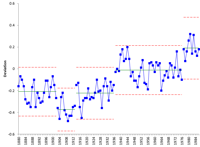
The long stable period in Figure 6 is followed by a short stable period from 1977 to 1986. The control chart with this period added is shown in Figure 7. Now there are five stable periods on the control chart with three step changes in the average temperature over the last three stages.
Figure 7: Global Temperature Deviations with 1977 – 1986 Period Added
1987 – 2020 Period
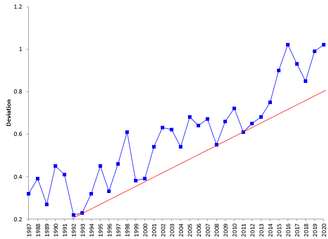
The deviations starting in 1987 show a different pattern than the previous data. There does not seem to be clear periods of stable temperatures. An upward trend has started in 1987 that has continued at least until 2015. Then it looks like another step change in temperature that could represent a leveling out of temperature – perhaps forming a new baseline. But that is not totally clear yet. Figure 8 is a run chart of the data from 1987 through 2020.
Figure 8: Global Temperature Deviations From 1987 to 2020
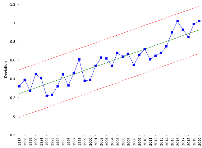
There is a red line plotted in Figure 8. This line has an upward trend. This line shows how the data hits a low point, moves above it, and then returns to it. There is definitely a trend in the data. For this time period, a trend control chart should be used. Figure 9 is the trend control for the data from 1987 through 2020.
Figure 9: Trend Control Chart for Global Temperature Deviations from 1987 to 2020
Information on how to construct a trend control chart can be found here: Trend Control Charts and Global Warming. With a trend control chart, the center line is the best fit line found using regression. The control limits are the same as the standard individuals chart, just with the best fit line replacing the average.
The best fit line for the global temperature deviations from 1987 to 2020 is given by:
Global Temperature Deviation = 0.0207364(Year) – 40.96075
This is the equation of the center line (the “average”) on the chart in Figure 9. The slope is 0.0207364. This means that for the years from 1987 to 2020, the global temperature deviation increased by about 0.02 on average per year. You can use the above equation to predict the global temperature deviation for 2021:
Global Temperature Deviation = 0.0207364(2021) – 40.96075 = 0.948
This “model” predicts that the 2021 result will be 0.948. The control limits for the last point in Figure 9 give the range of potential values (0.67 to 1.18).
All Data
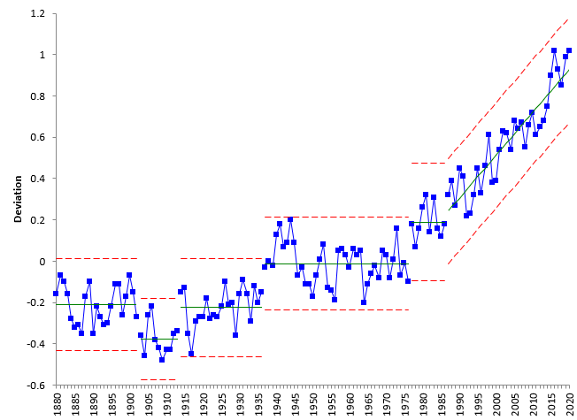
Figure 10 shows the control chart using all the data.
Figure 10: Global Temperature Deviations from 1880 to 2020
Figure 10 shows how the deviations in temperature have changed over time. There have been 5 periods of “stable” temperature deviations:
- 1880 – 1902 with an average of -0.21
- 1903 – 1913 with an average of -0.38
- 1914 – 1936 with an average of -0.02
- 1937 – 1976 with an average of -0.02
- 1977 – 1986 with an average of 0.19
The time period since 1987 is also stable, but the stability is around a trend. Since 1987, the temperature deviation has been increasing at a rate of 0.02 degrees per year.
Summary
This month’s publication updated our previous publications on global warming. The global temperature deviations based on the baseline period of 1951 – 1980 for the time period from 1880 to 2020 were used in the analysis. The analysis involved examining the data to determine if there were periods of stable temperatures. There were 5 such periods from 1880 to 1986. Each period produces “in control” temperature deviations. Starting in 1987, the data changed. The data began to trend upward, but also in a predictable pattern over the time period of 1987 to 2020. A trend control chart was used to analyze that data. The best fit line can be used to predict the temperature change for 2021. The predicted value for 2021 is 0.948.
