August 2023
 Gage R&R studies are widely used to determine how “good” a measurement process is. The emphasis is usually on the % of the total variance that is due to the measurement process. The analysis sometimes includes the construction of the Operator by Part control chart. It always should. This control chart gives you a lot of information – all in visual form. In fact, this control chart could tell you that you need to fix some issues and repeat the study. But it also gives you an initial visual look into how “good” your measurement process is.
This publication takes a closer look at the Operator by Part Control Chart in Gage R&R studies. In this publication:
- Two Key Decisions in Setting up a Basic Gage R&R Study
- Example Data
- Operator-Part Range Chart
- Operator-Part Chart
- Determining the % Variance due to the Measurement Process
- Past SPC Knowledge Base Articles on Measurement Systems Analysis
- Summary
- Quick Links
Please feel free to leave a comment at the end of this publication. You can download a pdf copy of this publication at this link.
Two Key Decisions in Setting up the Basic Gage R&R Study
There are two key decisions you must make in setting up a Gage R&R study. One is to determine the number of parts, the number of operators and the number of trials to use. The number of parts should be greater than or equal to 5. The number operators and the number of trials must be greater than or equal to 2. If possible, include all the operators who run the measurement process in the study.
The next key decision is deciding how to obtain the parts to include in the study. Part of the analysis involves comparing the measurement process variance to the total variance. One method to estimate the total variance is to use the parts in the study. This assumes that the parts represent the variation in the process. This is quite often very difficult to do in practice. Obviously choosing 10 parts in a row is not going to be representative of the variation in the process.
A better method of determining the process variance is to make a control chart from several months of process data. Then use the range chart to estimate the process standard deviation. This is often called the historical sigma. You choose a time period that is large enough so the vast majority of sources of variation have the opportunity to occur.
After these key decisions are made, you can run the study like any other Gage R&R study – in random order, operators not knowing any previous results, etc.
Example Data
Suppose we decide to run a Gage R&R with 10 parts, 3 operators, and 3 trials. That is a total of 90 samples. The three operators are Chris, John and Mary. Each operator runs 10 parts, 3 times each. The data are shown in Table1. The data are from the Automotive Industry Action Group (AIAG) Measurement Systems Analysis manual.
Table 1: Basic Gage R&R Study Data
| Operator | Part | Result | Operator | Part | Result | Operator | Part | Result | ||
| Chris | 1 | 0.29 | John | 1 | 0.08 | Mary | 1 | 0.04 | ||
| Chris | 1 | 0.41 | John | 1 | 0.25 | Mary | 1 | -0.11 | ||
| Chris | 1 | 0.64 | John | 1 | 0.07 | Mary | 1 | -0.15 | ||
| Chris | 2 | -0.56 | John | 2 | -0.47 | Mary | 2 | -1.38 | ||
| Chris | 2 | -0.68 | John | 2 | -1.22 | Mary | 2 | -1.13 | ||
| Chris | 2 | -0.58 | John | 2 | -0.68 | Mary | 2 | -0.96 | ||
| Chris | 3 | 1.34 | John | 3 | 1.19 | Mary | 3 | 0.88 | ||
| Chris | 3 | 1.17 | John | 3 | 0.94 | Mary | 3 | 1.09 | ||
| Chris | 3 | 1.27 | John | 3 | 1.34 | Mary | 3 | 0.67 | ||
| Chris | 4 | 0.47 | John | 4 | 0.01 | Mary | 4 | 0.14 | ||
| Chris | 4 | 0.5 | John | 4 | 1.03 | Mary | 4 | 0.2 | ||
| Chris | 4 | 0.64 | John | 4 | 0.2 | Mary | 4 | 0.11 | ||
| Chris | 5 | -0.8 | John | 5 | -0.56 | Mary | 5 | -1.46 | ||
| Chris | 5 | -0.92 | John | 5 | -1.2 | Mary | 5 | -1.07 | ||
| Chris | 5 | -0.84 | John | 5 | -1.28 | Mary | 5 | -1.45 | ||
| Chris | 6 | 0.02 | John | 6 | -0.2 | Mary | 6 | -0.29 | ||
| Chris | 6 | -0.11 | John | 6 | 0.22 | Mary | 6 | -0.67 | ||
| Chris | 6 | -0.21 | John | 6 | 0.06 | Mary | 6 | -0.49 | ||
| Chris | 7 | 0.59 | John | 7 | 0.47 | Mary | 7 | 0.02 | ||
| Chris | 7 | 0.75 | John | 7 | 0.55 | Mary | 7 | 0.01 | ||
| Chris | 7 | 0.66 | John | 7 | 0.83 | Mary | 7 | 0.21 | ||
| Chris | 8 | -0.31 | John | 8 | -0.63 | Mary | 8 | -0.46 | ||
| Chris | 8 | -0.2 | John | 8 | 0.08 | Mary | 8 | -0.56 | ||
| Chris | 8 | -0.17 | John | 8 | -0.34 | Mary | 8 | -0.49 | ||
| Chris | 9 | 2.26 | John | 9 | 1.8 | Mary | 9 | 1.77 | ||
| Chris | 9 | 1.99 | John | 9 | 2.12 | Mary | 9 | 1.45 | ||
| Chris | 9 | 2.01 | John | 9 | 2.19 | Mary | 9 | 1.87 | ||
| Chris | 10 | -1.36 | John | 10 | -1.68 | Mary | 10 | -1.49 | ||
| Chris | 10 | -1.25 | John | 10 | -1.62 | Mary | 10 | -1.77 | ||
| Chris | 10 | -1.31 | John | 10 | -1.5 | Mary | 10 | -2.16 |
The question is:
How does the Gage R&R study use this data to find insights into the measurement process?
It starts with a range chart. We will start with the operator by part range chart.
Operator-Part Range Chart
Control charts study various sources of variation. One thing we would like to know about our measurement process is how much variation there is in it. If one person measures the same part over and over, the difference in the results is a measure of the measurement process variation.
How can the data in Table 1 be subgrouped so that we can see that variation in the measurement process? Look at the first column in Table 1. You will see 3 results for Chris. The 3 results represent the value Chris received when running Part 1 in the measurement process. He ran Part 1 three times.
So, what is the reason for the difference in the three results: 0.29, 0.41 and 0.64? It is the same operator and the same part. The only reason for the difference is the measurement process. A measure of the measurement process variation is then the range of these three samples: |0.64 – 0.29| = 0.35. Is this a good measure of the measurement process variation? Probably not, it is just one subgroup. But there is a total of 30 such subgroups in Table 1. We can calculate the range in each one and construct a range chart. The range chart is shown in Figure 1.
Figure 1: Operator-Part Range Chart
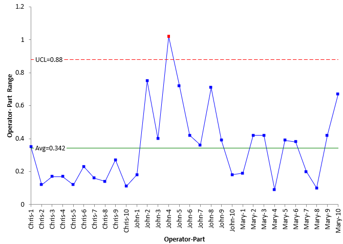
The range for each of the subgroups is plotted. The average and the control limits are then calculated and added to the control chart as shown above. The calculations are shown below.
R̅ = SRi/k = 10.25/30 = 0.342
LCLr = D3R̅ = None
UCLr = D4R̅ = 0.88
where k is the number of subgroups, D3 and D4 are control chart constants that depend on subgroup size, R̅ is the average range, LCLr is the lower control, and UCLr is the upper control limit. D3 does not exist for a subgroup size of 3, so there is no lower control limit on the range chart. D4 is 2.574 for a subgroup size of 3.
The R chart is analyzed. If all the points are within the control limits and there are no patterns (like 8 in a row above or below the average), the process is said to be consistent and predictable. It is in statistical control. You can predict what will happen in the future. It also means that you have a good value for the average range. Remember, the average range is a measure of the measurement process variation.
If there are out of control points or patterns present, then the process is said to be out of control. It is not consistent and predictable. The average range may not be a good measure of the measurement process variation.
Look at Figure 1. What do you see? Remember the R chart checks for consistency between operators. It shows the results for the repeated measurements for each operator for each part. Here is the conclusion:
- There is 1 out of control point on the R chart; the ranges are not consistent.
- The reason for the out of control point should be corrected and the study repeated.
You may not need to repeat the study all the time. Sometimes you might just rerun the operator-part that was out of control. If there are a lot of out of control points on the R chart, you need to investigate why, correct the problem and rerun the study. Or you may just ignore the out of control point if there is just one. For this publication, we will assume that the one out of control point does not significantly impact the results.
One more item in Figure 1: the operator Chris appears to have less variation than the other two operators in running the test. Finding out why would be a good idea at this point and seeing if what he does can be incorporated by the other two operators.
For now, we will assume that R̅ = 0.342 is a good measure of the measurement process variation. We can now determine the measurement process error, which is defined as the following:
spe = R̅ /d2 = 0.342/1.693 = 0.2018
where spe is the measurement process error (test-retest error), represented as standard deviation and d2 is a control chart that depends on subgroup size (1.693 for a subgroup size of 3). We will use this value below in the calculations of the % of total variance due to the measurement process.
Operator-Part Chart
The R chart used the range from the subgroups. Now the Operator-Part chart is going to use the subgroup (part) average. Go back to Table 1. The three results that Chris obtained in running Part 1 are 0.29, 0.41 and 0.64. The average of these results is 0.45. Each subgroup average is plotted on the chart. The overall average is added along the control limits. The chart is then interpreted – in a different manner than normal. Figure 2 is the Operator-Part X chart.
Figure 2: Operator-Part Chart
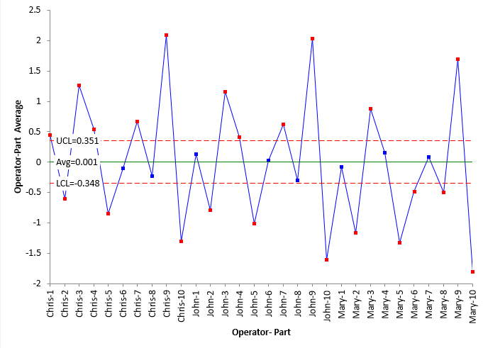
The first thing you notice about Figure 2 is that there are lots of out of control points. This is one situation where that is good – where you want out of control points – the more the better. Let’s see why this occurs. The equations for the average and control limits are given below.
X̿ = S/k = 0.0433/30 = 0.001
LCL = X̿ – A2R̅ = 0.001 – 1.023(0.342) = -0.348
UCL = X̿ + A2R̅ = 0.001 + 1.023(0.342) = 0.351
where A2 is a control chart constant that depend on subgroup size (1.023 for a subgroup size of 3), and LCL and UCL are the upper and lower control limits on the X chart.
Remember what R̅ is? It is a measure of the measurement process variation. You hope that the measurement process variation is small compared to the process variance. This leads to tight control limits and the abundance of out of control points.
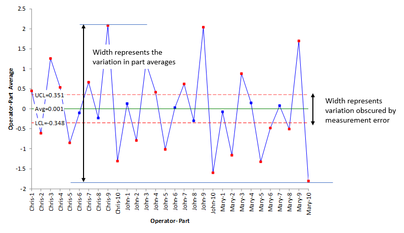
The range between the LCL and UCL on the X chart. in Figure 2 represents the measurements that are masked by measurement error. You can’t really tell the difference between the points between the control limits. The range between the minimum part average and maximum part average on the X chart represent the process variation. In Figure 2, this is much larger than the measurement process variation defined by the control limits. Figure 3 shows this concept.
Figure 3: Variation Masked by Measurement Process Error
To summarize the information in Figure 2:
- The X chart shows the average value for each operator for each part.
- The control limits on the X chart are based on the average range.
- The average range is representative of measurement error.
- The X chart control limits represent the variation obscured by measurement error.
- The relative utility of the measurement process increases:
- The more out of control points there on are on the X chart.
- The further the out of control points are away from the control limits.
- 22 out of 30 points are out of control on the X chart.
So, it looks like the measurement process is pretty good – it can tell the difference between samples as seen by all the out of control points in Figure 2.
If most or all of the points on the chart are in control, then this means that the measurement process can not tell the difference between the points and is not very good.
Of course, many of us want to have a metric that tells us how good the measurement process is. We show how to do that below.
Determining the % Variance due to the Measurement System
The basic equation describing the relationship between the total variance, the product variance and the measurement process variance is given below.
σx2= σp2+σe2
where σx2 = total variance of the product measurements, σp2= the variance of the product, and σe2 = the variance of the measurement process. The ratio of the measurement process variance to the total variance is given by:
Ratio of measurement process variance to the total variance = σe2/ σx2
To determine the % of total variance due to the measurement process, we need an estimate of the total variance. As mentioned above, you can take several months of process data, construct a control chart and use the range chart to estimate the total variance. You can also use the parts in the study to determine the total variance. We will do that here.
The variance of the measurement process is composed of two parts: repeatability and reproducibility. The repeatability is given by spe2. We calculated spe above from the range chart. The reproducibility (so2) can be calculated using the following:
so2 = so2 – (o/(nop))spe2
where so2 = variance of the operator averages, o = number of operators, n = number of trials and p = number of parts. The operator averages are:
- Chris: 0.1903
- John: 0.0683
- Mary: -0.2543
The variance of the operator averages is 0.05277. The reproducibility is then given by:
so2 = so2 – (o/(nop))spe2 = 0.0527-(3/90)(0.20182) = 0.0513
The Gage R&R is then:
Gage R&R = so2 + spe2 = 0.0513 + 0.0407 = 0.092
The product variance given by:
sp2 = sp2 – (p/(nop))spe2
where sp2 = variance of part averages.
The part averages are given by:
- Part 1: 0.1689
- Part 2: -0.8511
- Part 3: 1.0989
- Part 4: 0.3667
- Part 5: -1.0644
- Part 6: -0.1856
- Part 7: 0.4544
- Part 8: -0.3422
- Part 9: 1.9400
- Part 10: -1.5711
The part variance is 1.091. The product variance is then:
sp2 = sp2 – (p/(n o p))spe2 = 1.091 – (10/90)(0.20182) = 1.086
The total variance is then:
σx2= σp2 + σe2 = 1.086 + 0.092 = 1.178
And finally, the % of total variance due to the measurement process is:
% of total variance due to the measurement process = σe2/ σx2 = 0.092/1.178 = 7.8%
The measurement process causes 7.8% of the total variance. Based on this number alone, it is a good measurement process. But you already had a pretty good idea that the measurement process was good from Figure 2. Most of the points were out of control meaning that the measurement process can tell the difference between samples.
Past SPC Knowledge Base Articles on Measurement Systems Analysis
Ever since January 2004, we have been publishing monthly articles on a variety of SPC and statistical techniques. We have 34 articles on the Measurement System Analysis. These are listed below. You can access these articles at this SPC Knowledge Base link.
- Operational Definitions/Measurement System Analysis (March 2004 )
- Monitoring Test Methods Using SPC (May 2006 )
- Variable Measurement Systems – Part 1: Stability (September 2007 )
- Variable Measurement Systems – Part 2: Bias (October 2007 )
- Variable Measurement Systems – Part 3: Linearity (November 2007 )
- Variable Measurement Systems – Part 4: Gage R&R (December 2007 )
- Measurement Systems – Is Yours Any Good? (November 2009 )
- Attribute Gage R&R Studies: Comparing Appraisers (May 2010 )
- Attribute Gage R&R Studies – Part 2 (June 2010 )
- Levey-Jennings Charts (August 2010 )
- ANOVA Gage R&R – Part 1 (August 2012 )
- ANOVA Gage R&R – Part 2 (September 2012 )
- ANOVA Gage R&R – Part 3 (October 2012 )
- Gage R&R for Non-Destructive and Destructive Test Methods (September 2013 )
- Destructive Gage R&R Analysis (October 2013 )
- Evaluating the Measurement Process – Part 1 (December 2014 )
- Evaluating the Measurement Process – Part 2 (January 2015 )
- Three Methods to Analyze Gage R&R Studies (February 2015 )
- Monitoring Destructive Test Methods (November 2015 )
- Probable Error and Your Measurement System (April 2016 )
- Specifications and Measurement Error (May 2016 )
- SPC and the Lab (November 2017 )
- The Impact of Measurement Error on Control Charts (January 2018 )
- Acceptance Criteria for Measurement Systems Analysis (MSA) (April 2018 )
- Operational Definition of a Consistent Measurement System (May 2018 )
- The Short EMP Study (June 2019 )
- Evaluating the Measurement Process (EMP) Overview (July 2019 )
- Five Common Mistakes with Gage R&R Studies (November 2019 )
- Operator-Part Interaction in Gage R&R Studies (December 2019 )
- A Tale of Two Precision to Tolerance Ratios (March 2020 )
- How Does Measurement Variation Impact Control Chart Signals? (November 2020 )
- The Calculations Behind a Gage Linearity Study (February 2021 )
- Individuals Control Charts and Levey-Jennings Charts (December 2021 )
- How to Monitor Measurement Systems Over Time (May 2023 )
Summary
This publication showed how the operator-part control chart in Gage R&R studies gives you insights into how good your measurement process is. The range chart is used to ensure that the operator’s repeatability is consistent (in control). The average range from that chart is a measure of the measurement process error. The X chart plots each operators subgroup averages. With this type of chart, you want out of control points – the more the better. The control limits on the X chart show the range of values that are masked by the measurement error. This publication also showed how to calculate the % of the total variance caused by the measurement process.
Hi Bill – I posted this is a really old post, so i am going to repost it here since I think it may apply better to this article. Apologies for the redundancy:
I am trying to figure out what gauge studies would tell me the most information I need to know. I develop automated inline inspection systems (machine vision based metrology), so they only have 1 operator (the system itself) and never get to remeasure the parts that just passed by them (i.e., no true repeatability).
I can see utility in doing some prove out of the system by refeeding parts to capture repeatability or consistency, as this could show clear variation in how parts are presented to the vision system (i.e., fixturing or lighting). However, I want to do a study that most adequately assesses how the system behaves when it is being used as intended — only one operator and no remeasurement opportunities.
Can you assist?
Hello,
I see value in refeeding parts that represent the variaiton in your process. You can do the basic GageR&R study that way and find the meausrement errror, then compare that to the historical variation in the porcess. You may only have one operator but i assume they can be different over time. So, multiple parts and multiple operators.
Bill
Hi there — the system itself is the operator. There is no human interaction with the measurement process since it is all done inline automatically. How do we simulate multiple operators in that case? Can we?
And if we cannot refeed parts easily, or at all, is there a better way of assessing measurement variation relative to the process variation? I wanted to trial a nested GR&R or a destructive GR&R, but those also require multiple operators. Not sure how I can rationalize multiple operators without it being arbitrary.
Send me an email and we can chat further about this. bill@www.spcforexcel.com