This month’s newsletter examines Levey-Jennings charts. These charts are often used in laboratories, particularly in the healthcare industry, to ensure that test methods are stable (accurate). A control is selected for a lab test. In most cases, the control has a known “true” value. The control is run in the lab test on a regular basis (e.g., each shift, daily, or before each lab test). Each control result is plotted on the chart. The calculated standard deviation is used to set the control limits. Special rules, called the “Westgard Rules” are used to interpret the Levey-Jennings chart.
In this issue:
- Introduction
- Levey-Jennings Chart Example
- How to Construct a Levey-Jennings Chart
- Westgard Rules
- Similarities and Differences to X-mR Control Charts
- Quick Links
SPC for Excel software creates Levey-Jennings charts in the Excel environment. Update the chart easily with new data. Includes the Westgard Rules. See more about the SPC for Excel software at the link below. Or download the free 30-day demo
Introduction
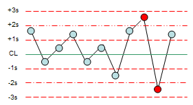
Our previous newsletters have examined how to monitor lab tests using X-mR (individuals) control charts. This approach is always a valid method of monitoring lab tests. Yet, many labs use Levey-Jennings charts to monitor the stability of their lab tests. This is particularly true in the healthcare industry. An example of a Levey-Jennings chart is shown below.
Levey-Jennings Chart Example
A lab runs a cholesterol test. To monitor the test, they run a control daily. The control value is 250 mg/dL. The data for thirty days is in the table below.
| Day | Control |
Day |
Control |
Day |
Control |
| 1 | 250 | 11 | 240 | 21 | 247 |
| 2 | 255 | 12 | 254 | 22 | 245 |
| 3 | 245 | 13 | 246 | 23 | 248 |
| 4 | 232 | 14 | 257 | 24 | 249 |
| 5 | 232 | 15 | 250 | 25 | 241 |
| 6 | 257 | 16 | 255 | 26 | 247 |
| 7 | 244 | 17 | 259 | 27 | 240 |
| 8 | 259 | 18 | 247 | 28 | 252 |
| 9 | 262 | 19 | 246 | 29 | 247 |
| 10 | 246 | 20 | 248 | 30 | 264 |
The Levey-Jennings chart for this data is shown below. Each control result is plotted on the Levey-Jennings chart. There two options for the center line on the chart. You can use the control value (as was done in this example) or you can use the average of the results. You might want to use the average if you do not have a control with a “known” value.
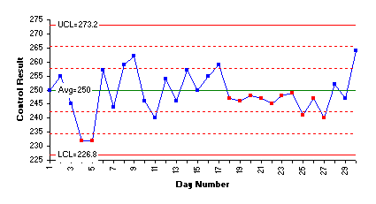
On each side of the results, there are three lines. The LCL and UCL are three standard deviations from the center line. The other two lines represent distances of one and two standard deviations from the average. The standard deviation is either a known standard deviation from previous measurements or the standard deviation of the results. In this example, it is the standard deviation of the results.
The red points in the chart above are “out of control.” When this is the case, the lab tests since the last control was run are suspect. Days 4 and 5 are out of control. They fail a test that says two consecutive points beyond 2 standard deviations from the average (or control value) are out of control. This condition indicates that the accuracy of the lab test is significantly different for those two points. Days 17 to 27 also represent an out of control situation. This is a run of 8 or more below the average and indicates that the accuracy of the lab test has shifted.
How to Construct a Levey-Jennings Chart
The steps in constructing a Levey-Jennings chart are shown below. It is assumed that the proper control has been selected. These steps relate just to how the Levey-Jennings is made.
1. Decide if you will use the control value for the center line on the Levey-Jennings chart or if you will use the average calculated from the results of running the control in the lab test.
2. Decide if you have a known standard deviation for the lab test or if you will use the calculated standard deviation from the results from running the control in the lab test.
3. Select the frequency with which the data will be collected (e.g., before each test or daily). Data should be collected in the order in which they are generated.
4. Select the number of data points (k) to be collected before control limits are calculated (at least twenty). You can start the chart with as little as six points. Recalculate the control limits until you have twenty or more points. The more data points you have, the better the estimate of the variation in the lab test.
5. Run the control in the lab test and record the individual results.
6. Plot the results (X) on the Levey-Jennings chart.
7. Calculate the overall process average (if the control value is not being used for the center line):
![]()
where k is the number of control samples run.
8. Calculate the standard deviation (if a known standard deviation is not being used):
![]()
You can easily calculate this in Excel using the STDEV function.
9. Calculate the upper control limit (UCL) and the lower control limit (LCL).

10. Plot the center line as a sold line on the Levey-Jennings chart and label. Plot the control limits on the Levey-Jennings chart and label. If you are using the Westgard rules (described below), you will also need to plot the lines at +1s, +2s, -1s and -2s from the center line.
11. Interpret the chart – what is it telling you about the lab test?
SPC for Excel creates the Levey-Jennings chart in seconds. The video below shows how it is done – all within your Excel environment. SPC for Excel also includes the Westgard rules.
Westgard Rules
The Levey-Jennings charts can be interpreted using the Westgard rules. These are really multi-rules quality control procedures that are designed to minimize false rejections and maximize error detection. The original paper was in the Journal of Clinical Chemistry (27/3, 493-501 (1981). If you read the paper, you will not see the term Westgard Rules.
The lead author was named James Westgard. You can find more information on these rules at www.westgard.com. This website also contains information on laboratory QC procedures.
The rules below assume that one control is being run. Each test is designed to send a signal that something in the lab test has shifted.
- 12s: This test sends a signal if there is a point beyond +/- 2 standard deviations. In the original Westgard multi-rule QC procedure, this test was used as a warning signal to carefully inspect the data. It is really not too useful a rule since computers make it easy to do charts now. If you use this test, remember that 5% of the points in a normal distribution will be beyond +/- 2 standard deviations from the center line. This means that you will have a large number of false rejections compared to using the rules below.
Figure 2: 12s Test
- 13s: This test sends a signal when a point exceeds +/- three standard deviations.
Figure3: 13s Test
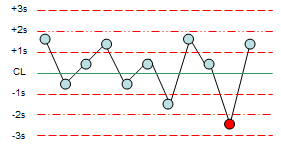
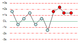
22s: This test sends a signal if two consecutive points are beyond + 2 standard deviations from the mean or beyond -2 standard deviations from the mean.
Figure 4: 22s Test
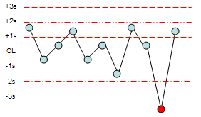
R4s: This test sends a signal when one point is beyond +2 standard deviations and the following point is beyond -2 standard deviations or vice-versa.
Figure 5: Test R4s
41s: This test sends a signal when 4 consecutive points exceed +1 standard deviation or 4 consecutive points exceed -1 standard deviation.
Figure 6: Test 41s
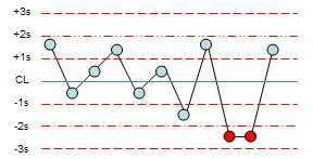
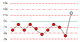
10x: This test sends a signal when 10 consecutive control measurements fall on one side of the centerline. Other common values used include 8 and 12.
Figure 7: Text 10x
Similarities and Differences to X-mR Control Charts
There are some similarities between the Levey-Jennings chart and an individuals (X-mR) control chart (see our October 2006 newsletter for more information on X-mR control charts). The Levey-Jennings chart and the X chart both plot a single result – the control result for the Levey-Jennings chart and the X value for the X chart (which could be the Levey-Jennings chart). The charts will look similar when they are completed – however there are some major differences.
One difference is the way that control limits are calculated. The Levey-Jennings chart uses the calculated standard deviation (or a known standard deviation) to determine the control limits. The individuals control chart uses an estimated standard deviation from the range chart to determine the control limits. In addition, the individuals chart uses the average of the results for the center line while the Levey-Jennings chart uses either the average or the control value for the center line.
Another difference is that the Levey-Jennings chart is always just one chart while the individuals chart is two charts – one for the X value and one for the moving range chart. If you are only running one control, there is no reason not to use a moving range chart with the Levey-Jennings chart. It just gives you more information.
There are also differences in the tests used to determine if the lab test is stable – although the tests are very similar (see our April 2004 newsletter for more information on interpreting control charts). For example, the 22s test is very similar to the test for Zone A.
So, which is better for laboratory tests? Levey-Jennings or the control chart method? If you have followed these newsletters, you may remember that we have had several that highlighted using control charts to monitor lab tests. In the end, you need to select the method that best fits your needs and your customer needs. Plotting the data over time will always give you insights into what is happening – regardless of whether you use the Levey-Jennings approach or the control chart approach. And, in reality, if the lab test is in statistical control (consistent and predictable), the two techniques give almost identical results.
SPC for Excel handles over 25 different control charts including Levey-Jennings and the individuals (X-mR) control charts.
Me gustaría, poder leer en pdf
Sorry, we were not providing the newsletters in pdf format at the time this was written.
Bill