December 2016
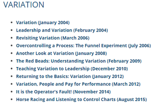
(Note: all the previous SPC Knowledge Base in the variation category are listed on the right-hand side. Select this link for information on the SPC for Excel software.)

In addition, this month we introduce how we have made it easier for you to navigate around our 13 years of publications in our SPC Knowledge Base. There are now over 150 articles on a variety of statistical topics – all free for you to access.
In this issue:
- Variation: Spilling the Milk
- A Case Study in Variation
- Variation and Control Charts
- Navigating the SPC Knowledge Base
- Best Wishes for the New Year
- Quick Links
You may also download a pdf copy of this publication at this link. Please feel free to leave a comment at the end of the publication.
Variation: Spilling The Milk
This is from our first publication back in January 2004 (with a few edits).

Variation comes from two sources, common and special causes. Think about how long it takes you to get to work in the morning. Maybe it takes you 30 minutes on average. Some days it may take a little longer, some days a little shorter. But as long as you are within a certain range, you are not concerned. The range may be from 25 to 35 minutes. This variation represents common cause variation — it is the variation that is always present in the process. And this type of variation is consistent and predictable. You don’t know how long it will take to get to work tomorrow, but you know that it will be between 25 and 35 minutes as long as the process remains the same.
Now, suppose you have a flat tire when driving to work. How long will it take you to get to work? Definitely longer than the 25 to 35 minutes in your “normal” variation. Maybe it takes you an hour longer. This is a special cause of variation. Something happened that was not supposed to happen. It is not part of the normal process. Special causes are not predictable and are sporadic in nature.

If only common causes are present, you must FUNDAMENTALLY change the process. The key word is fundamentally — a major change in the process is required to reduce common causes of variation. And management is responsible for changing the process.
It has been estimated that 94% of the problems a company faces are due to common causes. Only 6% are due to special causes (that may or may not be people related). So, if you always blame problems on people, you will be wrong at least 94% of the time. It is the process most of the time that needs to be changed. Management must set up the system to allow the processes to be changed.
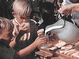
So, Mom, sorry. But most of the time, spilling the milk was not my fault. It was usually yours (management). The glasses were too big for my small hands (no spill-proof cups in those days). When I wanted to put it by the edge of the table to make it easier to reach, you said move it back – I might spill it. And with the meal-time conversation, how could I concentrate on my milk!
The first thing to do in process improvement efforts is to teach the concept of variation. You need to know what is due to common causes of variation and what is due to special causes of variation.
A Case Study in Variation
That first publication back in 2004 also contained the following story. To really understand variation, many people have to change their paradigm. The following is a true story. A plant produced a number of different powdered products. Each of these products was run through the same production equipment at different conditions and put into unique silos (one or more for each product type).

The plant leadership had a policy that anyone who cross-contaminated a silo received three days off with no pay. What type of variation did leadership assume was present? Special cause. They assumed that the operators were at fault. One manager said that he was not going to “idiot proof” the plant.
Was leadership correct? The only way to find out is to collect data.
It turns out that anyone who had worked in the unit for more than 3 months had time off for cross- contaminating a silo. If everyone is doing it, what type of variation is it? Common cause. And the only way to reduce common cause of variation is to change the process.
Leadership put together a team that worked on the problem. The team came up with two simple solutions: label the lines and put better lights out at night. Easy solutions but beyond the authority of the operators to get done by themselves. With the solutions implemented, the problem, which had been occurring almost monthly, went away entirely. So simple if you understand variation.
So how do you separate common from special causes of variation? The only effective way to do this is by using control charts.
Variation and Control Charts
The follow is an excerpt from our December 2010 publication on teaching variation to leadership. Consider sales for the two months shown below:
Jan-15: $11,229
Feb-15: $10,016
Are these sales numbers the same? The measurements we take reflect the variation in the process. The problem with measurement systems that compare one-time frame to another is that the actual performance (variation) of the process is hidden – we don’t know what the underlying process is doing.

The only tool to effectively examine the behavior of a process is a control chart. The data in Table 1 is our sales data. What does this table of data show you?
Table 1: Sales Data
| Month | Sales (000) | Month | Sales (000) | |
|---|---|---|---|---|
| Jan-15 | 7997 | Oct-15 | 11117 | |
| Feb-15 | 9132 | Nov-15 | 6481 | |
| Mar-15 | 6694 | Dec-15 | 6897 | |
| Apr-15 | 10005 | Jan-16 | 11229 | |
| May-15 | 12055 | Feb-16 | 10016 | |
| Jun-15 | 11485 | Mar-16 | 8903 | |
| Jul-15 | 8133 | Apr-16 | 9617 | |
| Aug-15 | 7215 | May-16 | 8190 | |
| Sep-15 | 8278 | Jun-16 | 9653 |
The table does begin to show some of the variation in the underlying process. It is an improvement over the limited comparison of two numbers. But it is still difficult to see the underlying process behavior.
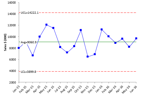
To really understand what is happening, you need to construct a control chart. The individuals control chart for the data in Table 1 is shown in the figure below. We will not show the moving range chart here.
Figure 1: Sales Data – X Control Chart
The upper control limit (UCL) is the largest value you would expect from a process with just common causes of variation present. The lower control limit (LCL) is the smallest value you would expect. As long as the all the points are within the limits and there are no patterns, only common cause of variation are present. The process is said to be “in control” To improve it, you must fundamentally change the process.
All the points are within the control limits and there are no patterns. The sales process is “in control.” Sales might be as low as 3,899 or as high as 14,222 each month. The variation is simply the random variation in the process. We can predict what will happen in the future. As long as the process remains the same, sales will average 9060 per month with the monthly variation being between the control limits.
Quite often, people will say that the control limits are too wide – and don’t really help them. They miss the point. It is not the control limits, but the story that the control chart tells. It provides feedback on the state of the process – improving or declining or in control. And this process is in statistical control, it tells leadership that the process must be fundamentally changed if sales are to increase. The key word here is fundamentally. This means new products, new sales approaches, etc. And the control chart can be used to judge the impact of those fundamental changes.
Navigating the SPC Knowledge Base
Earlier this year, we made it easier to navigate the over 150 publications in the SPC Knowledge Base. For years, we simply had the publications listed by the month they were published. The link below takes you to that page:
List of publications by month published
As our number of publications grew, we needed a better method of allowing users to find the publications of interest to them. So, we divided the articles into categories to make it easier to find the publications. The link below takes you to that page:
List of publications by category

- Variation
- Dr. W. Edwards Deming
- Control Charts
- Basics
- Variable Control Charts
- Rational Subgrouping
- Attribute Control Charts
- Control Chart Examples
- Bar Charts: Pareto and Histograms
- Measurement Systems Analysis
- Process Capability
- Root Cause Analysis
- Comparing Processes
- Experimental Design Techniques
- Basic Statistics
- Process Improvement
- Miscellaneous

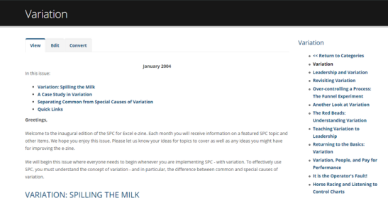
Suppose you click on the first article listed. This takes you to the article on variation from January 2004. When you are on the publication page, look at the right-hand column. You will see a list of all the publications in that category. The one you are viewing is listed in black; the others are in blue. This allows you to move to other publications within the category.
Hopefully, this makes it easier to navigate through all the publications to find the ones that interest you!
Best Wishes for the New Year
We appreciate you taking time to read our publications. It has been a joy to provide them to you over the years – our gift for those seeking to understand. Best wishes to you and yours in the New Year!


Does the interpretation of XmR range chart, like the other variable control (Shewart´s) charts is reliable only if data follow a Normal Distribution? How can we check it?
It is not a requirement that data be normally distributed to use a control chart. Points beyond the control limits work pretty well regardless of the type of distribution. The zones tests may give some false signals if the distribution is very skewed, as discussed in the article on Control Chart and Non-Normal Data. As far as determining if data are normally distributed, please see our June 2016 artice: <a href="/knowledge/basic-statistics/what-my-data-are-not-normal">What? My Data are Not Normal?</a>
I wish you A very Happy New Year!