March 2011
 This month’s newsletter examines the purpose of control charts and some ways they can be used. I ran across a blog this past week that talked about control charts. The blog is on a website devoted to reducing the healthcare-acquired infections in clinical settings – a very noble and worthwhile ambition. The purpose of the blog was to question the use of control charts by epidemiologists and in healthcare in general. That is fine. Control charts don’t work everywhere – just in the vast majority of processes.
What got my attention was the misinformation about control charts in the blog – things like control limits are confidence limits, a spike above two standard deviations is an out of control point, that a control chart is used to keep a process at “average”, etc.
I decided it was time to revisit the purpose of control charts and why they are invaluable statistical techniques to use in many processes – including many health care processes. It is obvious from the misinformation in the blog that I need to start with the basics – what a process is. So, in this issue we will answer the following questions:
- What is a process?
- What is a control chart?
- What is variation?
- What does a control chart look like?
- What are control charts used for?
- Shouldn’t control charts be used everywhere?
- What blog has the misleading information?
And, of course, we end with our usual Quick Links. I include a link to the blog that contains the misleading information as well as a link to my response in case you are interested. I have also open this newsletter up to comments if you want to tell others how you use control charts – where you have found them useful and where they have not been as useful. You can add your comments at the end of the newsletter.
What is a Process?
This is a good place to start our discussion. After all, control charts are the heart of statistical process control (SPC). A process is simply what we do. It can be filling out an expense report, checking a person into a hospital, burning a CD with music, driving to work, filling a prescription, etc. All these processes generate an output – either a product or service. But, in addition, the processes generate data. SPC is simply taken that data the process generates and using it to control and improve the process. It is often useful to collect data in four dimensions on a process: quality, quantity, timeliness, and cost.
What is a Control Chart?
A control chart is one of many process improvement techniques. It is not the answer to all your problems. Nor should a control chart be used alone. There are always other process improvement tools that should be used along with control charts.
A control chart is used to monitor a process variable over time. That variable can be in any type of company or organization – service, manufacturing, non-profit and, yes, healthcare. It provides a picture of the process variable over time and tells you the type of variation you are dealing with as you move forward with continuous improvement. This understanding of variation is the key to using control charts effectively.
For example, suppose you want to reduce the time it takes to admit someone to the hospital. You are using a problem solving methodology (e.g., see our May 2004 newsletter). You have developed the process flow diagram on how people are admitted to the hospital. You have begun measuring the average time it takes to admit a patient each day. That process variable can be plotted on a control chart over time. The objective of the control chart is to find any “special” causes of variation as well as to reflect the process improvements that have been made. Again, to effectively use control charts, you must understand the information in variation.
What is Variation?
Variation is so important that we have seven newsletters dedicated to the subject since our monthly newsletter started in January 2004. This is from the first newsletter and explains the concept of variation:
“I used to, now and then, spill a glass of milk when I was young. Our table slanted toward where my mother sat. So, the milk always headed in her direction. And she usually had some choice words when this happened. Of course, I was at fault. I needed to be more careful. Or was that really true? If you understand variation, you will realize that most of the problems you face are not due to individual people, but to the process — the way it was designed and the way it is managed on a day-to-day basis.
Variation comes from two sources, common and special causes. Think about how long it takes you to get to work in the morning. Maybe it takes you 30 minutes on average. Some days it may take a little longer, some days a little shorter. But as long as you are within a certain range, you are not concerned. The range may be from 25 to 35 minutes. This variation represents common cause variation — it is the variation that is always present in the process. And this type of variation is consistent and predictable. You don’t know how long it will take to get to work tomorrow, but you know that it will be between 25 and 35 minutes as long as the process remains the same.
Now, suppose you have a flat tire when driving to work. How long will it take you to get to work? Definitely longer than the 25 to 35 minutes in your “normal” variation. Maybe it takes you an hour longer. This is a special cause of variation. Something happened that was not supposed to happen. It is not part of the normal process. Special causes are not predictable and are sporadic in nature.
Why is it important to know the type of variation present in your process? Because the action you take to improve your process depends on the type of variation present. If special causes are present, you must find the cause of the problem and then eliminate it from ever coming back, if possible. This is usually the responsibility of the person closest to the process. If only common causes are present, you must FUNDAMENTALLY change the process. The key word is fundamentally — a major change in the process is required to reduce common causes of variation. And management is responsible for changing the process.
It has been estimated that 85 to 94% of the problems a company faces are due to common causes. Only 6 to 15% are due to special causes (that may or may not be people related). So, if you always blame problems on people, you will be wrong at least 85% of the time. It is the process most of the time that needs to be changed. Management must set up the system to allow the processes to be changed.”
Variation exists in all processes – including healthcare processes.
What Does a Control Chart Look Like?
Let’s take the simple example of driving to work. A possible control chart (X chart from the X-mR control charts) is shown below.
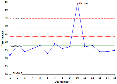
The process variable (the time to get to work) is plotted over time. After sufficient points, the process average is calculated. Then the upper control limit (UCL) and the lower control limit (LCL) are calculated. Nobody sets these values- they are determined by the process and how you sample the process. The UCL is the largest value you would expect from a process with just common causes of variation present. The LCL is the smallest value you would expect. As long as the all the points are within the limits and there are no patterns, only common causes of variation are present. The process is said to be “in control.”
What are Control Charts Used for?
We will continue with the driving to work example. There is one “out of control” point on the control chart. It took much longer to get to work that day. You had a flat tire – a special cause of variation. In this example, the objective is to remove the special cause of variation to keep it from ever coming back into your process. It is not part of the way you designed the process. Can you totally remove the possibility of getting a flat tire on the way to work? No, but you can significantly reduce that probability with proper tire maintenance, checking the tires regularly, etc.
This is one purpose of a control chart – to monitor a process for those special causes of variation that can occur and remove them so they don’t occur again. Being in statistical control is not a “normal” state. It takes work to get a process there.
If you know the reason for the special cause, you can remove it from the calculations. This gives the following control chart:
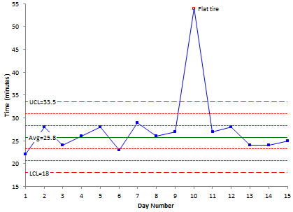
This process is essentially in statistical control. You found the reason for the out of control point and recalculated the control limits. The control chart now tells you the average of the process and the spread in the data. The average time it takes to get to work is 25.8 minutes. And as long as the process stays in control, that time will vary from about 18 minutes to 33.5 minutes – and it is all due to the normal variation in the process.
Thus, another purpose of a control chart is to estimate the process average. Another purpose is to estimate the variation (the spread in the histogram). It is important to remember that a calculated average or standard deviation has no meaning unless the process that generated it is in statistical control. The average for the first chart shown above with the special cause of variation was 27.7 minutes compared with an average of 25.8 without the special cause – about a 7% difference.
With the exception of the day when you got the flat tire, the process is in statistical control. You have a consistent and predictable process. Now you can ask yourself the following question:
“Is my process capable of doing what I want it to?”
With some processes, there are specifications and process capability (Cpk) values can be calculated to help judge whether the process is acceptable. With others, the objective may be to continuously reduce or improve a variable over time.
If you want to improve a variable that is in statistical control (e.g., reduce the time it takes to get to work), you must fundamentally change your process. That doesn’t mean re-training someone or telling them about their mistakes. It means fundamental change. In this simple example, it could be getting up earlier, driving faster, taking a different route or moving closer to work.
Suppose you decide to get up 30 minutes earlier and leave the house 30 minutes earlier to avoid some of the rush hour traffic. You do that for two weeks. The resulting control chart is shown below.
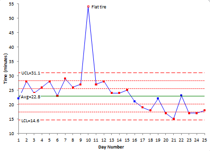
The control chart now shows a run below the average. It is obvious that leaving the house earlier has reduced the time it takes to get to work. The control limits may now be recalculated to reflect the new average and new variation in the data. The resulting control chart is shown below.
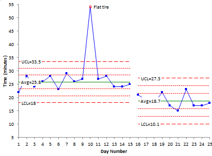
Another purpose of a control chart is to judge the impact of your process improvement efforts. In this example, the process changes worked, new control limits were calculated, and the process can be monitored into the future for the appearance of any special causes.
Note that not all special causes are “bad.” Suppose a point occurs below the lower control limit and your objective is to reduce the variable. This is a good thing, but it is still a special cause. Something happened that is not part of the normal process. If you can find out what happened and start doing it all the time, then the process will be improved.
Shouldn’t Control Charts be Used Everywhere?
Control charts are one of many statistical tools that can be used to aid in continuous process improvement. They are helpful in many types of processes. But not in all processes. You cannot really make a blanket statement that a control chart will always work here and never work there. However, there is almost always an advantage to plotting data over time to see what is happening.
The first question you must answer is: Why start a control chart? You should have some objective. Maybe you are working on a Six Sigma project and want to understand the type of variation you are dealing with. Maybe a customer requires it. Maybe you want to reduce a variable over time. Maybe you want to simply track a process for special causes. The key is to start with a purpose.
But, in the end, if a control chart is not helping you in a process, stop using it.
What Blog has the Misleading Information?
The blog I ran across was written by Eileen at this link. Again the website deals with the efforts to reduce healthcare-acquired infections in clinical settings – very worthwhile effort. I wish them many successes in their efforts. However, the blog was not written by someone who understands control charts, how they are used, or the information that is contained in this website. Just about every paragraph contained misleading information – and no data. If she had left this website out of it, I probably would not have responded. Here is the link to my response.
Thank you for a very informative, explanatory and practical use of SPC Newsletter. Regards, Didrik Strand.
This came to me via our contact us page:
What restraint on a professional/personal attack of
knowledge/experience via a “blogger”!
I commend you for your professional response.
The only thing better than offering some
training to them, would be to offer it to their competitor for the particular
processes this blogger says it can not be applied!
Dear Bill,
I liked the newsletter it fitted in with my own ideas of using SPC for nearly 30 years. I also like the ideas of Donald Wheeler of trying to get the name control chart changed to a process behaviour chart, and that the aim of the SPC is to collect data to see how the process behaves over time, it was a shame it was ever called a control chart, but we have to live with it.
Kevin Gardner
Thanks Kevin. I also like Dr. Wheeler's desire to change from control limits to process limits. It is a better description of what the chart does. I see you had a comment on their blog. They did not post my comment.
Bill
I commend you for your restaint, I now see a development on the old addage on Lies and statistics,
Lies, Damn lies and Statistics…..
There are now lies about statistics
Well done
Bill, thanks for sharing this. We need to do all we can to have control charts become a celebrated tool of management, not something to misuse and then abuse. My work is in performance measurement, and I find that control charts are fantastic to help managers see the true signals in their performance measures rather than reacting to every month-to-month difference (tampering). Don Wheeler’s book is fabulous, and XmR charts are really quite simple and perfect for most management performance measures. Loved your article, and intend to share it with my own subscribers. Smiles, Stacey Barr http://www.staceybarr.com
This is a really entertaining Article that you've put up there. I registered to your Page's RSS and hope you post more stuff that are equally perfect.
Cheers ..
This is really informative,helpful regarding the control charts newsletter . Thanks a lot Bill.
very helpful..
Great information and thanks for sharing!
This was a VERY helpful article. We have a Quality Assurance Officer, who is using Control Charts to do with our lab results. This makes it clearer what he is attempting to do with Control Charts. I would have asked him directly but he has a tendency to drone on at length. This just flat out made sense. Thank you for posting this!
1. If we stop using control chart cos it's not working to achieve purpose, what else (based on yoir exprrience) would you suggest one use? 2. Does Control chart falls in the space of causality or causal analysis than correlations or 'statistical' analysis? Thanks alot.
If for some reason a control chart does not help you, then don't use it – but at a mininum plot the data over time. Not clear on your second question but a control chart does not tell you a cause of anything – you have to find what causes out of control points. So, it is more statisitcal analysis l think.
Its reall y tremendous