April 2008 (Revised February 2016)
Note: This article was originally published in April 2008 and was updated in February 2016. The original article indicated that kurtosis was a measure of the flatness of the distribution – or peakedness. This is technically not correct (see below). Kurtosis is a measure of the combined weight of the tails relative to the rest of the distribution. This article has been revised to correct that misconception. New information on both skewness and kurtosis has also been added.
In this Issue
 You have a set of samples. Maybe you took 15 samples from a batch of finished product and measured those samples for density. Now you are armed with data you can analyze. And your software package has a feature that will generate the descriptive statistics for these data. You enter the data into your software package and run the descriptive statistics. You get a lot of numbers – the sample size, average, standard deviation, range, maximum, minimum and a host of other numbers. You spy two numbers: the skewness and kurtosis. What do these two statistics tell you about your sample?
This month’s publication covers the skewness and kurtosis statistics. These two statistics are called “shape” statistics, i.e., they describe the shape of the distribution. What do the skewness and kurtosis really represent? And do they help you understand your process any better? Are they useful statistics? Let’s take a look
You may download a pdf copy of this publication at this link. You may also download an Excel workbook containing the impact of sample size on skewness and kurtosis at the end of this publication. You may also leave a comment at the end of the publication.
Introduction
Skewness and kurtosis are two commonly listed values when you run a software’s descriptive statistics function. Many books say that these two statistics give you insights into the shape of the distribution.
Skewness is a measure of the symmetry in a distribution. A symmetrical dataset will have a skewness equal to 0. So, a normal distribution will have a skewness of 0. Skewness essentially measures the relative size of the two tails.
 Kurtosis is a measure of the combined sizes of the two tails. It measures the amount of probability in the tails. The value is often compared to the kurtosis of the normal distribution, which is equal to 3. If the kurtosis is greater than 3, then the dataset has heavier tails than a normal distribution (more in the tails). If the kurtosis is less than 3, then the dataset has lighter tails than a normal distribution (less in the tails). Careful here. Kurtosis is sometimes reported as “excess kurtosis.” Excess kurtosis is determined by subtracting 3 form the kurtosis. This makes the normal distribution kurtosis equal 0. Kurtosis originally was thought to measure the peakedness of a distribution. Though you will still see this as part of the definition in many places, this is a misconception.
Skewness and kurtosis involve the tails of the distribution. These are presented in more detail below.
Skewness
Skewness is usually described as a measure of a dataset’s symmetry – or lack of symmetry. A perfectly symmetrical data set will have a skewness of 0. The normal distribution has a skewness of 0.
The skewness is defined as (Advanced Topics in Statistical Process Control, Dr. Donald Wheeler, www.spcpress.com):
![]()
where n is the sample size, Xi is the ith X value, X is the average and s is the sample standard deviation. Note the exponent in the summation. It is “3”. The skewness is referred to as the “third standardized central moment for the probability model.”
Most software packages use a formula for the skewness that takes into account sample size:

This sample size formula is used here. It is also what Microsoft Excel uses. The difference between the two formula results becomes very small as the sample size increases.
Figure 1 is a symmetrical data set. It was created by generating a set of data from 65 to 135 in steps of 5 with the number of each value as shown in Figure 1. For example, there are 3 65’s, 6 70’s, 9 75’s, etc.
Figure 1: Symmetrical Dataset with Skewness = 0
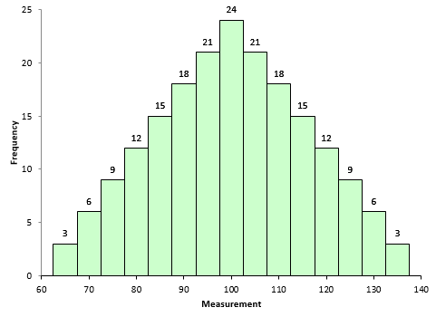
A truly symmetrical data set has a skewness equal to 0. It is easy to see why this is true from the skewness formula. Look at the term in the numerator after the summation sign. Each individual X value is subtracted from the average. So, if a set of data is truly symmetrical, for each point that is a distance “d” above the average, there will be a point that is a distance “-d” below the average.
Consider the value of 65 and value of 135. The average of the data in Figure 1 is 100. So, the following is true when X = 65:

For X = 135, the following is true:

So, the -4278 and +4278 even out at 0. So, a truly symmetrical data set will have a skewness of 0.
To explore positive and negative values of skewness, let’s define the following term:

So, Sabove can be viewed as the “size” of the deviations from average when Xi is above the average. Likewise, Sbelow can be viewed as the “size” of the deviations from average when Xi is below the average. Then, skewness becomes the following:

If Sabove is larger than Sbelow, then skewness will be positive. This typically means that the right-hand tail will be longer than the left-hand tail. Figure 2 is an example of this. The skewness for this dataset is 0.514. A positive skewness indicates that the size of the right-handed tail is larger than the left-handed tail.
Figure 2: Dataset with Positive Skewness
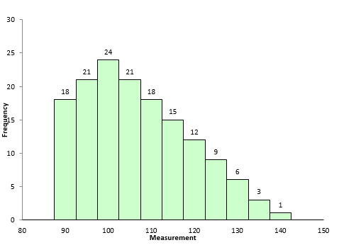
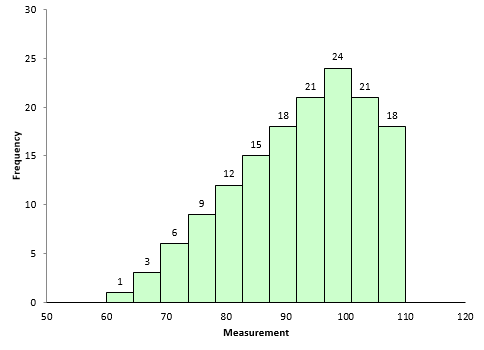
Figure 3 is an example of dataset with negative skewness. It is the mirror image essentially of Figure 2. The skewness is -0.514. In this case, Sbelow is larger than Sabove. The left-hand tail will typically be longer than the right-hand tail.
Figure 3: Dataset with Negative Skewness
So, when is the skewness too much? The rule of thumb seems to be:
- If the skewness is between -0.5 and 0.5, the data are fairly symmetrical
- If the skewness is between -1 and – 0.5 or between 0.5 and 1, the data are moderately skewed
- If the skewness is less than -1 or greater than 1, the data are highly skewed
Kurtosis
How to define kurtosis? This is really the reason this article was updated. If you search for definitions of kurtosis, you will see some definitions that includes the word “peakedness” or other similar terms. For example,
- “Kurtosis is the degree of peakedness of a distribution” – Wolfram MathWorld
- “We use kurtosis as a measure of peakedness (or flatness)” – Real Statistics Using Excel
You can find other definitions that include peakedness or flatness when you search the web. The problem is these definitions are not correct. Dr. Peter Westfall published an article that addresses why kurtosis does not measure peakedness (link to article). He said:
“Kurtosis tells you virtually nothing about the shape of the peak – its only unambiguous interpretation is in terms of tail extremity.”
Dr. Westfall includes numerous examples of why you cannot relate the peakedness of the distribution to the kurtosis.
Dr. Donald Wheeler also discussed this in his two-part series on skewness and kurtosis. He said:
 “Kurtosis was originally thought to be a measure the “peakedness” of a distribution. However, since the central portion of the distribution is virtually ignored by this parameter, kurtosis cannot be said to measure peakedness directly. While there is a correlation between peakedness and kurtosis, the relationship is an indirect and imperfect one at best.”
Dr. Wheeler defines kurtosis as:
“The kurtosis parameter is a measure of the combined weight of the tails relative to the rest of the distribution.”
So, kurtosis is all about the tails of the distribution – not the peakedness or flatness. It measures the tail-heaviness of the distribution.
Kurtosis is defined as:

where n is the sample size, Xi is the ith X value, X is the average and s is the sample standard deviation. Note the exponent in the summation. It is “4”. The kurtosis is referred to as the “fourth standardized central moment for the probability model.”
Here is where is gets a little tricky. If you use the above equation, the kurtosis for a normal distribution is 3. Most software packages (including Microsoft Excel) use the formula below.

This formula does two things. It takes into account the sample size and it subtracts 3 from the kurtosis. With this equation, the kurtosis of a normal distribution is 0. This is really the excess kurtosis, but most software packages refer to it as simply kurtosis. The last equation is used here. So, if a dataset has a positive kurtosis, it has more in the tails than the normal distribution. If a dataset has a negative kurtosis, it has less in the tails than the normal distribution.
Since the exponent in the above is 4, the term in the summation will always be positive – regardless of whether Xi is above or below the average. Xi values close to the average contribute very little to the kurtosis. The tail values of Xi contribute much more to the kurtosis.
Look back at Figures 2 and 3. They are essentially mirror images of each other. The skewness of these datasets is different: 0.514 and -0.514. But the kurtosis is the same. Both have a kurtosis of -0.527. This is because kurtosis looks at the combined size of the tails.
The kurtosis decreases as the tails become lighter. It increases as the tails become heavier. Figure 4 shows an extreme case. In this dataset, each value occurs 10 times. The values are 65 to 135 in increments of 5. The kurtosis of this dataset is -1.21. Since this value is less than 0, it is considered to be a “light-tailed” dataset. It has as much data in each tail as it does in the peak. Note that this is a symmetrical distribution, so the skewness is zero.
Figure 4: Negative Kurtosis Example
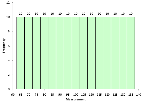
Figure 5 is shows a dataset with more weight in the tails. The kurtosis of this dataset is 1.86.
Figure 5: Positive Kurtosis Example
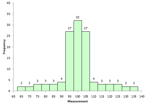
Most often, kurtosis is measured against the normal distribution. If the kurtosis is close to 0, then a normal distribution is often assumed. These are called mesokurtic distributions. If the kurtosis is less than zero, then the distribution is light tails and is called a platykurtic distribution. If the kurtosis is greater than zero, then the distribution has heavier tails and is called a leptokurtic distribution.
The problem with both skewness and kurtosis is the impact of sample size. This is described below.
Our Population
Are the skewness and kurtosis any value to you? You take a sample from your process and look at the calculated values for the skewness and kurtosis. What can you tell from these two results? To explore this, a data set of 5000 points was randomly generated. The goal was to have a mean of 100 and a standard deviation of 10. The random generation resulted in a data set with a mean of 99.95 and a standard deviation of 10.01. The histogram for these data is shown in Figure 6 and looks fairly bell-shaped.
Figure 6: Population Histogram
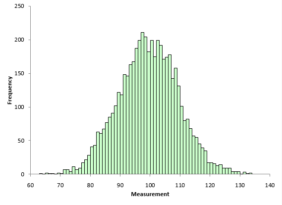
 The skewness of the data is 0.007. The kurtosis is 0.03. Both values are close to 0 as you would expect for a normal distribution. These two numbers represent the “true” value for the skewness and kurtosis since they were calculated from all the data. In real life, you don’t know the real skewness and kurtosis because you have to sample the process. This is where the problem begins for skewness and kurtosis. Sample size has a big impact on the results.
Impact of Sample Size on Skewness and Kurtosis
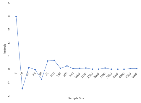
The 5,000-point dataset above was used to explore what happens to skewness and kurtosis based on sample size. For example, suppose we wanted to determine the skewness and kurtosis for a sample size of 5. 5 results were randomly selected from the data set above and the two statistics calculated. This was repeated for the sample sizes shown in Table 1.
Table 1: Impact of Sample Size on Skewness and Kurtosis
| Sample Size | Skewness | Kurtosis |
| 5 | 1.983 | 3.974 |
| 10 | -0.078 | -1.468 |
| 15 | -0.384 | 0.127 |
| 25 | -0.356 | -0.025 |
| 50 | -0.169 | -0.752 |
| 75 | -0.489 | 0.615 |
| 100 | -0.346 | 0.671 |
| 250 | 0.089 | 0.061 |
| 500 | 0.186 | 0.232 |
| 750 | -0.02 | 0.042 |
| 1000 | -0.138 | 0.062 |
| 1250 | 0.085 | 0.079 |
| 1500 | -0.017 | 0.001 |
| 2000 | -0.059 | -0.009 |
| 2500 | 0.037 | 0.096 |
| 3000 | 0.009 | 0.005 |
| 3500 | -0.015 | 0.004 |
| 4000 | -0.015 | -0.009 |
| 4500 | 0.009 | 0.036 |
| 5000 | 0.007 | 0.03 |
Notice how much different the results are when the sample size is small compared to the “true” skewness and kurtosis for the 5,000 results. For a sample size of 25, the skewness was -.356 compared to the true value of 0.007 while the kurtosis was -0.025. Both signs are opposite of the true values which would lead to wrong conclusions about the shape of the distribution. There appears to be a lot of variation in the results based on sample size.
Figure 7 shows how the skewness changes with sample size. Figure 8 is the same but for kurtosis.
Figure 7: Skewness versus Sample Size
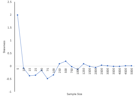
Figure 8: Kurtosis versus Sample Size
30 is a common number of samples used for process capability studies. A subgroup size of 30 was randomly selected from the data set. This was repeated 100 times. The skewness varied from -1.327 to 1.275 while the kurtosis varied from -1.12 to 2.978. What kind of decisions can you make about the shape of the distribution when the skewness and kurtosis vary so much? Essentially, no decisions.
Conclusions
The skewness and kurtosis statistics appear to be very dependent on the sample size. The table above shows the variation. In fact, even several hundred data points didn’t give very good estimates of the true kurtosis and skewness. Smaller sample sizes can give results that are very misleading. Dr Wheeler wrote in his book mentioned above:
“In short, skewness and kurtosis are practically worthless. Shewhart made this observation in his first book. The statistics for skewness and kurtosis simply do not provide any useful information beyond that already given by the measures of location and dispersion.”
Walter Shewhart was the “Father” of SPC. So, don’t put much emphasis on skewness and kurtosis values you may see. And remember, the more data you have, the better you can describe the shape of the distribution. But, in general, it appears there is little reason to pay much attention to skewness and kurtosis statistics. Just look at the histogram. It often gives you all the information you need.
To download the workbook containing the macro and results that generated the above tables, please click here.
Below is the e-mail Dr. Westfall sent concerning the describing kurtosis as a measure of peakedness. It is printed with his permission. It did lead to the re-writing of the article to remove the peakedness defintion of kurtosis.
Thank you for making your information publically available. I often point students to the internet for supplemental information, and some of your is valuable. However, your description of kurtosis as “essentially useless for SPC” misses the point by a wide mark.
Kurtosis has nothing to do with “peakedness”. It is a measure of outliers (special, rather than common causes of variation, in Deming’s terms), and a large part of spc is about identifying them and correcting the special causes when possible. Thus, if you see a large kurtosis statistic, you know you have a quality control problem that warrants further investigation.
Here is a simple explanation showing why kurtosis measures outliers and not “peakedness”.
Consider the following data set: 0, 3, 4, 1, 2, 3, 0, 2, 1, 3, 2, 0, 2, 2, 3, 2, 5, 2, 3, 1
Kurtosis is the expected value of the (z-values)^4. Here are the (z-values)^4: 6.51, 0.30, 5.33, 0.45, 0.00, 0.30, 6.51, 0.00, 0.45, 0.30, 0.00, 6.51, 0.00, 0.00, 0.30, 0.00, 27.90, 0.00, 0.30, 0.45
The average is 2.78, and that is an estimate of the kurtosis. (Subtract 3 if you want excess kurtosis.)
Now, replace the last data value with 999 so it becomes an outlier: 0, 3, 4, 1, 2, 3, 0, 2, 1, 3, 2, 0, 2, 2, 3, 2, 5, 2, 3, 999
Now, here are the (z-values)^4: 0.00, 0.00, 0.00, 0.00, 0.00, 0.00, 0.00, 0.00,0.00, 0.00, 0.00, 0.00, 0.00, 0.00, 0.00, 0.00, 0.00, 0.00, 0.00, 360.98
The average is 18.05, and that is an estimate of the kurtosis. (Subtract 3 if you want excess kurtosis.)
Clearly, only the outlier(s) matter. Nothing about the “peak” or the data near the middle matters. Further, it is clear that kurtosis has very positive implications for spc in its detection of outliers.
Here is a paper that elaborates: Westfall, P.H. (2014). Kurtosis as Peakedness, 1905 – 2014. R.I.P. The American Statistician, 68, 191–195.
May I suggest that you either modify or remove your description of kurtosis. It does a disservice to consumers and users of statistics, and ultimately harms your own business because it presents information that is completely off the mark as factual.
Many thanks,
Peter Westfall
Excellent way of explaining, and nice article to get information on the topic of my presentation topic, which i am going to deliver in institution of higher education.
I have many samples, let us say 500, with say 50 cases within each sample. I compute for each sample the skewness and kurtosis based on the 50 observations. In the scatter plot of the sample skewness and sample kurtosis (500 data points) I observe a curved cloud of data points between the skewness and kurtosis. When I used 500 simulated data sets with 50 simulated measurements generated according to an exponential distribution I again found the curved shaped cloud of scatterpoints. Theoretically, however, the skewness is equal to 2 and the kurtosis equal to 6. Can youn elaborate about this?My e-mail address is ………
A very informative and insightful article. But one small typo, I think. When defining the figure 3 (in the associated description) it was mentioned that “Figure 3 is an example of dataset with negative skewness. It is the mirror image essentially of Figure 2. The skewness is -0.514. In this case, Sbelow is larger than Sabove. The right-hand tail will typically be longer than the left-hand tail.”the bold part should be “The left-hand tail will typically be longer than the right-hand tail“. Please correct me if I am wrong. Thanks,Pavan
Thanks Pavan. You are correct. I fixed the typo.
Shouldn't kurtosis for normal distribution be 3?And skewness is 0…
Please see the equation for a4 above. It will give 3 for a normal distribution. But many software packages (including Excel) use the formula below that which subtracts 3 – and it gives 0 for a normal distribution.
Please, I need your help. I'm doing a project work on skewness and kurtosis and its applications. Could you please help me with some of the areas of applications of skewness and kurtosis and also the scope and delimitations undergone during the study. Thanks.
Hello Anita,
I am not sure what you are asking. You can find applications by searching the internet. For example, they are used by some stock traders to help determine when to sell or buy stocks. Please e-mail at bill@SPCforExcel.com if you need more.
1. Questions: What does the little i mean in the variable Xi2. Impressive: I thought the overall article was well-written and had good examples.3. Needs Improvement: It would be helpful to have simpler problems as a basis of each example and skew and kurtosis topic.
Thanks for the comment. The little i is simply denotes the ith result.
Your discription of figure 4 and 5 seem backward. In figure 4 the the far tails (m=60, m=140) have the same weight as the central region (m=100). Wouldn't that be heavy tailed? Likewise for figure 5, the tail region is short relative to the central region (i.e. light rather than heavy).
Heavy or light as to do with the tails. The uniform distribuiton in Figure 4 has no tails. It is "light" in tails. The other has long tails – so it is heavy in tails.
Maybe broad or tight would be better descriptors as heavy and light imply high and low frequency at least in my mind.
I would agree with those descriptors.
From figure 8, the kurtosis sees to somewhat converge to its 'true' value as the data points are increased. However, in my empirical tests, the kurtosis is simply increasing in the number of data points, going beyond the 'true' kurtosis as well. What could be the reason for this? I dont find it intuitive. Thanks.
n is the sample size. As it increases, the kurtosis will approach that of the normal distribution, 0 or 3 depending on what equation you use. How are you doing your empirical testing?
One small typo " there are 3 65’s, 6 65’s" for describing Figure 1. It should be " there are 3 65’s, 6 75’s".
Corrected. Thanks for letting me know.
good,thanks
Thanks for revising the information about kurtosis. There are still a couple of small issues that should be addressed, though. 1. The graph showing "high kurtosis" is misleading in the way that it presents "heavy tails". The graph actually looks similar to a .5*beta(.5,1) + .5(-beta(.5,1)) distribution, which has light tails (bounded between -1 and 1), negative excess kurtosis, but an infinite peak. For a better example, consider simulating data from a T(5) distribution and drawing the histogram. There, the positive kurtosis more correctly appears as the presence of occasional outliers. The "heavy tailedness" of kurtosis is actually hard to see in a histogram, because, despite the fact that the tails are heavy, they are still close to 0 and hence difficult to see. A better way to demonstrate the tailedness of high kurtosis is to use a normal q-q plot, which makes the heavy tails very easy to see. 2. The argument that the kurtosis is not a good estimate of the "population" (or "process") parameters is true, but not a compelling argument against using the statistic for quality control or SPC. A high kurtosis alerts you to the presence of outlier(s), commonly known as out-of-control conditions, possibily indicating special causes of variation at work. Of course, such cases should be followed up by a plot of some sort, but just the fact that the kurtosis indicates such a condition tells you that it is indeed useful and applicable for SPC. There is no need for the "population" framework here, as Deming would agree, considering that this is an analytic (not enumerative) study. So the argument that kurtosis is not useful for SPC is overstated at best, and not supportable at worst. Peter Westfall
A few posts above is a suggested correction to a typo in describing Figure 1 — ” there are 3 65’s, 6 75’s” — this actually introduced another typo. In my viewing of Figure 1, the correct description ought to be ” there are 3 65’s, 6 70’s and 9 75’s”.
Thanks for the correction of the correction! It has been changed.
Wouldn't a useful measurement be the rate at which kurtosis approaches 0? If kurtosis is a measurement highly dependent on sample size, we should measure to what degree the kurtosis of a population depends on sample size as a measurement of kurtosis itself.
Hello, isn't that what Figures 7 and 8 are doing? Taking different sample sizes from a population? Sample size has to be pretty large before the kurtosis value starts to level off
This is a useful article, but the conclusion seems strange. The skewness, say, of a sample says something about the distributrion of that sample. Whether it's valid for the population is a question that, yes, depends on sample size – but that's just as true of a histogram and, unlike a histogram, skewness can't be manipulated by bin widths, etc. Seems like you can play all day with histograms bin widths – but if your first take shows a distribution that is bunched roughly in the middle, why not use skewness and your rules of thumb to confirm that instead of teasing the histogram?
Thanks Tom. Agree you can change the look of a histogram by changing the bin widths, etc. The sample skewness does tell you about the sample – just not about the distribution it came from unless the sample size is large.
Can you help me with this, my lecturer ask me this question. ‘What can you tell about the skewness and kurtosis, of the weight and length of ikan selat in the lake?
Weight (g) = Skewness (1.038), Kurtosis (3.546)
Total length (cm) = Skewness (1.112), Kurtosis (3.725)
What do you think you can tell?
A very nice explanation. Thank you Dr. Bill McNeese.
what is the evaluation if the skewness is exactly 1 or 0.5?
Help! When I enter the frequency values from Figure 2 of this post and apply the SPC descriptive statistics function to those values, the resulting Skewness is -0.347, not 0.514. I get the same result using the Skew formula in Excel.
Likewise, when I enter the frequency values from Figure 3, I don’t get the same skewness result from either SPC or Excel’s skew formula, although the results are quite as radically different (-0.35 for me vs. -0.514 in your article above).
Even when I enter the values for the normal distribution in Figure 1, the skewness output isn’t quite 0.0, it’s 0.05, which is disconcerting.
I assume my approach is not correct, possibly because I’ve not used the correct input data. I’ve tried using calculated probability density functions and the Measurement*frequency results instead of the raw frequencies. Using the equations you described above didn’t help either. I’m starting to feel very stupid because the histograms are so clearly non-skewed, right-skewed and left-skewed. Is there some other value I should be using instead of the raw frequencies, the PDF results or the measurement*frequency?
FYI, I’m not a statistician, but I need a working understanding of this for some data analysis I’m doing for a homeless shelter. I’m having the same problem with the data distributions from that project. Quantitative information on the relative skewness of different parameters (e.g. age, health data, public assistance levels) would provide more value than histograms alone for making decisions about where the programs are working, where they’re not, what areas need adjustment, and how to prioritize the work.
You can’t enter the frequencies, you have to enter the individual values, like 18 values of 90. Please email me at bill@SPCforExcel.com if you want more help.
AHHHH, I see. I tried it and it worked! Thank you so much for that clear, concise explanation. You’ve put an end to many sleepless nights and countless person•weeks of flailing around.