January 2022
(Note: all the previous SPC Knowledge Base in the control chart examples category are listed on the right-hand side. Select this link for information on the SPC for Excel software.)

2021 Tied for 6th Warmest Year in Continued Trend, NASA Analysis Shows
The earth is warmer than it has been since global temperature data began to be collected in 1880. There is little doubt about that. The data are overwhelming. The last 7 years have been the warmest since 1880. This publication is an update on our previous articles on global warming and how control charts can be used to help gain insights into the warming process.
Is the earth still on an upward warming pattern? Well, yes and no. The last 7 years have been consistent and predictable, i.e., stable. During that time, the earth has not been getting warmer, but it has not been getting cooler either. Has the earth’s temperature plateaued? That would be great, but, unfortunately, as shown below, the pattern we are seeing has occurred multiple times – the earth’s temperature is stable for a period of years and then there is a sudden step change upward in the warming trend. These patterns are described in terms of control charts.
In this publication:
- NASA Article
- The Global Temperature Data
- Control Charts and Plotting Global Temperatures
- Past Global Temperature Publications
- Annual Global Temperature Deviations as a Control Chart
- A Closer Look Using the Monthly Global Temperature Deviations
- Summary
- Quick Links
You may download a pdf version of this publication at this link. Please feel free to leave a comment at the end of the publication.
NASA Article
The January 2022 NASA article starts off like this:
Earth’s global average surface temperature in 2021 tied with 2018 as the sixth warmest on record, according to independent analyses done by NASA and the National Oceanic and Atmospheric Administration (NOAA).
Continuing the planet’s long-term warming trend, global temperatures in 2021 were 1.5 degrees Fahrenheit (0.85 degrees Celsius) above the average for NASA’s baseline period, according to scientists at NASA’s Goddard Institute for Space Studies (GISS) in New York. NASA uses the period from 1951-1980 as a baseline to see how global temperature changes over time.
Collectively, the past eight years are the warmest years since modern recordkeeping began in 1880. This annual temperature data makes up the global temperature record – which tells scientists the planet is warming.
It is clear from the article that the data says the planet is warming. We take a closer look at the data below, in particular the last 7 years that are the warmest years recorded. The NASA article says the last 8 years are the warmest – which is true, but the first year, 2014, of those 8 years is part of a different pattern, as will be shown below.
The Global Temperature Data
The data used in all our publications about global warming were downloaded from the Goddard Institute for Space Studies (GISS) website at this link. GISS is part of NASA. The data are given as a deviation from the baseline period from 1951 – 1980. For example, the average global temperature deviation for 2021 is 0.85 °C. This means that 2021 was, on average, 0.85 °C higher than the baseline mean from 1951 to 1980. The raw data are given as the change in monthly deviations. The 12 months for the year are averaged to give the annual global temperature deviation. Table 1 shows the temperature deviations for each month in 2021.
Table 1: 2021 Monthly Temperature Deviations
| Month | Deviation | Month | Deviation | |
|---|---|---|---|---|
| Jan-21 | 0.82 | Jul-21 | 0.93 | |
| Feb-21 | 0.64 | Aug-21 | 0.82 | |
| Mar-21 | 0.89 | Sep-21 | 0.92 | |
| Apr-21 | 0.76 | Oct-21 | 1.00 | |
| May-21 | 0.79 | Nov-21 | 0.93 | |
| Jun-21 | 0.85 | Dec-21 | 0.86 |
The average of these 12 months is 0.85, which is reported then as the annual global temperature deviation. We will focus first on the annual deviations and then look at the monthly deviations.
You may download an Excel workbook of the data used at this link.
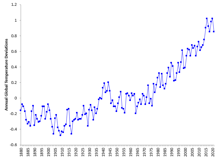
Figure 1 shows the annual global temperature deviations from 1880 to 2021 as run chart. Very clear that the temperature has been rising since the 1980’s.
Figure 1: Annual Global Temperature Deviations from 1880 to 2021
Control charts provide additional information to the run chart.
Control Charts and Plotting Global Temperatures
One purpose of a control chart is to determine if a process is in statistical control – if it is consistent and predictable over time. This is accomplished by plotting the data over time and adding the average and control limits. If there are no points beyond the control limits or patterns in the data, then the process is in statistical control – it is stable.
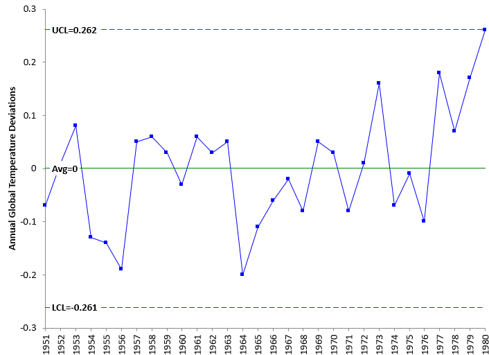
The baseline data used by NASA is from 1951 – 1980. It would be best if that period represented a stable period – one where the temperatures just varied normally and there were no special causes. Figure 2 shows the control chart for this time period. The individuals control chart (X-mR) is used to analyze the data in this publication. Only the X chart is shown though. All the control charts were produced using the SPC for Excel software.
Figure 2: Annual Global Temperature Deviations for Baseline Period 1951 – 1980
The annual global temperature deviations are plotted over time. The average is then calculated and added to the chart. In this chart, it is 0 as you would expect since the deviations are based on the average temperature from 1951 to 1980. The control limits are then calculated and added to the chart. For more information, please see our SPC Knowledge Base publication Individuals Control Charts.
The chart in Figure 2 is in statistical control. There are no points beyond the control limits and no patterns present like those in the zone tests. Please see our SPC Knowledge Base publication Control Chart Rules and Interpretation for more information.
The control chart can be used to help determine when a change in the annual global temperature deviation has occurred. This is what our previous publications on global warming did.
Past Global Temperature Publications
We have six previous publications on using control charts to analyze global temperature. These are briefly described below.
- SPC and Global Warming (December 2015): This publication used global temperature data referred to as dTs data. These are data based on the meteorological station data. This publication showed the periods where the global temperature was essentially stable. There were five such periods, each followed by a sudden increase in the global temperature. It also showed the trend that began in 1997. This trend was used to predict the global temperature for 2016.
- Trend Control Charts and Global Warming (January 2016): This publication expanded on how to use trend control charts and the calculations involved. Global warming data was used as the example.
- SPC and Global Warming Update (February 2017): This publication updated the results with the 2016 data. The data used in this analysis was the LOTI (land-ocean temperature index) data. The LOTI data are considered more accurate than the dTs data used in the first publication listed above. This is also where it was discovered that the historical data had changed somewhat since it was examined in 2015.
- SPC and Global Warming – 2017 Update (March 2018): This publication updated the results through 2017 data.
- Global Warming: A Trend or Step Changes? (June 2020): This publication focused on if it was better to use a trend control chart for the period since 1997 or to use a series of step changes in the process.
- SPC and Global Warming: 1880 – 2020 (January 2021): This publication was similar to our first one. The control charts were updated to reflect using the LOTI data instead of the dTs data. There are differences between the two datasets, and it does not appear that GISS uses the dTs data anymore. It might surprise you that, over the time span from 1880 to 2020, there have only been stable periods. The first five stable periods had consistent, predictable temperatures. The last period has also been consistent – except the global temperature is trending up in a fairly predictable pattern.
Annual Global Temperature Deviations as a Control Chart
Our last publication showed the patterns in the annual global temperature deviations. The chart, with 2021 added, is shown in Figure 3.
Figure 3: Annual Global Temperature Deviations from 1880 to 2021
This control chart splits the control limits at various places with each segment meant to represent a period where the temperature was not changing significantly. There have been 5 periods of “stable” temperature deviations:
- 1880 – 1902 with an average of -0.21
- 1903 – 1913 with an average of -0.38
- 1914 – 1936 with an average of -0.02
- 1937 – 1976 with an average of -0.02
- 1977 – 1986 with an average of 0.19
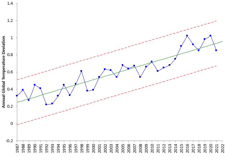
The time period since 1987 is also stable, but the stability is around a trend. Since 1987, the temperature deviation has been increasing at a rate of about 0.02 degrees per year. This is shown in Figure 4 using a trend control chart.
Figure 4: Annual Global Temperature Deviations Trend from 1987 – 2021
The center line is the best fit linear equation and is given by:
Annual Global Temperature Deviation = -39.85345 + 0.02018(Year)
You can use this equation to predict the value for this year:
Annual Global Temperature Deviation = -39.85345 + 0.02018(2022) = 0.95
This analysis then predicts that the average global temperature for 2022 will be 0.95 °C above the baseline.
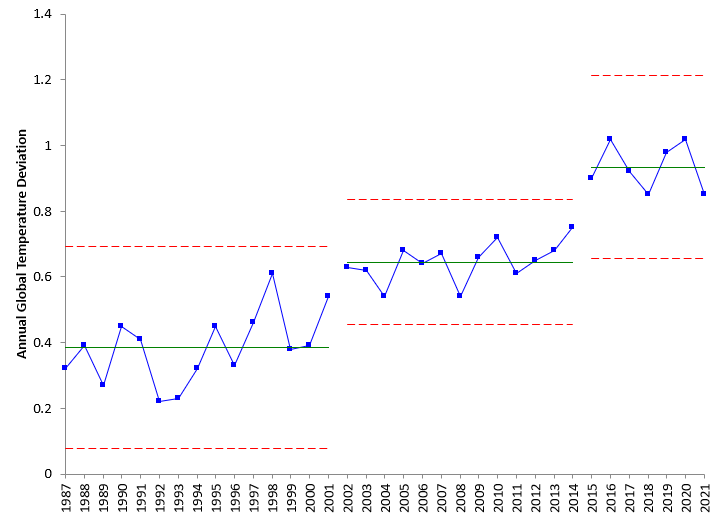
Take a closer look at Figure 4. What can you say about the last 7 years? Is the temperature increasing over these 7 years? It does not look like it. It looks like it has leveled off. But this pattern has shown up before. You can take the data in Figure 4 and not treat it as a trend chart but instead look for areas where the temperatures are not increasing but are the same – like the periods before 1987 in Figure 3. Figure 5 shows the data in Figure 4 but without the trend.
Figure 5: Annual Global Temperature Deviations from 1987 – 2021
Figure 5 shows that the trend could be interpreted as three step changes. It is clear from the chart that the last 7 years represent a step change up in the temperature and represents a period where the temperature is not getting hotter or cooler. But this has happened before, where there is a period of “constant” temperature followed by a step-change up. The previous period was from 2002 – 2014, which represents 13 years. Based on the chart, there is no reason to believe this kind of pattern won’t repeat itself – there will be a few more years in the range 0.85 to 1 and then another step change upward. This will continue unless the chart shows a shift downward in the data – over a period of several years. These three stable periods are given by:
- 1987 – 2001 with an average of 0.38
- 2002 – 2014 with an average of 0.75
- 2015 – 2021 with an average of 0.93
A Closer Look Using the Monthly Global Temperature Deviations
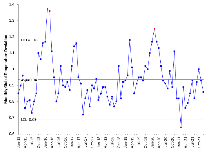
The analysis above uses the average of the monthly global temperature deviations each year. What if we used a control chart with the monthly global temperature deviations each year? That data are available in the link above. The control chart for the data over the last seven-year period is shown in the figure below.
Figure 6: Monthly Global Temperature Deviations from 2015 – 2021
The monthly deviations bounce around more than the annual numbers, as expected. There are a few points beyond the limits, plus some runs below and above the average. But there is no indication of an upward trend in the monthly data – even if the monthly data is not “in control.”
Summary
This publication continued our look at global warming by including the 2021 data. The model from our previous publication had predicted an annual global temperature deviation in 2021 of 0.948. The actual number was 0.85. The previous publication used a trend control chart for the data from 1987 through 2020. The new data for 2021 shows that the global deviations over the past 7 years are stable – the global temperature is not getting hotter or cooler. It also showed that this pattern has existed before. There is a period where the temperature is stable – not significantly changing – and then there is a step change upward. The chart shows no reason to believe that this pattern will not continue over time – at least for now. The two patterns before the last 7 years lasted 15 and 13 years – so it may be a awhile before we seen the next upswing in warming.

Well done! I love reading these posts. I've learned so much of the I know about SPC from these. Would love to know more about suspected causes of the shifts between the different stable regions, but that might be out of scope here; leave it to the SMEs.
Thanks for the feedback Zac!
Very good analysis. But, how do we know reasonable warming is not good? The warming is occurring in the temperate and cold zones. These areas are all just trying to achieve a uniform temperature since the last ice age. As the atmosphere warms it hold much more water; which dampens temperature extremes; which in turn should reduce bad weather events; a cooling atmosphere squeezes the water out and the air becomes dryer and much greater temperature gradient development thus making storms worse. The northern hemisphere has greened remarkably over the last 20 years and the same thing would have happened in the southern hemisphere if they had cheap fossil fuel and didn’t have to burn the trees and brush for an energy source. The argument is not is the earth warming slightly, the question is whether it is bad or not?
Thanks for the comment. My analysis, on purpose, was simply that the earth is warming up. I will leave to others to define why that is happening and if it is good or bad.