April 2006
In this issue:
- The Control Chart Selection Flow Chart
- Attributes or Variables Data?
- Variables Data
- Attributes Data
- Quick Links
Ever had problems deciding what type of control chart to use in a given situation? Selecting the right control chart is often a challenge. The procedure below shows how to select the right chart for the right situation. The control charts included are four attributes control charts (p, np, c, and u) and three variables control charts (Xbar-R, Xbar-s, and X- mR).
The information below is based on the book Building Continual Improvement by Dr. Don Wheeler and Sheila Poling. You can find this book and much more at Dr. Wheeler’s website: www.spcpress.com. Just be sure you come back here!
The Control Chart Selection Flow Chart
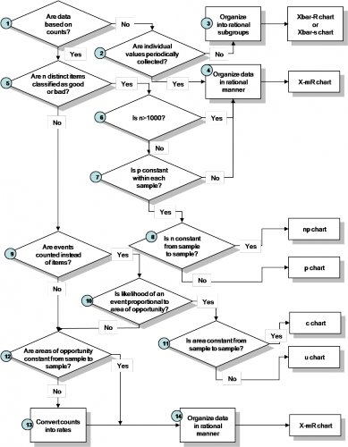
The flow chart shown above leads you through the steps in determining what control chart to use. It is a slightly refined version of that given in the book Building Continual Improvement by Dr. Don Wheeler and Sheila Poling.
Dr. Wheeler challenges some of the conventional thought on when to use certain control charts. You can best sum up this approach as “when in doubt, use the individuals control chart (X-mR).” The numbered steps in the flow diagram are described in the sections below.
Attributes or Variables Data?
Step 1: Are data based on counts?
This is the first step. Data based on counts are often called attributes data. There are two types of attributes data: yes/no and counting type data. With yes/no type data, you are examining distinct items (such as invoices, deliveries, or phone calls). With counting type data, you are usually examining an area where a defect has an opportunity to occur. Both types of data are explained below.
Yes/No Data: For each item, there are only two possible outcomes: either it passes or it fails some preset specification. Each item inspected is either defective (i.e., it does not meet the specifications) or is not defective (i.e., it meets specifications). Examples of the yes/no data are phone answered/not answered, product in spec/not in spec, shipment on-time/not on-time and invoice correct/incorrect.
The conventional thought has been if you have yes/no data, you will use either a p or np control chart to examine the variation in the fraction of items not meeting a preset specification in a group of items. You would use a p control chart if the subgroup size (the number of items examined in a given time period) changes over time. You would use the np control chart if the subgroup size stays the same.
Counting Data: With counting data, you count the number of defects. A defect occurs when something does not meet a preset specification. It does not mean that the item itself is defective. For example, a television set can have a scratched cabinet (a defect) but still work properly. When looking at counting data, you end up with whole numbers such as 0, 1, 2, 3; you can’t have half of a count.
The conventional thought has been if you have counting data, you would use a c chart or a u chart. The c chart would be used if the area stayed constant from sample to sample; the u chart would be used if the area did not stay constant. Again, the flow chart above shows that this is not always the case.
If you don’t have data based on counts, you have variables data. Variables data are taken from a continuum and are often referred to as continuous. Variables data can, theoretically, be measured to any precision you like. Examples of variables data include time, length, width, density, dollars, and height.
Variables Data
 Step 2: Are individual values periodically collected?
You have decided that you have variables data at this point. Next, you are being asked how much data you have and how frequently you take the data. Do you have one value to represent the time period or do you have multiple values to represent one time period? For example, you might collect data on the percentage of phone calls answered within three rings each day. In this case, you have one value to represent the day. Or you might select five parts from your production process each hour and measure a critical dimension. In this case, you have multiple values to represent one hour.
If you have multiple values at one time, go to step 3. If you one value at one time, go to step 4.
Step 3: Organize into rational subgroups and use either the Xbar-R chart or the Xbar-s chart.
You have decided that you have multiple values to represent the situation at one time. Rational subgrouping is a primary topic in the study of sampling procedures. You want to take data to get the most information possible. Samples should be selected in a way that explores the variation of interest to you. The variation of interest might be shift-to-shift, day-to-day, hour-to-hour, batch-to- batch, etc. One possible way of looking at control charts is that they are a statistical test to determine if the variation from subgroup to subgroup is consistent with the average variation within the subgroups. A basic principle is to choose the subgroups in a way that will give the maximum chance for the measurements in each subgroup to be alike and the maximum chance for the subgroups to be different. The subgroups should have internal homogeneity.
It is a matter of choice if you use Xbar-R or the Xbar-s chart. If the subgroup size is large (>=9), use the Xbar-s chart.
For more information on rational subgrouping, please see our May 2005 and June 2005 articles on rational subgrouping (click here).
Step 4: Organize the data in a rational manner and use the X-mR
You have individual values which were collected periodically. You want to organize the data in a way that explores the variation you are interested in. For example, if you want to explore the variation in daily sales, you would collect the data on daily sales. The X-mR chart would reflect the variation in daily sales. You might want to collect data on weekly sales. In this case, you would be examining the variation in weekly sales. The X-mR chart is the chart of choice when you have only one value to represent the situation at a given time.
Attributes Data
 Step 5: Are n distinct items classified as good or bad?
You have decided that you have data based on counts at this point. Now you are deciding if you have yes/no data as described in step 1. In other words, are you looking at n distinct items in a given time period and deciding if each distinct item is good or bad? For example, you might be looking at the number of deliveries each week (n) and deciding if each was on time or not on time. This means that you are looking at n distinct items and classifying them as good or bad. In this case, you would answer the step 5 question as “Yes.”
If you have yes/no data (meaning you answered the step 5 question as “Yes”), then go to step 6. If you have counting data (meaning you answered the step 5 question as “No”), then go to step 9.
Step 6: Is n>1000?
You have decided that you have yes/no data at this point. You are looking at n distinct items over a given time frame and classifying them as good or bad. The question now is how many you are looking at over a given time period. For example, you might be looking at all the deliveries in a given week (n, the subgroup size) and determining if each is on time or not. You might be looking at the number of invoices each week (n, the subgroup size) and determining if each is correct or not.
If n is greater than 1000, go to step 4 and use the X-mR chart. If n is not greater than 1000, go to step 7.
Step 7: Is p constant within each sample?
p is the probability that a single item meets the preset specification (for example, on-time delivery). This value must be constant for each of the n items. Note that is OFTEN not the case. For example, for on-time deliveries, the value of p is probably not constant for each item. If you ship a product next day air, the probability of that product being on time (arriving the next day) is most likely different from that of the rest of your shipments.
If p is constant within each sample, go to step 8. If not, go to step 4 and use the X-mR chart.
Step 8: Is n constant from sample to sample?
If the subgroup size is constant from sample to sample, this means that you are examining the same number of items each time period. For example, you might be monitoring the fraction of invoices that are correct. If you take a random sample of 100 invoices each week, then the subgroup size is constant from sample to sample. If you look at all invoices each week, the number will not be the same and the subgroup size is not constant.
If n is constant from sample to sample, you may use the np chart. If n is not constant from sample to sample, you may use the p chart.
Step 9: Are events counted instead of items?
You have decided that you have counting data. Are you counting events or items? An event could be a lost time accident. An item could be a surface imperfection on a plastic bottle.
If you are counting events, go to step 10. If you are counting items or aren’t sure, go to step 12.
Step 10: Is the likelihood of an event proportional to the area of opportunity?
This means that the likelihood of an event is not affected by which portion of the product or area is selected as the area of opportunity. For example, suppose you are measuring the number of lost-time accidents in a plant. It would be incorrect to include two plants of different sizes in the data. The likelihood of a lost-time accident occurring may not be proportional to the size of the plant – particularly if they make significantly different products.
If the likelihood of an event if not proportional, go to step 12. If it is proportional, go to Step 11.
Step 11: Is the area constant from sample to sample?
An example of area that is constant from sample to sample is monitoring the number of lost time accidents in a plant monthly. The area, the plant, is the same from month to month (assuming no major changes at the plant). Suppose you monitoring, monthly, the number of days associates spend in the hospital by dividing that by the number of total days worked. Since the total number of days worked varies from month to month, the area is not constant.
If the area is constant, you may use a c chart. If the area is not constant, you may use a u chart.
Step 12: Are the areas of opportunity constant from sample to sample?
This is essentially step 11 repeated. If the area is not constant, go to step 13. If the area is constant, go to step 14.
Step 13: Convert Counts to Rates
Convert the counts to rates and go to step 14. For example, if you are monitoring lost time accidents and they rarely happen, you get to a point where the control limits on a c control chart are no longer valid. You can convert the data to a rate, e.g., days between accidents, and use the X-mR chart.
Go to step 14.
Step 14: Organize the data in a rational manner and use the X-mR chart
See step 4