November 2022
(Note: all the previous SPC Knowledge Base in the control chart basics category are listed on the right-hand side. Select this link for information on the SPC for Excel software.)
Control charts are used to monitor processes over time, looking for changes that may occur. These process changes are often detected by certain criteria (out of control tests such as points beyond the control limits) that have been developed over the years. There are more out of control tests than you probably realize. And if you use them all, you will probably be seeing a lot of out of control signals from your control chart. What are the “common” out of control tests that are used? Of these, which should you be using? Which should be on your “A” list of out of control tests? This publication addresses these questions.
The criteria and guidelines for what out of control tests to use are given below. In reviewing the literature and our past articles on out of control tests, I ran across an out of control test that is not mentioned very often. Dr. Donald Wheeler has written extensively about statistical process control. In his book Advanced Topics in Statistical Process Control, there is a section on the tests that can be used to determine if a process is out of statistical control. Hidden in that section is an out of control test that is rarely mentioned. And it should be well known because it definitely belongs on your “A” list for out of control tests.
In this publication:
- Control Chart Review
- In Control Process
- Out of Control Tests
- Patterns: The Pattern Detection Guideline
- Summary: The “A” List
- Quick Links
Please feel free to leave a comment at the bottom of this publication. You can download a pdf copy at this link.
Control Chart Review
A control chart is a picture of your process over time. One major use of a control chart is to determine when a process change has occurred. To determine this, you plot your data over time. After you have enough data, you calculate the average and control limits and add them to the chart. Then you interpret the chart.
If there are no points beyond the control limits and no patterns in the data, the process is in statistical control. This means that there is only common causes of variation present in the process. This is the natural or normal variation in the process. If there are any points beyond the control limits or patterns in the data, the process is said to be out of statistical control. This means there are special causes of variation present. Special causes are not part of the process and not supposed to be there.
The out of control tests help you determine if the process is in statistical control or not. You will see that these tests focus on two areas: one is a change in the process represented by the control chart. The other area is the setup of the chart – problems with subgrouping or how the process is sampled.
In Control Process
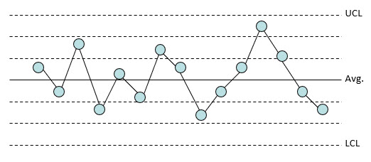
To effectively use control charts, one must be able to interpret the control chart. What is this control chart telling me about my process? Is this picture telling me that everything is all right and I can relax? Is this picture telling me that something is wrong, and I should get up and find out what has happened? The chart below is an example of a stable (in statistical control) process.
Figure 1: In Control Process
This pattern is typical of processes that are stable. Four characteristics of a process that is in statistical control are:
- Most points are near the average
- A few points are near the control limits
- No points are beyond the control limits
- No patterns in the data such as eight consecutive points below the average
If a control chart does not look similar to the one above, there is probably a special cause present. Various tests for determining if a special cause is present are given below.
Out of Control Tests
There are many out of control tests. We have covered 8 in previous publications. And there are more than just those 8. We will start with reviewing these 8. For more detailed information, please see the three articles in our SPC Knowledge Base on interpreting control charts:
Interpreting Control Charts (April 2004): Introduces the 8 out of control tests
Control Chart Rules and Interpretation (March 2016): Describes possible process reasons for the out of control situation
Applying the Out of Control Tests (January 2017): Shows which out of control test applies to which chart
We also have a brief video on interpreting control charts at this link.
The 8 control chart rules listed in Table 1 give you indications that there are special causes of variation present. These out of control tests come from the Western Electric Statistical Quality Control Handbook (1956) for the most part. The first four are called the Western Electric Zone Tests.
Table 1: Control Chart Rules
| Rule | Rule Name | Pattern |
|---|---|---|
| 1 | Beyond Limits | One or more points beyond the control limits |
| 2 | Zone A | 2 out of 3 consecutive points in Zone A or beyond |
| 3 | Zone B | 4 out of 5 consecutive points in Zone B or beyond |
| 4 | Zone C | 7 to 10 or more consecutive points on one side of the average (in Zone C or beyond) |
| 5 | Trend | 7 consecutive points trending up or trending down |
| 6 | Mixture | 8 consecutive points with no points in Zone C |
| 7 | Stratification | 15 consecutive points in Zone C |
| 8 | Overcontrol | 14 consecutive points alternating up and down |
Missing from this list is the out of control test mentioned by Dr. Wheeler in his book. This will be covered below. First, however, the 8 rules are reviewed, and a decision made if the rule should be on your “A” list for out of control tests.
Rule 1: Points Beyond the Control Limits
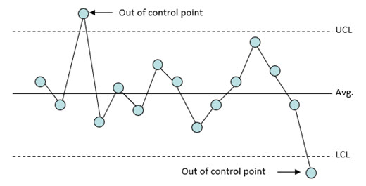
A special cause is present in the process if any points fall above the upper control limit or below the lower control limit as shown in Figure 2.
Figure 2: Points Beyond the Control Limits
Action should be taken to find the special cause and remove it from the process.
Quite often, this is the only test for out of control that you need. Most of the time you are not really interested in small process changes. You are interested in large process changes. All processes will exhibit out of control points from time to time. If you have a lot, then you don’t need to include any other test for out of control.
Rule 1, points beyond the control limits, is definitely on the “A” list of tests to use.
Zones Tests
Rules 2 to 4 in Table 1 are what is called “the zone tests.” These tests are designed to detect small shifts quickly. Again, it is not often that you are that concerned with small shifts. You are more concerned with large shifts that will be covered by points beyond the control limits.
However, there are times, such as monitoring test methods, where you are concerned about the smaller shifts.
The first step in using these tests is to divide the control chart into zones. So, life has just become more complicated. Instead of just looking at the upper and lower control limits for points beyond the control limits, we are having to divide a chart into zones.
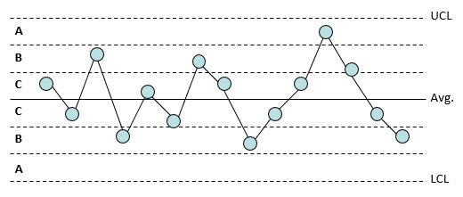
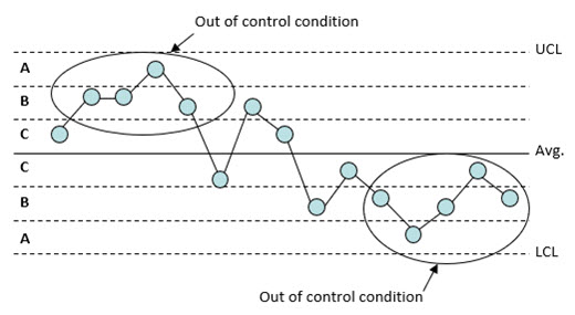
Dividing the chart into zones is done by dividing the area between the average and the upper control limit into three equally spaced areas. This is then repeated for the area between the average and the lower control limit. This is shown in Figure 3.
Figure 3: Dividing a Control Chart into Zones
The zones are called zones A, B, and C. There is a zone A for the top half of the chart and a zone A for the bottom half of the chart. The same is true for zones B and C. Control charts are based on 3 sigma limits of the variable being plotted. Thus, each zone is one standard deviation in width. For example, considering the top half of the chart, zone C is the region from the average to the average plus one standard deviation. Zone B is the region between the average plus one standard deviation and the average plus two standard deviations. Zone A is the region between the average plus two standard deviations and the average plus three standard deviations.
Rule 2: Test for Zone A
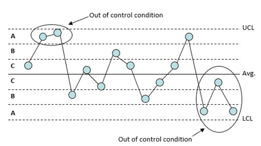
A special cause exists if two out of three consecutive points fall in zone A or beyond as is shown in Figure 4. The test is applied for the zone A above the average and then for the zone A below the average.
Figure 4: Test for Zone A
This test, like the tests for Zone B and Zone C below, is applied to both halves of the chart. However, only one half is considered at a time. For example, if one point falls in the zone A above the average and the next point falls in zone A below the average, this is not two out of three consecutive points in zone A or beyond. The two points in zone A must be on the same side of the average.
To use this test, you do have to add the two-sigma line to the control chart. So, it may not be the best test to use. It does not make the “A” list, unless you are very concerned about small shifts in the process average.
Rule 3: Test for Zone B
A special cause exists if four out of five consecutive points fall in zone B or beyond as is shown in Figure 5.
Figure 5: Test for Zone B
This test is applied for zone B above the average and then for zone B below the average. Like the test for Zone A, you need to calculate an additional line, in this case, the one-sigma line. It might not be the best test to use, so it is not on the “A” list unless you really concerned about those small shifts in the average.
Rule 4: Test for Zone C
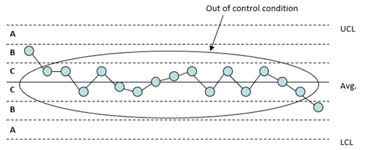
A special cause exists if eight to ten consecutive points fall in zone C or beyond as is shown in Figure 6.
Figure 6: Test for Zone C
Figure 6 shows 8 points in a row. You might ask why the range is from eight to ten consecutive points. Years ago, when I first was trained in SPC, I was taught seven in a row was the correct number for this test. I used this for a long time. It comes from Eugene Grant’s book Statistical Quality Control (1946). Most now believe that seven is not a good number to use for this test – it leads to too many false signals. You can pick what you want to use. Most people appear to use eight consecutive points now.
The test should be applied for the zone C above the average and then for the zone C below the average.
Note that this test does not require any additional lines, like the tests for Zones A and B. It is easy to understand runs above and below the center line. Rule 4, eight consecutive points above or below the average, is definitely a candidate for the “A” list of out of control tests to use.
Rule 5: Test for Trends
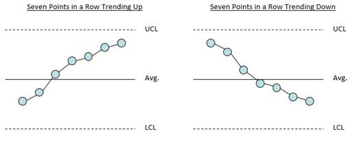
A special cause exists if there are seven points in a row trending up or trending down as shown in Figure 7. Six points is also used sometimes instead of 7.
Figure 7: Trend Out of Control Situation
There are no additional lines besides the control limits for this test. You may be inclined to add it to the “A” list. But there are some issues. An upward trend often does not have one point after the other. There may be a general upward or downward trend. So, this test would not pick that up. What test does pick up that type of trend then? No test does, but you do, by looking at the chart. Another issue is that data can be highly autocorrelated. The test picks this up but does so incorrectly. It is not a special cause of variation.
Rule 6: Test for Mixtures
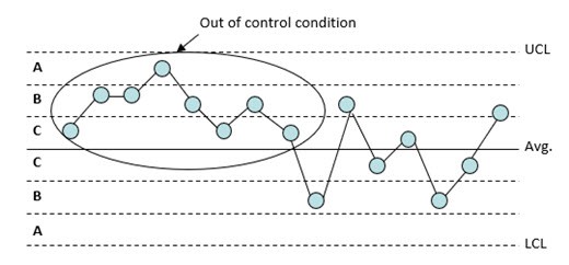
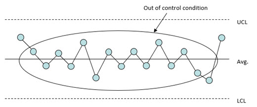
A mixture exists when there is more than one process present but sampling is done for each process separately. For example, suppose you take three samples per shift and form a subgroup based on these three samples. If different shifts are operating at different averages, a mixture can occur. A mixture (a special cause) is present if eight or more consecutive points lie on both sides of the average with none of the points in zone C as is shown in Figure 8.
Figure 8: Test for Mixtures
This test is applied to the entire chart. This test does have additional lines like the tests for zones A and B. So, should it be on the “A” list of out of control tests to use? No, it should not be included on the “A” list. This out of control situation should show up as you first put the control chart together. If it does, find out why the averages are different and correct the problem. Or, start a different control chart for each process.
Of course, there could be the situation where one of the processes significantly changes, and the pattern emerges. One of the zone tests will probably be violated before the mixture test does. It doesn’t make the “A” list.
Rule 7: Test for Stratification
Stratification occurs if two or more processes are being sampled systematically. For example, stratification can occur if samples are taken once a shift and a subgroup size of 3 is formed based on the results from three shifts. It is possible that the shifts are operating at a different average or variability. Stratification (a special cause) exists if fifteen or more consecutive points fall in zone C either above or below the average as shown in Figure 9.
Figure 9: Test for Stratification
Note that the points tend to hug the centerline. This test involves the use of the zones but is applied to the entire chart and not one-half of the chart at a time. If stratification is occurring, a histogram of the individual measurements will probably be bimodal.
This test does have additional lines like zones A and B. Should it be on our “A” list? Like the mixture test, this test provides the most help as you first put the control chart together. If stratification shows up when you first start the control chart, find the reasons for the differences in averages and correct them. Or, use a different control chart for each process. The stratification test does not belong on the “A” list.
Rule 8: Test for Overcontrol
A special cause of variation is present if 14 consecutive points alternate up and down as shown in Figure 10.
Figure 10: Test for Overcontrol
This pattern is typical of over adjusting the process. This is often called “tampering” with the process. Adjusting a process that is in statistical control actually increases the process variation. For example, an operator is trying to hit a certain value. If the result is above that value, the operator makes an adjustment to lower the value. If the result is below that value, the operator makes an adjustment to raise the value. This results in a saw-tooth pattern.
This out of control test does not require additional lines like zones A and B. Should it be on the “A” list? By itself it should not. But if you look back at the out of control tests for mixtures, stratification and overcontrol, you see there are patterns that repeat. This leads to a rule that isn’t typically used for control charts.
Patterns: The Pattern Detection Guideline
Earlier, it was stated that a process was in statistical control if there were no points beyond the control limits and there were no patterns. Patterns are not random. Several of the out of control tests are really patterns that repeat:
- Rule 4: Eight consecutive points in a row above or below the average
- Mixture: Eight or more consecutive points lie on both sides of the average with none of the points in zone C
- Overcontrol: Fourteen or more consecutive points alternating up and down
This leads to the Pattern Detection Guideline from Dr. Wheeler:
“An explanation should be sought anytime a pattern repeats itself eight times in succession.”
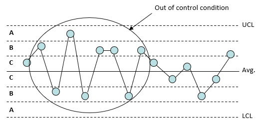
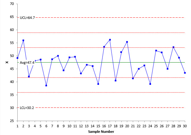
And this rule does belong on the “A” list. What this rule requires is for you to look at the control chart and look for patterns in the data. Patterns will not always be detected by the out of control tests. An example is shown in Figure 11.
Figure 11: Pattern Detection
The chart in Figure 11 does not indicate there is a special cause of variation. None of the tests indicate that the process is out of control. But is there an issue? Yes, there is. There is a repeating pattern. Two high points followed by one low point. The process is not random and therefore not in statistical control. There is a special cause of variation causing the pattern. The challenge is to find it.
Summary: The “A” List
What tests make the “A” list of out of control tests to use. There are three:
- Rule 1: Points beyond the control limits
- Rule 4: Eight consecutive points above or below the average
- Pattern Detection Guideline: Anytime a pattern repeats itself eight times in succession
If small shifts are very important to you, then you can add Rules 2 (Zone A) and 3 (Zone B).
And there is one more rule you can use: your knowledge of the process. If the control chart on your process looks “funny” to you, investigate it.
