March 2022
(Note: all the previous SPC Knowledge Base in the variable control chart category are listed on the right-hand side. Select this link for information on the SPC for Excel software.)
Over the years, the use of individuals control charts has increased, particularly in non-manufacturing situations. In fact, there are those who say there is no reason to learn any other chart – saying you can use the individuals control chart anywhere.
The individuals control chart is empirical, and the empirical approach is always right. Is that true? Is the only control chart we need to know the individuals? In many cases, yes, but not all cases. And there are some other things you need to remember when using the individuals control chart.
The individuals control chart is often denoted by X-mR or I-mR, where mR stands for the moving range. In this publication, we will examine the X-mR chart and answer 10 questions about this chart. In this issue:
- How do you construct a X-mR chart?
- When should a X-mR chart be used?
- Does data have to be normally distributed to use a X-mR chart?
- Is the time between points important for a X-mR chart?
- Do you need to think about rational subgrouping with a X-mR chart?
- Do X-mR charts work with rare events data?
- Do X-mR charts work with chunky data?
- Do X-mR charts give false signals?
- Can you use the X-mR chart with data that are counts?
- Can you use the X-mR chart with data with varying large subgroup size?
- Summary
- Quick links
Please feel free to leave a comment at the end of the publication. You can download a pdf copy of this publication at this link.
We will start with the basics of how to construct a X-mR chart.
How Do You Construct a X-mR Chart?
The X-mR chart monitors individual values (X) over time. The individual values are plotted on the X chart. The moving range between consecutive individual values are plotted on the mR chart. Suppose we take a sample once an hour from a process and measure it for some quality characteristic. The results for the last 30 hours are shown in Table 1.
Table 1: Process Data
| Sample | X | Sample | X | |
|---|---|---|---|---|
| 1 | 93.4 | 16 | 101.7 | |
| 2 | 101.8 | 17 | 94.7 | |
| 3 | 97.1 | 18 | 96.8 | |
| 4 | 91.8 | 19 | 111.4 | |
| 5 | 99.4 | 20 | 103.7 | |
| 6 | 104.5 | 21 | 102.4 | |
| 7 | 95.9 | 22 | 99.5 | |
| 8 | 95.8 | 23 | 109.6 | |
| 9 | 86.6 | 24 | 107.5 | |
| 10 | 88.2 | 25 | 92.0 | |
| 11 | 103.7 | 26 | 103.4 | |
| 12 | 85.4 | 27 | 87.4 | |
| 13 | 95.2 | 28 | 92.2 | |
| 14 | 102.3 | 29 | 89.3 | |
| 15 | 92.7 | 30 | 96.6 |
The first moving range value is the range between samples 1 and 2:
First Moving Range: |93.4 – 101.8| = 8.4
The overall average (X) and the average moving range (R) are then calculated using the following formulas:
X= SX/k
R= SR/(k-1)
where k = the number of samples. Now you can calculate the upper control limit (UCLx) and lower control limit (LCLx) for the X chart as follows:
UCLx =X + 2.66R
LCLx =X – 2.66R
The upper control limit (UCLr) for the moving range chart can then be calculated.
UCLr = 3.268R
The 2.66 and 3.268 are constants based on using a moving range of 2 (between consecutive samples) in the analysis. There is no lower control limit on the moving range chart.
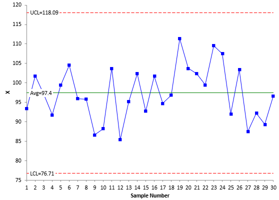
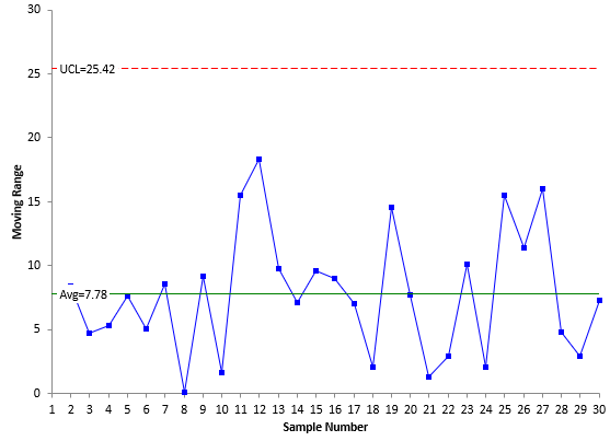
The averages and control limits can then be added to the charts. Figure 1 is the X chart with the average being the centerline. Figure 2 is the mR chart with the average moving range being the centerline.
Figure 1: X Chart
Figure 2: mR Chart
Both charts are in statistical control – there are no points beyond the control limits or patterns in the data (e.g., a run below the average).
The information on constructing a X-mR chart comes from our SPC Knowledge Base article Medians and the Individuals Control Chart. There are times when you can use the median in place of the overall average. More on that below.
When Should a X-mR Chart be Used?
Control charts, when properly designed, monitor variation over time. Two options for monitoring the variation in a process include monitoring the individual values as shown above or combining samples (e.g., 4 samples) to from a subgroup and monitoring the subgroup averages and ranges over time (i.e., using the X-R chart).
This appears to indicate that the decision to use a certain chart should include how much data are available to represent a given situation at a given time. If you have multiple data points at a point in time to represent the situation, then you should use one of the subgrouping charts, like the X-R chart. If you have only one point in time to represent the situation, you should use the X-mR chart.
For example, if you have only one data point per day, a week, or a month to represent a situation, then you have infrequent data. You would want to use the X-mR chart. If you are testing a stream for a contaminant daily, you probably want to use the X-mR chart. You have only one data point to represent the situation daily and, in this case, you would like to be able to respond immediately if the contaminant is out of control. It doesn’t make any sense to wait four days, for example, to form a subgroup and plot the result on the X-R chart.
So, it is best to use the X-mR chart when you have only one data point to represent a situation at a given point in time, and it is important to respond to signals at that moment in time.
Does Data Have to Be Normally Distributed to Use a X-Mr Chart?
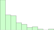
You may have heard that data must be normally distributed before you can plot the data using a control chart? Quite often you hear this when talking about the X-mR chart. This is a myth. Data do not have to be normally distributed before a control chart can be used – including the X-mR chart.
Dr. Donald Wheeler, for one, has shown extensively, in multiple publications (www.spcpress.com), that the X-mR chart can be used to monitor the variation regardless of the type of distribution – even heavily skewed distributions.
But there is more to the story here. Dr. Wheeler focused primarily on the ability to detect a point beyond the control limits. He did not focus on the impact on the other out of control tests, for example, the zones tests. Care should be given when applying the other out of control tests to non-normal data.
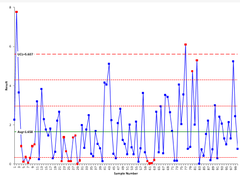
Our SPC Knowledge Base article Control Charts and Non-Normal Data covers this topic in detail. In that article, 100 points are randomly generated from an exponential distribution. The data are heavily skewed towards the left. The X control chart for that data is shown in Figure 3 (the mR chart will not be shown here).
Figure 3: X Control Chart for Exponential Data
The chart shows the average and UCL. There is no LCL since the exponential function can’t be below 0. There are two red lines between the average and UCL and one red line between the average and 0. These are used for the zones tests. The zones tests can be used to interpret the individuals control chart. For more information, please see our SPC Knowledge Base article Interpreting Control Charts.
The red points in Figure 3 represent out of control points. There are two points above the UCL. There are also two runs of at least 7 below the average, one area where there are 4 points in a row in zone B, and an area where there are two out of three consecutive points in zone A. These all represent special causes.
With heavily skewed data, is it surprising that you get runs of 7 or more below the average? It is not surprising – after all, the distribution is skewed that direction. The conclusion here is that if you are plotting non-normal data on the X-mR chart, take care in applying the zones tests. These tests are designed for a normal (or at least a somewhat symmetrical) distribution. Using them with non-normal data can create false signals of problems.
Removing the zones tests leaves two points that are above the UCL – out of control points. With our knowledge of variation, we would assume there is a special cause that occurred to create these high values. Are these false signals? You cannot assign a probability to a point being due to a special cause or not – regardless of the data distribution. So, are they false signals? In the real world, you don’t know. But wouldn’t you want to investigate what generated these high values?
The amazing thing is that the individuals control chart can handle the heavily skewed data so well – only two “out of control” points out of 100 on the X chart. This demonstrates how robust the moving range is at defining the variation. The +/- three sigma limits work for a wide variety of distributions.
You can also use the median in place of the average if you want to see the impact of this on the zone tests. The median is not impacted like the average by the higher results. This is described in more detail in the article referenced above.
Is the Time Between Points Important for a X-Mr Chart?
As stated above, control charts, when properly designed, monitor variation over time. Time is an important but sometimes ignored part of control charts – particularly for the X-mR charts. Remember, the X chart control limits as well as the mR chart control limits depend on the average moving range.
Suppose you are monitoring a variable once a day and plotting those results on a X-mR chart. You get your results for day 1 and day 2 and plot those as well as the moving range between the 2 days. Now you wait 5 days to get the next result. How do the potential sources of variation compare between days 1 and 2 and then, between days 2 and 7? The odds are that there are more sources during the 5 days than the 1 day. You are not comparing apples to apples. The time frame between samples should be the same. In one case, the moving range represents the variation between consecutive days and the other moving range represents the variation between 5 days. They are most likely not the same.
It is important that the time between results on the X-mR chart be the same over time, for example, between consecutive days. In fact, if you miss a sample, don’t use the previous sample in determining a moving range. The table below demonstrates this.
- Day 1: X =100
- Day 2: X = 102; moving range = |102 – 100| = 2
- Day 3: Missed
- Day 4: X = 98; No moving range
- Day 5: X = 103, moving range = |98 – 103| = 5
Pay attention to missed data on the X-mR chart and be sure the moving range is handled properly.
Do You Need to Think About Rational Subgrouping with a X-mR Chart?
Yes, and it is directly related to the last question above – time. You have to remember what you are doing when you setup a X-mR chart. The subgroup size is one. And based on the results, you are going to calculate the control limits based on the moving range between successive differences. You want it to be logical to compare the consecutive differences. The moving range then captures the normal variation in the process, and you can use the control limits to filter out the noise and see the signals.
Do X-mR Charts Work with Rare Events Data?
No, they don’t work well at all. But with some calculations, you can convert the rare events to rates and use the X-mR chart based on those rates. Our SPC Knowledge Base article Rare Events and X-mR Charts describes this situation in more detail.
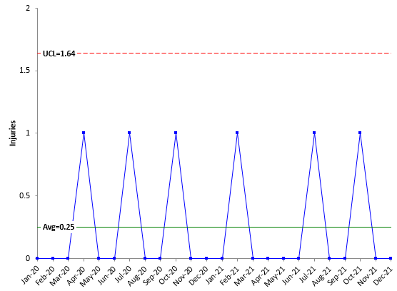
One data set in the article monitors the number of injuries per month in a plant. There are seldom injuries – essentially a rare event for that plant. Figure 4 shows the X chart for the data, which is given in the above article. The mR chart is not shown.
Figure 4 is monitoring the number of injuries in a plant per month. As you can see, the chart is not of much use.
Figure 4: X Chart with Rare Events
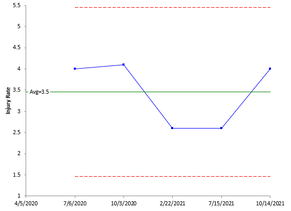
There are only two possible outcomes in the chart, 0 or 1. But you can change the data you are looking at by calculating the number of days between injuries and converting that to an injuries per year rate. Figure 5 shows the chart with the rates calculated. The article referenced above explains how to do this calculation.
Figure 5: X Chart: Injuries per Year Rate
This chart is much more useful than the chart in Figure 4. You know what your yearly rate is and can see from the chart if it is staying the same, improving or getting worse. You could also chart the number of days between injuries instead of the yearly rate.
Do X-mR Charts Work with Chunky Data?
Not really. Chunky data occurs when the range between possible values becomes too large. One example is measuring a person’s height to the nearest yard. This measurement is too large and would obscure the variation in height from person to person. Excessive round-off will lead to chunky data. It can also occur when the measurement process cannot tell the difference between samples (usually indicated by a very large gage R&R %). In this case, the measurement unit is too large (as in the case of measuring a person’s height to the nearest yard).
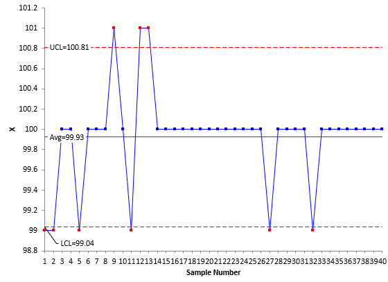
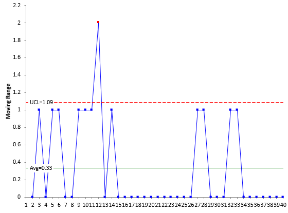
Our SPC Knowledge Base article Chunky Data and X-mR Charts explores this issue in detail. In that article, temperature values are being charted, with the temperature values rounded to the nearest 0.1. The article shows this process to be in statistical control and is a typical looking X-mR chart, with many different values on the mR chart. Now the data are rounded to the nearest degree, and another X-mR chart is created. Figures 6 and 7 are the X and mR charts based on the rounded data.
Figure 6: X Chart with Chunky Data
Figure 7: mR Chart with Chunky Data
Note that there are eight points beyond the control limits on the X chart and 1 out of control point on the moving range chart. These out of control points occurred simply because of the way we rounded the data. They have nothing at all to do with the process – which the article above shows was in statistical control. The out of control points are the result of excessive rounding. This type of data can lead to false alarms. You can get out of control points when the process is actually in statistical control.
It is easy to tell if you have chunky data. Simply count the number of possible values on the mR chart. For X-mR charts, the data is chunky if the mR chart has three or fewer possible values below the upper control limit.
Do X-mR Charts Give False Signals?
Yes, all control charts can give false signals. This is one potential reason not to use the X-mR chart if there is a lot of data available. If you have a lot of data and can rationally subgroup the data, it is best to use the X–R chart. This chart actually gives less false signals than the X-mR chart. Please see our SPC Knowledge Base article Comparing the X-mR and Xbar-R Control Charts for the simulation that shows this to be the case.
Can You Use The X-mR Chart with Data That Are Counts?
Yes, you can. There are two classes of data: attribute and variables data. Attributes data are either yes/no or counting.
With yes/no data, there are only two possible outcomes for an item: either it passes, or it fails some preset specification. Each item inspected is either defective (i.e., it does not meet the specifications) or is not defective (i.e., it meets specifications). An example of yes/no data includes is the product in spec or not.
With counting data, you count the number of defects. A defect occurs when something does not meet a preset specification. It does not mean that the item itself is defective. For example, a dresser can have a scratch (a defect) but still work properly. When looking at counting data, you end up with whole numbers such as 0, 1, 2, 3; you can’t have half of a defect.
Variables data consist of observations made from a continuum (such as the temperature). That is, the observation can be measured to any decimal place you want if your measurement system allows it. Some examples of variables data are contact time with a customer, sales dollars, amount of time to make a delivery, height, weight, and costs.
In the past, it was often taught that you use attributes control charts with attributes data and variables control charts with variables data. For example:
- Attributes Data:
- Yes/No type data: use p or np chart
- Counting type data: use c or u chart
- Variables data: use X-R or X-mR charts
There are other attribute and variable control charts. Over time it has been emphasized that certain conditions must be met to use the attributes charts, primarily because of the assumption of the underlying distribution, – and that seldom the conditions are met. It has been suggested more and more that the X-mR chart should be used for attributes data.
If you compare the results for the X-mR chart with the attribute charts you will find that the results are very similar. Please see our SPC Knowledge Base article Comparing Individuals Charts to Attributes Charts to see the comparison between the X-mR chart and the attribute charts.
Yes, you can use the X-mR chart in place of the p, np, c and u charts. But there is more to the story on this. That is the last question.
Can You Use The X-mR Chart with Data with Varying Subgroup Sizes?
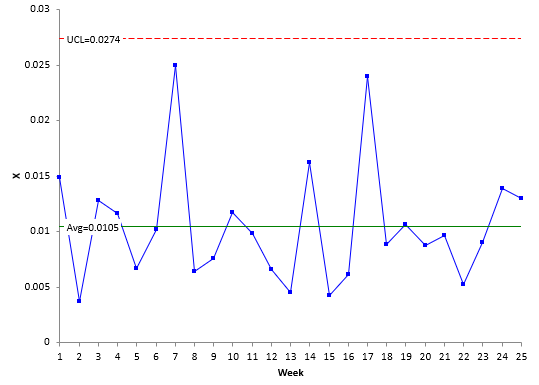
Yes, but there is the potential to miss signals if the large subgroup sizes vary too much. In the past, the X-mR chart has been used to address the issue of large subgroup sizes with attributes charts. Please refer to our SPC Knowledge Base article Laney u’ Control Chart for details and data on this topic. The data from the article is the number of errors/ patient per week. During week 1, there were 98 errors for 6566 patients. This gives X = 98/6566 = 0.01493. If a u chart was used for these data, the control limits would be very tight with the potential for many out of control points. The individuals chart avoids that problem. Figure 8 is the X chart for the data in the article. It is in statistical control.
Figure 8: X Chart for Patients/Errors Data
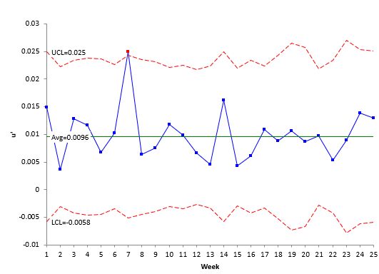
The X chart looks good. However, it does not account for the varying subgroup sizes in the data. The subgroup size (the number of patients per week) varies from 5114 to 10496. The Laney u’ chart – another type of attribute control chart designed to handle large sample sizes – accounts for this issue. Figure 9 is the Laney u’ chart for the data.
Figure 9: Laney u’ Control Chart for Patients/Errors Data
Take a close look at Figure 9. A couple of items to notice. First, the control limits vary because the subgroup size (number of patients) varies each week. There is one out of control point with the Laney u’ chart. The X-mR chart did not have any. The reason the Laney u’ control chart picks it up is that it is accounting for the varying subgroup size – which the X-mR chart does not. In this situation, the Laney u’ control chart is a better choice than the X-mR chart.
Summary
The X-mR chart has gained in popularity over the years, even to the point of some recommending just teaching the X-mR chart – that it is all you need. Yes, it is empirical and will work in many, many circumstances. Just not all. This publication pointed out some of the things you should be aware of when using the X-mR chart. This publication also looked at how to construct, and when to use the X-mR chart as well as the importance of time when setting up the data collection for the X-mR chart. False signals and using the X-mR chart in place of the attributes charts were also discussed.
Tahnks for your insightful paper, as usual! The transformation data war is really very interesting, Mr. Montgomery approves it and Mr. Wheeler does not, in my training sessions I discusse this two options with my trainees, and in my humble opinion, when Shewhart created the SPC concept he didn't transformed a nonnormal data to a normal distribution., this is my approach. Best Regards.
Very nice text!!!
Control limits for charts of individuals work fine if the distribution of individual values is normally distributed. Shewart utilized the Central Limit Theroeum as th basis for recommending charts of avrages and ranges as the distribution of averages is normally distributed regardless of the shape of individuals.. This is especially trtue when the number of individual values used to calculate the average is at least 4 and preferabbly 5 or more. For example in a chart of averages and ranges, the sample group should be taken close together to reflect the short term variation of the process and the time between sample groups should reflect the time to time variation.Shewerts whole concepts were based on the use of the charts as a tool to tell the operatorv when the process is running in a stable or unstable mode and when to take action when it is unstable (special cause variation). He never liked using his charts to display process data after the fact which was too late to take action to prevent the process from continuing to make defective product.Hank.
What a wonderful resource! Thank you.Can you tell me how to input phase lines in an I-chart to indicate a process change? I didn't see mention of this in your paper or on this website.
The easiest way of course is to use our SPC for Excel software. You simply select where you want to split the control limits and go to the actions panel on sthe SPC for Excel ribbon. Manually, you calculate each phase separately. Let me know if you need more information.