June 2016
(Note: all the previous SPC Knowledge Base in the basic statistics category are listed on the right-hand side. Select this link for information on the SPC for Excel software.)
You just finished your capability analysis on a new product for a customer. You entered your data into your software and clicked the right buttons to generate a fancy process capability report. This report has it all! A histogram with the specifications, a control chart (you are in control!), and a normal probability plot. And the big thing for you – your Cpk value is over 1.33 – your customer’s requirement. All is good.
You get ready to e-mail your report to your customer, but you happen to note the p-value on the normal probability plot. It is less than 0.05. Oh no! Your data are not normally distributed! It has to be normally distributed to determine Cpk! Your customer is not going to like this!
Now what? You remember, from somewhere in your distant past, you should transform the data if it is not normally distributed. So, you run a Box-Cox transformation. You don’t quite remember what that is all about, but it seems to get used a lot. And the transformed data is normal!
You now run your process capability analysis again. Your Cpk is still over 1.33. All is good again. You e-mail your report to the customer. Time to head home.
This scenario plays out too often. It involves blindly applying a statistical technique to transform data without first looking at the data and seeing what that data are trying to tell you. We worry too much about normality sometimes – and miss the signals the data may be sending us.
This month’s publication looks at how you can examine your data to see if it is normally distributed. You do need a normal distribution for certain things – like calculating a Cpk value. However, you should not just blindly take the results from something like a normal probability plot and assume that your data are or are not normally distributed. You have to think.
In this issue:
Please feel free to leave a comment at the end of this publication. You may download a copy of this publication from our e-reader at this link.
Know Your Process

Is there a reason that you would expect the data from your process to be non-normal?
Here are some possible reasons that a process may generate data that are not normally distributed:
-
You are trying to minimize something (e.g., a contaminate) in a process; this leads to data that is shifted to the left or positively skewed
-
You are trying to maximize something (e.g., yield) in a process; this leads to data that is shifted to the right or negatively skewed
-
There is minimum boundary in the process; for example, you cannot have a waiting time or a lead time less than 0
-
There is a maximum boundary in the process; for example, you cannot have an on-time delivery greater than 100%
The last two can give rise to data that is even more skewed than the first two. So, the first step is to determine if there is a valid reason that the process should generate non-normal data. If there is not, based on your knowledge of the process, then you should be expecting to see normally distributed data.
Below are some tools to help you in determining if the data are normally distributed.
Tools to Help You Examine Normality

-
Control charts
-
Histograms
-
Normal probability plot
The first tool, the control chart, does not tell you if the data are normal, but lets you know if the process that generated the data is consistent and predictable, i.e., stable. The easiest control chart to use is the individuals control chart. Plot the data over time and see if it looks stable. Wait! Haven’t you heard that the data needs to be normally distributed to be used in an individuals chart? Yes, you may have heard that fallacy. You can review our publication about that at this link. For now, we will move forward using the individuals chart.
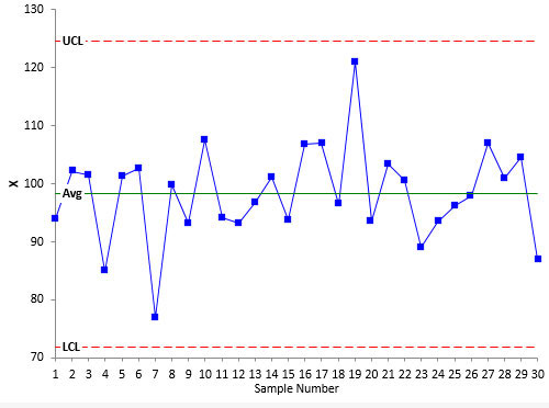
Figure 1 shows a process that is stable. We will call this Process A. Assume we believe that our process should produce normally distributed data. There are 30 data points that we collected over time. These points are plotted as individual values over time. The average is calculated and plotted. The lower and upper control limits are calculated and plotted. As long as the points are within the control limits and there are no patterns, the control chart is said to be in statistical control. The process is consistent and predictable. It is a stable process. This is the case for Process A – a stable process.
Please note that being in statistical control does not mean that your data are normally distributed. A control chart does not tell you that. We are simply using the control chart to ensure that the process was predictable when we took our data.
Figure 1: Stable Process A
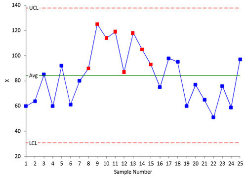
Figure 2 is a control chart of another process. This is a process that is not stable. You can see there is run above the average. The process is not predictable – so you can’t decide if the data are normal or not. You must fix the process and take the data again. Until the process is predicable, you can’t be sure of getting similar results in the near future.
Figure 2: Unstable Process
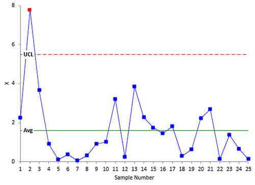
For our purposes here, we are looking at whether the process is fairly stable or if it is shifting widely. We are not looking for specific out of control points. A rule of thumb you can use: as long as less than 5% of the points are out of control, you have a fairly stable process. But, again, use your knowledge of the process. Does it look stable to you? Figure 3 shows a process that I would consider “stable” even with the one out of control point. The reason: process knowledge. This is data from a process with 0 as a natural lower boundary. We will call this Process B.
Figure 3: “Stable” Process B
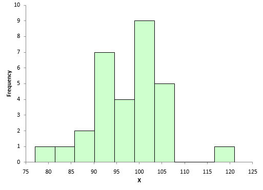
The second tool is the histogram. This gives you a snapshot in time of the variation in the process. It measures how often a value or range of values occurred in the data. It is the best tool for looking at whether the data are normal or not. Figure 4 is a histogram of the data used in Figure 1. Does it look normally distributed to you?
Figure 4: Histogram for Process A
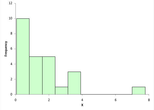
Yes, for only 30 data points, it looks pretty normally distributed. Figure 5 is a histogram of the data used in Figure 3, the one we know is probably non-normal (process B) – and it appears to be non-normal.
Figure 5: Non-Normal Histogram for Process B
The third technique is the normal probability plot. Please see our publication on normal probability plots for more information. A normal probability plot charts the z value against the data value. There are two ways to determine if the data are normally distributed. First, if the points fall along a straight line, then the data probably came from a normal distribution. You can also calculate the Anderson-Darling statistic and determine the p-value associated with that statistic. A small p-value (0.05) implies that the data are not normally distributed. A large p-value implies that the data are normally distributed.
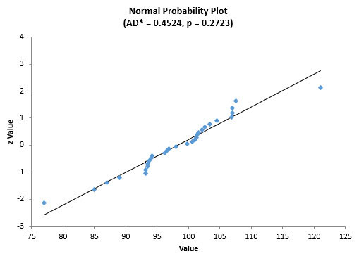
Figure 6 is the normal probability plot for the stable process data (process A).
Figure 6: Normal Probability Plot for Process A
The points generally fall along the straight line. The p-value is 0.2723, which is larger than 0.05. You would conclude that the data appear to come from a normal distribution. AD* is the Anderson-Darling statistic calculated for the data.
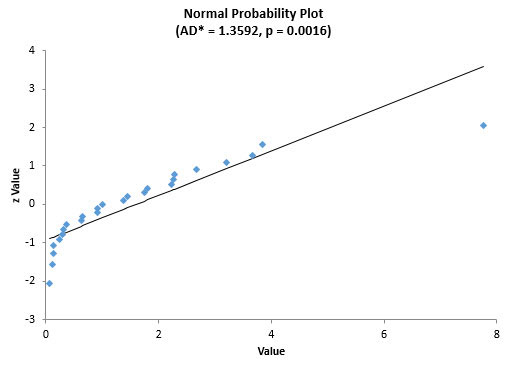
Now, let’s move to the data used in Figure 3 and Figure 5 – process B. Based on our process knowledge, we believe that the data should be non-normal and the histogram confirmed that it was. So, when we create the normal probability plot, we would expect it to have a p-value less than 0.05. Figure 7 is a normal probability plot for that data.
Figure 7: Normal Probability Plot for Process B
You can see that the data does not fit a straight line. In addition, the p-value is less than 0.05. So, we can conclude that the data are not normally distributed.
These three tools will give you further insight to the normality of the data. But how much data do you need?
Sample Size

If you have a sample size of 1000, the control chart and histogram will give you good information. But, larger sample sizes are not good for the normal probability plot. It will tend to produce a p-value that is indicates the data are not normally distributed, even if the histogram clearly shows it is a normal distribution.
So, how much data to you need? A good rule of thumb is from 30 to 125 data points.
Look at Your Data
Far too often, we take data and plug that into a software package to generate all sorts of statistical analysis. The example to start this publication is true. The p-value on the normal probability plot was too small. So, the supplier simply ran all the transformations and distribution fitting routines he could from his software, picked the one with the highest p-value, and used it for his process capability analysis. This satisfied the customer.
But what was missed? You should never blindly apply transformations and distribution fitting – or any statistical tool. You need to look at your data.
What does looking at your data mean? At a minimum, it means using the three tools above. First, use the control chart to make a decision about process stability. If the process is stable, take a look at the histogram. Does the histogram look non-normal? Is it what you expect from your knowledge of the process?
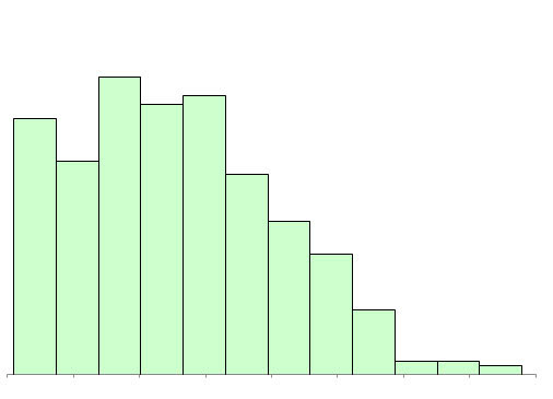
Here are some examples of “non-normal” histograms that come from a process producing normally distributed data. Figure 8 is actually a histogram that looks non-normal. But since you expect a normal distribution, this should raise a red flag to you. Something is going on.
Figure 8: Truncated Data Histogram
Turns out that data below the lower specification was not being recorded (true story – aren’t you amazed someone would do that?). And there was lots of data below the lower specification. This non-normal histogram was really due to a problem in the process (not recording data).
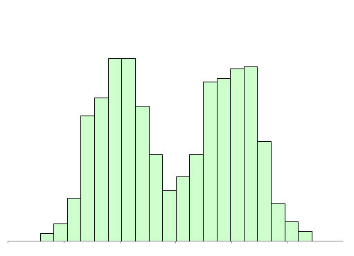
Figure 9 is another example of a histogram that indicates a problem instead of being non-normal data. The histogram has two peaks. This is usually an indication that there are at least two processes present: two shifts, two suppliers, etc.
The data appears non-normal but if you move the processes to be the same, then the data becomes normal – and you reduce variation significantly.
Figure 9: Bimodal Histogram
There are other examples in our publication on histograms.
At this point, you should have a very good idea if the data are normal. The process is stable (from the control chart). The histogram looks either normal or non-normal – and it is the pattern you expect from the process because of your knowledge of the process. If the histogram shows a problem, then work on correcting that problem and recollect the data.
You can construct the normal probability plot at this time to confirm your decision about the normality of the data. The normal probability plot is best used to provide additional information to support your knowledge of the process and what the histogram tells you about normality.
The Data is Non-Normal: Now What?
You have decided the data are non-normal. Now what do you do when you have to do something that requires a normal distribution? Like calculate Cpk for your process capability. You have two options: transform the data so it is normally distributed or fit the data to a different distribution. Some data sets may not transform to a normal distribution – or be fit to a distribution. The histogram that was truncated because no one would record out of specification material is an example of this. You can’t normalize that data no matter what you do.
Next month, we will take a look at a commonly used transformation technique: the Box-Cox transformation. This technique attempts to transform the data into a normal distribution.
Summary


Respected SirThanks for sharing the important article on data to see the normal distribution and tools associated with that.Best RegardsShishpal Singh
Nice article…but:First you write, “There are a variety of tools to help you determine if the data are normally distributed or not. The three key ones (in my opinion) are: Control charts…”. Then you write, “Please note that being in statistical control does not mean that your data are normally distributed. A control chart does not tell you that.”RE Figure 1, I’d also recommend running the Individuals control chart without the two data points that appear to lie “outside” the rest of the data – they may be inflating the estiamted standard deviation and lie outside the re-calculated control limits. Control limits should be calculated using only data that vary due to Common Causes.
Thanks Wayne. Yes, the control chart doesn't tell you if the data are normally distributed or not – just if the data came from a stable system to help you make a judement about the data itself. So, I edited that sentence. On Figure 1: the points appear to be part of the system based on the control limits, but yes, you could drop them out to see the impact on the data.