November 2018
(Note: all the previous SPC Knowledge Base in the control charts basics category are listed on the right-hand side. Select this link for information on the SPC for Excel software.)
Control charts help you look for changes in your process. But changes from what? You must set the baseline data if you want to be able to see process changes. Setting baseline data is not always easy. The baseline data for a control chart usually consists of 6 to 30 points that represent a period of stability – when the process is in statistical control. If your process is stable, it is easy to set that baseline period.
The difficulty is when there has been a process change – and that process change is not going away. Deciding when the process changed and how to set the baseline data (and the control limits) for the changed process is not always easy. Yet, it is one key to effectively using a control chart.
This month’s publication examines how to look at setting baseline data for a process that changed. There are no “set” rules for this in the real world – and we will use real world data, the monthly U.S. trade deficit.
In this issue:
- The Sequential Nature of Control Charts
- U.S. Trade Deficit
- Baseline Data for the U.S. Trade Deficit
- The Changing Process of the U.S. Trade Deficit
- Summary
- Quick Links
Please feel free to leave a comment below. You can download a pdf copy of this publication at this link.
The Sequential Nature of Control Charts
Control charts are designed to analyze data over time. A process variable is plotted on the control chart. The process variable can be many things – a product characteristic, downtime, rework, scrap, missed appointments, sales, etc. After you have enough points (from 6 to 30 depending on your process), the process average is calculated and added to the control chart. Then the upper control limit (UCL) and lower control limit (LCL) are calculated and added to the control chart. The UCL is the largest value and the LCL is the smallest value you would expect if you have just common causes of variation.
If all the points are within the control limits and there are no patterns, then the process is said to be stable – in statistical control. You can predict what will happen in the near future if the process stays the same. This becomes the baseline data for your process. You extend these control limits into the future and compare future data to them to see if your process has changed.
Once the baseline control limits are set, you continue to collect data over time. These data points are compared to the baseline control limits. This means that there must be data continuously being generated by the process. Each time a new data point is added to the control chart, we ask the following question:
Is the current data point consistent with the baseline data?
If it is consistent, we assume that the process has not changed. If it is not consistent, we assume that the process may have change. We will look at this sequential nature of control charts using data on the U.S. monthly trade deficit.
U.S. Trade Deficit
What do we hear about the U.S. trade deficit? Each month, we typically hear the trade deficit is increasing or decreasing. Now is that surprising? Here are some quotes from CNBC news this year:
- For January 2018
- The Commerce Department said the trade gap jumped 5 percent to $56.6 billion, the highest level since October 2008.
- For May 2018
- The Commerce Department said the trade deficit, the gap between what the U.S. exports and what it imports from foreign countries, was $43.1 billion for the month of May, down 6.6 percent from April.
- For July 2018
- U.S. trade deficit jumps by the most in 3 years; the U.S. trade deficit increased to a five-month high in July; the Commerce Department said the trade gap jumped 9.5 percent to $50.1 billion, widening for a second straight month.
Each month it may increase or decrease – and that change is compared to something – usually another single data point – last month, previous high. The comparison is always there it seems.
We want to take the data and look at it as a process – as part of a bigger picture. Data on the monthly U.S. trade deficit from January 2016 to September 2018 was taken from the United States Census Bureau website. The data are shown in Table 1.
Table 1: U.S. Trade Deficit (Millions $)
| Month | Trade Deficit | Month | Trade Deficit | Month | Trade Deficit | ||
|---|---|---|---|---|---|---|---|
| Jan-16 | $42,217 | Jan-17 | $46,879 | Jan-18 | $52,334 | ||
| Feb-16 | $45,695 | Feb-17 | $44,171 | Feb-18 | $54,963 | ||
| Mar-16 | $37,350 | Mar-17 | $43,909 | Mar-18 | $46,693 | ||
| Apr-16 | $38,192 | Apr-17 | $46,074 | Apr-18 | $45,512 | ||
| May-16 | $40,170 | May-17 | $45,823 | May-18 | $42,561 | ||
| Jun-16 | $43,737 | Jun-17 | $44,803 | Jun-18 | $45,739 | ||
| Jul-16 | $41,136 | Jul-17 | $44,221 | Jul-18 | $50,037 | ||
| Aug-16 | $41,635 | Aug-17 | $44,163 | Aug-18 | $53,309 | ||
| Sep-16 | $39,000 | Sep-17 | $44,407 | Sep-18 | $54,019 | ||
| Oct-16 | $42,644 | Oct-17 | $46,986 | ||||
| Nov-16 | $46,127 | Nov-17 | $48,952 | ||||
| Dec-16 | $44,100 | Dec-17 | $51,889 |
Baseline Data for the U.S. Trade Deficit
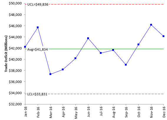
The first thing we have to do with a control chart is to set the baseline data. There are no set rules about how to do this. You can have as few as 5 to 6 points to set the baseline data or as many as 30. It really depends on how you will use the control chart. With financial data, people seem fixated on years – this year compared to last. So, without any real reason, we will pick the 12 months of 2016 in Table 1 as our baseline time period. Figure 1 shows the control chart based on 2016 data. We are using an individuals control chart but will not show the moving range chart.
Figure 1: 2016 Monthly U.S. Trade Deficit
The control chart in Figure 1 is in statistical control. All the points are between the control limits and there are no patterns. The process (as defined in 2016) is consistent and predictable. The deficit average is $41.834 billion for 2016 and could have been anywhere from $33.831 to $49.836 billion. This is our baseline data. Pretty good – all in statistical control. The data appears to be homogeneous.
The Changing Process of the U.S. Trade Deficit
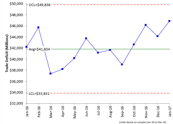
With the baseline data determined, we set the control limits to the values in Figure 1 and begin the sequential aspect of control charts. The next point generated by the process is the deficit for January 2017. That point has been added to the control chart as shown in Figure 2.
Figure 2: Jan-17 Trade Deficit Added to Control Chart
Now, you ask the question:
Is the current data point consistent with the baseline data?
The point is above the average, but not beyond the UCL. So, you conclude that the January 2017 data point is consistent with the baseline data. You assume, at this point, that the process has not changed.
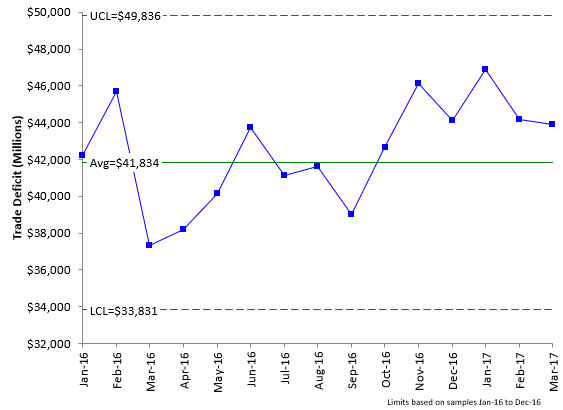
This sequential process of adding new data to the chart and answering the question above continues. Figure 3 has added the data points for February and March of 2017. Are the two new data points consistent with the baseline data?
Figure 3: Feb-17 and Mar-17 Trade Deficit Added to Control Chart
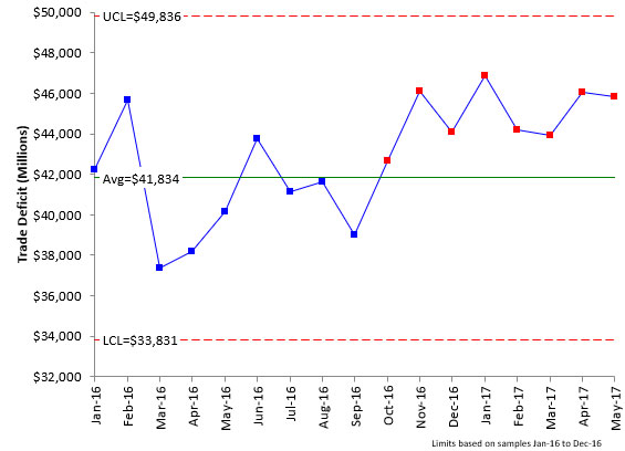
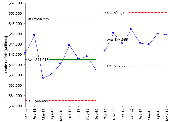
The two new points in Figure 3 are not beyond the control limits. They are both above the average. There is now a run of 6 points in a row above the average. An out of control situation occurs if you have 7 or 8 points in a row above the average. The process is getting close to that, but there is not yet a signal. The two new points are consistent with the baseline data. The sequential process continues. Data for April and May of 2017 are collected and added to the control chart. You would add a point each month. For purposes of this publication, we will add multiple months at one time sometimes. The control chart with the new data is shown in Figure 4.
Figure 4: Apr-17 and May-17 Trade Deficit Added to Control Chart
The control chart now has a signal present. There are 8 months in a row above the average. How do you interpret the control chart now that a signal is present? Whenever there is a signal, one good approach to interpreting the control chart is to look at the sequence of points before the out of control point occurred.
Looking at the control chart, you can see that the run of 8 above the average started back in October 2016. Note back when we added this point, we said it was consistent with the baseline data. It was at that point in time. But the run from October 2016 to May 2017, when taken together, is no longer consistent with the baseline data. Something has changed. One possible interpretation is that something happened in October 2016 that causes the process average to shift up. In many processes, you will want to find out what caused this increase (the special cause of variation) and remove it so the process returns to its baseline limits. For our example here, we will assume that the special cause of variation is here to stay, and we have a new process.
Now, we must set the new baseline to judge the process against in the future. One potential new baseline is the run of the data above the average. Figure 5 shows the control chart with the control limits split in October 2016. The control chart clearly shows the increase in the average U.S. trade deficit from about $41 billion to almost $45 billion. The last 8 months are within the new control limits of $39.770 billion to $50.162 billion. It appears that we can use these control limits as the new baseline. You could make a choice to recalculate the control limits as you get new data until you have more points.
Figure 5: New Baseline Control Limits
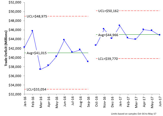
Now the sequential process starts again. A new data point is added, and you ask if that new data point consistent with the new baseline data. The data for June 2017 has been added to the control chart in Figure 6. Remember the control limits are now based on the data from October to May of 2017.
Figure 6: Jun-17 Trade Deficit Added to Control Chart
The June 2017 is almost the average value for the new baseline data. So, it appears to be consistent with the previous data. We will speed up the process here a little bit and add data for the rest of 2017. The resulting control chart is shown in Figure 7.
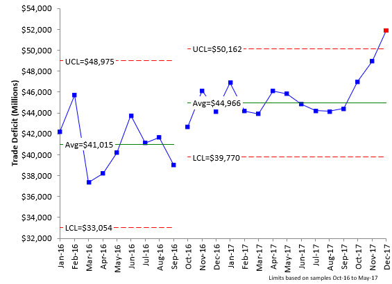
Figure 7: U.S. Trade Deficit 2016 – 2017
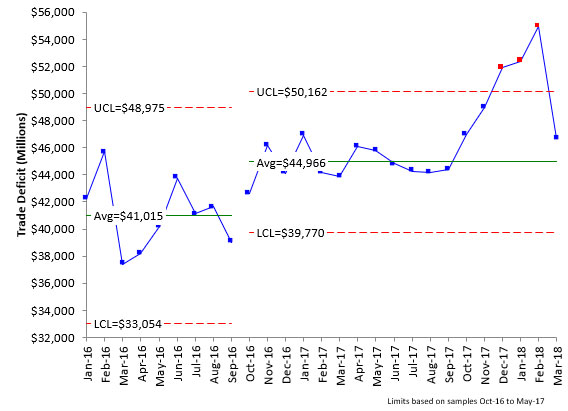
Look at Figure 7. What do you see? What do you conclude? From July 2017 thru November 2017, the data are consistent with the baseline data – although one might be a little concerned about the increase in November. But still no “official” signal on the control chart – until December 2017. That month’s result is above the UCL – a definite signal that something has changed. This data point is not consistent with the baseline data.
What about future data? What do you do now about the control limits? Change them based on the last three points? Not very many data points for baseline data. What would you do?
There is no perfect answer here. There is not enough data to reset the baseline data – and since the process is out of control, you have no idea where the next month’s result will be. One option is not to change the control limits at all. Just take more data and see where the data points lie on the chart.
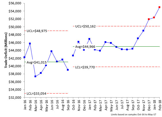
At this point, just continue to add the new data and compare it to the baseline data. January and February of 2018 have been added in Figure 8. Both are higher than December 2017 and are not consistent with the baseline data. It appears that the trade deficit is on an upward trend and not leveling out to form a new baseline.
Figure 8: Jan-18 and Feb-18 Trade Deficit Added to Control Chart
So, what do you do? This is an example of an out of control process. There is nothing predictable. You know that the process no longer looks like the baseline data – but you have no idea what the process looks like now! Without a stable process, you can’t predict where the next point will be. Will March 2018 be more than February 2018? Is there an upward trend? Hard to tell. What do you think?
Despite the out of control process, the sequential nature of the control chart continues. The data for March 2018 has been added to the control chart in Figure 9.
Figure 9: Mar-18 Trade Deficit Added to Control Chart
The data point for March 2018 is back within the control limits. This could mean several things. One is that whatever caused the three points beyond the control limits is gone and the process is now back within the baseline data. Or perhaps there is a new process comprised of the last six points above the average. Again, because the recent process history is out of control, you really do not know what to expect in the process. The best thing might be to leave the baseline data just where it is.
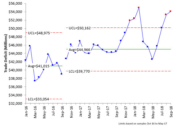
Figure 10 adds the data through September 2018 keeping the baseline data from October 2016 to May 2017.
Figure 10: U.S Trade Deficit Data from Jan-16 – Sep-18
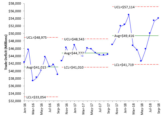
You can see that the data fell for a while back within the baseline control limit but that the last three months were very high again, with the last two being beyond the control limits. You can now begin to see a possible place for a new baseline. It looks like a run above the average began in October 2017. This could become the new baseline for the chart. This is shown in Figure 11.
Figure 11: U.S. Trade Deficit New Baseline Data
The new baseline average is $49.416 billion with UCL = 57.114 billion and LCL = 41.719 billion. And all the points are within the control limits – so the new baseline looks pretty good.
Finding a new baseline in this type of situation is not always easy. The first change in the baseline data for this example was straight forward. There were 8 points in a row above the average and those 8 points formed a stable pattern. However, the next shift upward was more difficult to define. In these situations, it is probably best to simply begin to recalculate the control limits with each new data point until you get to a pattern that is stable for the baseline.
One possible approach would have been to take the data from October 2017 through February 2018 and set the initial baseline data. Then continue to recalculate the control limits with each new point until you get a stable baseline pattern with enough data points.
Summary
This month’s newsletter examined how it can be difficult to set baseline data for a control chart. This is particularly true of processes that change often. The monthly U.S. trade deficit data was used as an example. There are no specific rules for how to set the baseline data except that you want a run of points that are stable – in statistical control. And hopefully, your process is stable enough to do that.
I just finished up reading your November newsletter; what a great paper and so useful to me for a number of reasons. I have been working with a young woman in our team, trying to teach her data analysis since that is such a big part of what we do and frankly many people do not do it well. I will use this paper as a tutorial for her.
Bill, I really like this article of yours. I’ve linked to it in my article about setting baselines for KPIs: https://www.staceybarr.com/measure-up/set-kpi-baseline-monitor-improvement/