February 2023
(Note: all the previous SPC Knowledge Base in the control chart basics category are listed on the right-hand side. Select this link for information on the SPC for Excel software.)

In this issue:
- Control Chart Review
- Separating the Signals from the Noise
- Individuals Chart Examples for Baseline Data
- Do I Plot the Out of Control Points in the Baseline Data?
- Do I Include Out of Control Points in Calculations for the Baseline Data?
- A Word of Caution About Removing Out of Control Points
- Summary
- Quick Links
Please feel free to leave a comment at the bottom of this publication. You can download this publication at this link.
Control Chart Review
A control chart monitors variation in a process over time. It separates common causes of variation from special causes of variation. Common causes of variation represent the “noise” in the process. It is the normal or natural variation that exists in the process. It exists because of the way you designed the process and manage it on a day to day basis.
A good example of this is the time it takes you to get to work in the morning if you are driving. There is a certain amount of “normal variation” in that process. There is an average time it takes to get to work with some variation about that average. Maybe that variation is 15 to 25 minutes. This variation is normal for you, and you expect it. This is common causes of variation – the normal variation in the process.
A special cause of variation represents a “signal” that something has changed in the process. For example, if you get a flat tire on the way to work, you will not be getting to work in your normal time variation of 15 to 25 minutes. It will be much later most likely. This is a special cause of variation in the process. It is not part of the way the process is designed and is managed. It is not supposed to be there.
A control chart separates the common causes of variation from the special causes of variation. All processes have noise – the common causes of variation. Some processes have signals – the special causes of variation that indicate something has changed. When a special cause of variation exists, you should find the reason for the special cause and remove it from the process – hopefully preventing it from coming back again. For more information on variation, please see our SPC Knowledge Base articles at this link.
So how does a control chart do this?
Separating the Signals from the Noise
A control chart is the only effective way to separate the signals from the noise. This is done by plotting the data (like the time to get to work) over time. Once you have enough data, you calculate the average and the control limits. There are usually two control limits. One is the upper control limit (UCL). This is the largest value you would expect if you just had common causes of variation present. The other is the lower control limit (LCL). This is the smallest value you would expect if you just had common causes of variation present.
After you have plotted the average and control limits, you interpret the control charts. As long as there are no points beyond the control limits or patterns (like 8 in a row above the average), the process only has common causes of variation (noise) present. The process is said to be in statistical control. If there is a point beyond the control limits or patterns present, then the process is sending a signal that something has changed.
A common question is how many data points do I need before I calculate control limits. The rule of thumb is that you can start a control chart with as few as 5 points. You recalculate the control limits with each new data point until you get to 20 to 30 data points. Then you can set your baseline control limits. Please see our SPC Knowledge Base article When to Calculate, Lock and Recalculate Control Limits for more information.
Individuals Chart Examples for Baseline Data
Let’s take a look at two examples: one without any out of control points in the baseline data and one with out of control points. Table 1 shows the data for the example without any out of control points in the baseline data.
Table 1: Baseline Data Without Any Out of Control Points
| Sample | X | Sample | X | |
|---|---|---|---|---|
| 1 | 47.2 | 14 | 51.1 | |
| 2 | 45.9 | 15 | 54.8 | |
| 3 | 60.7 | 16 | 43.7 | |
| 4 | 48.5 | 17 | 53.4 | |
| 5 | 45.7 | 18 | 43.1 | |
| 6 | 39.3 | 19 | 54.4 | |
| 7 | 47.1 | 20 | 56.2 | |
| 8 | 49.8 | 21 | 48.6 | |
| 9 | 44.8 | 22 | 45.1 | |
| 10 | 44.7 | 23 | 43.9 | |
| 11 | 56.4 | 24 | 62.8 | |
| 12 | 51.7 | 25 | 48.0 | |
| 13 | 45.0 |
The individuals chart is used for all the examples. It is really two charts – the X chart and the moving range chart. The individual result for each sample is plotted on the X chart while the range between consecutive points is plotted on the moving range chart.
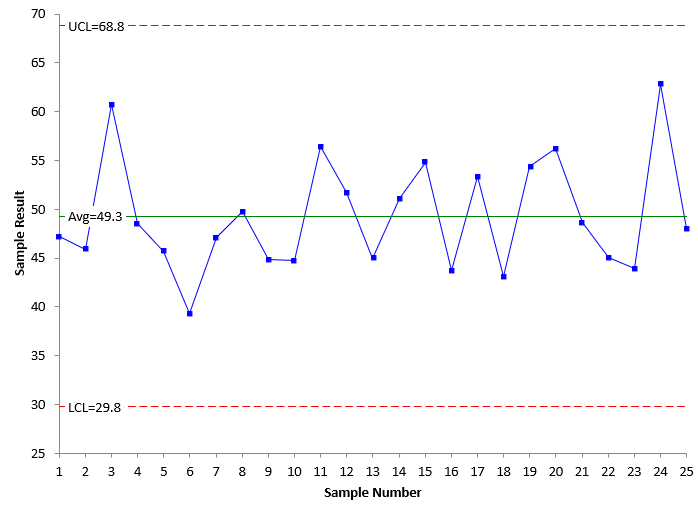
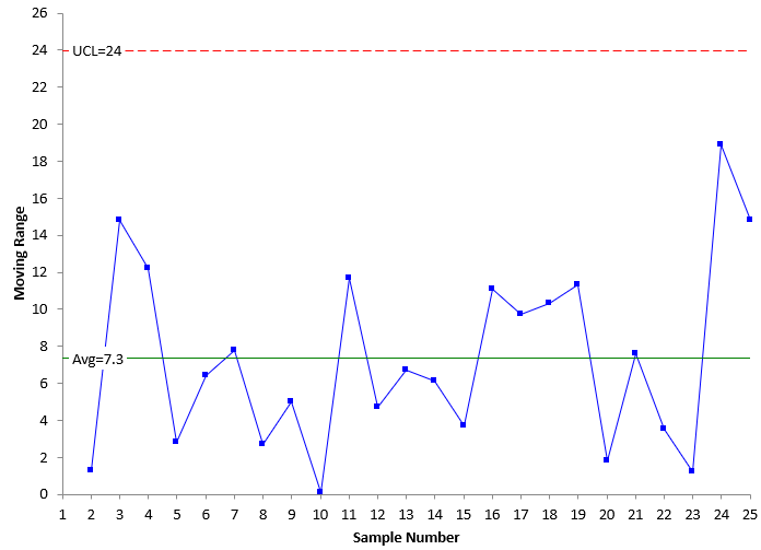
Figure 1 shows the X chart for these data while Figure 2 shows the moving range chart. All the charts in this publication were made with the SPC for Excel software. The average and control limits are calculated and added to the two charts.
Figure 1: X Chart for Data Without Out of Control Points in Baseline Data
Figure 2: mR Chart for Data Without Out of Control Points in Baseline Data
The equations used for the calculations of the averages are given below.
X = ∑X/k
R = ∑R/(k-1)
where k = the number of samples (25), X is the average of the X values, R is the average of the moving range (R) values.
The upper and lower control limits for the X chart are given as follows:
UCLx = X + 2.66R
LCLx = X – 2.66R
The upper control limit for the moving range chart is given as:
UCLr = 3.268R
There are no points beyond the control limits or patterns on the charts in Figures 1 and 2. Both are in statistical control. This means that they are consistent and predictable. These control limits can be extended into the future to judge future performance against. This is the easy case.
Table 2 is the data that contains out of control points in the baseline data.
Table 2: Baseline Data With Out of Control Points
| Sample | X | Sample | X | |
|---|---|---|---|---|
| 1 | 47.2 | 14 | 46.2 | |
| 2 | 45.9 | 15 | 46.5 | |
| 3 | 47.4 | 16 | 43.7 | |
| 4 | 79.2 | 17 | 48.1 | |
| 5 | 45.7 | 18 | 46.2 | |
| 6 | 39.3 | 19 | 51.2 | |
| 7 | 47.1 | 20 | 32.1 | |
| 8 | 49.8 | 21 | 48.6 | |
| 9 | 45.7 | 22 | 46.2 | |
| 10 | 47.3 | 23 | 43.9 | |
| 11 | 78.4 | 24 | 48.4 | |
| 12 | 51.7 | 25 | 48.0 | |
| 13 | 45.0 |
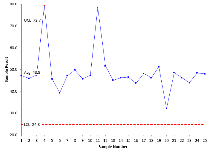
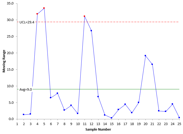
Figure 3 is the X chart and Figure 4 is the moving range chart for the data in Table 2.
Figure 3: X Chart for Data with Out of Control Points in Baseline Data
Figure 4: mR Chart for Data with Out of Control Points in Baseline Data
Both charts have out of control points. Points 4 and 11 are out of control on the X chart in Figure 3. This leads to the moving range chart having three out of control points. This means that the average moving range is inflated – larger than it would be if there are no out of control points on the moving range chart.
Since the average moving range is used to calculate the control limits on the X chart, those control limits are inflated as well – wider than they would be if there were no out of control points.
Note that the X chart still shows two out of control points, above the UCL – even using the inflated average moving range.
You can see the influence of this on the X chart’s average line. 20 of the 25 points are below the average – all because those two out of control points have inflated the average. This means that the average – and thus the control limits – are not representative of the process without special causes of variation present. This will cause issues if you are using out of control tests that depend on the average like the zone tests.
What do you do about these baseline limits? Use them even though they are inflated? Remove them from the calculations? Remove them entirely from the chart?
Do I Plot the Out of Control Points in the Baseline Data?
When plotting data from your process, you should always include all the data! Plot all the data because it is the history of your process. There are outlier tests that are designed to discover outliers, with the assumption you will remove them from the process. However, you should never leave data out of a visual representation. It should be included even it is not used in the calculations.
This publication is looking at the impact of out of control points on baseline control limits. But I have seen, too many times, organizations where out of specification material is not ever entered into a database – or worse yet the data is changed to make it within specification.
So, always plot the actual data – each and every point – good or bad. This is the only way you can see your history. Now we need to address whether to leave the points in the calculations – or remove them from the calculations.
Do I Include Out of Control Points in the Calculations for the Baseline Data?
The impact out of control points have on the baseline control limits depends, of course, on how many you have and how far they are out of control. The more you have and the farther they are out of control, the more impact there is. If you only have one point out of control out of 25 to 30 data points, it will probably have very little impact, and you don’t need to worry about it. You can just calculate the average and control limits and use them. But what if you have 3 or 4 out of control points.
One option is to do nothing- just include the out of control points in the baseline data calculations. The control chart will still work. It will still show out of control points, but there is the danger that some special causes could be masked by the influence of the out of control points.
Another option is to remove the out of control points from the calculations of the average and control limits. You still plot them, but don’t include them in the calculations.
Here is my rule of thumb for out of control points in the baseline data.
- If 10% or less of the points in the baseline data are out of control, remove them from the calculations. Then extend the average and control limits into the future and judge future process performance by the average and control limits without the influence of the out of control points.
- If there are more than 10% of the points out of control, then include all the points in the calculations. You process is nowhere near consistent and predictable (in control). You don’t need tighter control limits at this point; that could well overwhelm you with out of control points.
The 10% figure may vary depending on your process. Use your knowledge of your process to decide what is reasonable for you.
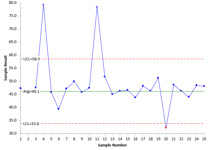
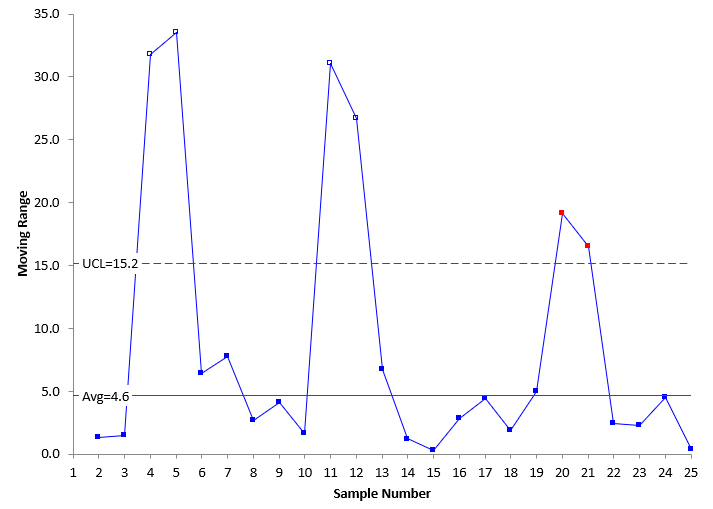
Figures 5 and 6 show the X and moving range charts with the out of control points removed from the calculations.
Figure 5: X Chart With Initial Out of Control Points Removed
Figure 6: Moving Range Chart With Initial Out of Control Points Removed
The SPC for Excel software has an option to remove all the points beyond the control limits. When it does this, the points that were excluded from the calculations are still plotted but just as an outline, not filled in. This way you know that the point is not in the calculations.
Figure 5 shows the X chart with the two original out of control points removed from the calculations. You can see that the control limits are much tighter now. The same is true for the moving range in Figure 6. The table below shows the changes in control limits.
| Control Charts | UCL | Avg | LCL | |
|---|---|---|---|---|
| Original | X Chart | 72.7 | 48.8 | 24.8 |
| mR Chart | 29.4 | 9.0 | ||
| Remove Out of Control Points | X Chart | 58.5 | 46.1 | 33.8 |
| mR Chart | 15.2 | 4.6 |
You can see that the average range in Figure 6 is about half of what it was in the original moving range chart in Figure 4. Removing the out of control points had a significant impact on the control limits.
But, there are still out of control points on the two charts. Removing the original out of control points causes an additional out of control point. Now what do you do? It is decision time again. You can leave the limits where they are in Figures 5 and 6 and extend them into the future.
Or you can remove the out of control point in Figure 5 and see what happens to the control limits.
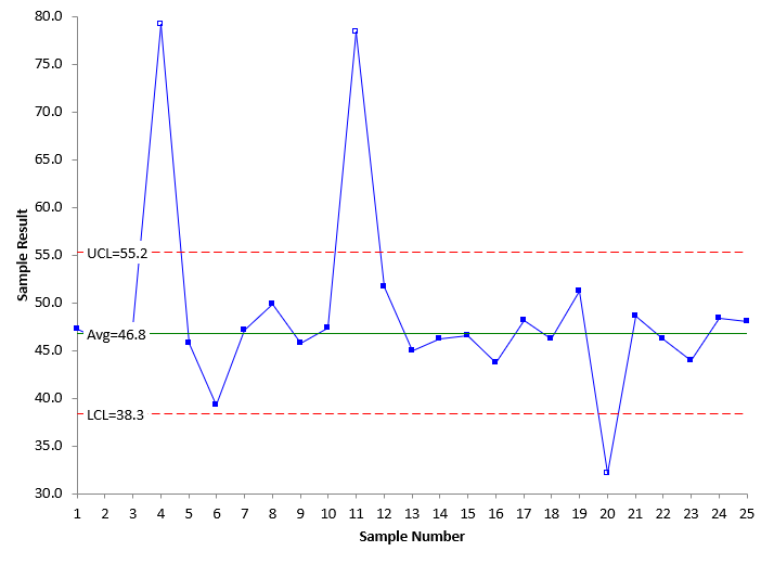
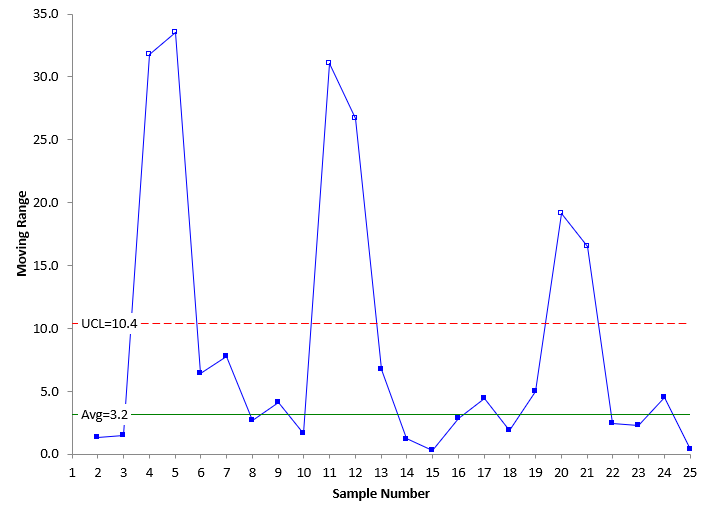
We will opt to remove the out of control point. Figures 7 and 8 are the control charts with the third out of control point removed.
Figure 7: X Chart With Second Removal of Out of Control Points
Figure 8: Moving Range Chart With Second Remove of Out of Control Points
The control limits in Figures 7 and 8 are the limits based on no out of control points. These control limits can be extended in to the future and used to judge future process performance. The table below shows the changes in control limits as the out of control points where removed.
| Control Charts | UCL | Avg | LCL | |
|---|---|---|---|---|
| Original | X Chart | 72.7 | 48.8 | 24.8 |
| mR Chart | 29.4 | 9.0 | ||
| 1st Removal Out of Control Points | X Chart | 58.5 | 46.1 | 33.8 |
| mR Chart | 15.2 | 4.6 | ||
| 2nd Removal Out of Control Points | X Chart | 55.2 | 46.8 | 38.3 |
| mR Chart | 10.4 | 3.2 |
There was not that much of a change in the control limits when removing the third out of control point.
A Word of Caution About Removing Out of Control Points
If you process is widely out of control, then be careful about using the above procedure. It is possible that you end up with tight control limits and a lot more out of control points in the future. If you are widely out of control, then just use the control limits including the out of control points. Once you have gotten your process under better control, you can use the above procedure.
Summary
This publication examined the impact of out of control points on setting the baseline average and control limits. If less than 10% of our datapoints in the baseline data set are out of control, then remove those points from the calculations. If there are more than 10% out of control, you will have to make a decision about leaving them in or removing at least some of them. This will depend on your process knowledge.
