February 2021
(Note: all the previous SPC Knowledge Base in the measurement systems analysis category are listed on the right-hand side. Select this link for information on the SPC for Excel software.)

In this issue:
- Definitions of Bias and Linearity
- Example Data Set
- Calculate the Bias
- Calculate the Average Bias per Part
- Calculate the Best Fit Line Between Reference Values and Biases
- Determine if the Slope is Significant
- Calculate the Confidence Interval Around the Best-Fit Line
- Create the Linearity Chart
- Summary
- Quick Links
You may download a pdf version of this publication at this link. Please feel free to leave a comment at the end of the publication.
Definitions of Bias and Linearity
We will use the Measurement Systems Analysis manual from the Automotive Industry Action Group (AIAG) to define bias and linearity. From the fourth edition of the manual:
Bias: The difference between the observed average of measurements (trials under repeatability conditions) and a reference value; historically referred to as accuracy. Bias is evaluated and expressed at a single point within the operating range of the measurement system.
Linearity: The difference in bias errors over the expected operating range of a measurement system. In other terms, linearity expresses the correlation of multiple and independent bias errors over the operating range.
Bias is how well your measurements compare to a reference value while linearity is assessing how accurate the measurements are over the operating range of the measurement system.
There have been two earlier SPC Knowledge Base articles on bias and linearity from 2007.
This SPC Knowledge Base article updates some of the prior information with an increased focus on the calculations.
Example Data Set
A new measurement system will be used to monitor production for some quality characteristic. Five parts are selected from the process that represent the range of the quality characteristic in production. The reference values of each part are determined. Then one operator measures each part ten times. The data are shown in Table 1.
Table 1: Example Data
| Part | 1 | 2 | 3 | 4 | 5 |
|---|---|---|---|---|---|
| Ref Value | 7 | 9 | 11 | 13 | 15 |
| 1 | 7.7 | 10.1 | 10.8 | 12.6 | 14.1 |
| 2 | 7.5 | 8.9 | 10.7 | 12.7 | 14.3 |
| 3 | 7.4 | 9.2 | 10.9 | 12.8 | 14.5 |
| 4 | 7.5 | 10 | 10.9 | 12.7 | 14.3 |
| 5 | 7.7 | 8.8 | 11 | 12.8 | 14.4 |
| 6 | 7.3 | 8.9 | 11.1 | 12.8 | 14.5 |
| 7 | 7.5 | 8.9 | 11 | 12.8 | 14.5 |
| 8 | 7.5 | 8.9 | 11.1 | 12.7 | 14.5 |
| 9 | 7.4 | 8.9 | 11.4 | 12.8 | 14.6 |
| 10 | 7.4 | 9 | 11.3 | 12.5 | 14.2 |
We will set g = the number of parts and m = the number of replications. We will use “i” to denote the part number and “j” to denote the replication. We will walk through the calculations beginning with bias.
Calculate the Bias
The first step is to calculate the bias for each individual reading. The bias for an individual reading is given by:
Bij = xij – RVi
where Bij is the bias for the jth replication for part i, xij is the measurement value for the jth replication for part i, and RVi is the reference value for part i.
The reference value for part 1 is given by RV1, the reference value for part 2 is given by RV2, and so on.
The bias for the first point in Table 1 is then the difference between the measurement value for the first replication (7.7) and the reference value for part 1 (7).
B11 = x11 – RV1 = 7.7 – 7 = 0.7
Table 2 shows all the bias calculations.
Table 2: Bias Calculations
| Part | 1 | 2 | 3 | 4 | 5 |
|---|---|---|---|---|---|
| 1 | 0.7 | 1.1 | -0.2 | -0.4 | -0.9 |
| 2 | 0.5 | -0.1 | -0.3 | -0.3 | -0.7 |
| 3 | 0.4 | 0.2 | -0.1 | -0.2 | -0.5 |
| 4 | 0.5 | 1 | -0.1 | -0.3 | -0.7 |
| 5 | 0.7 | -0.2 | 0 | -0.2 | -0.6 |
| 6 | 0.3 | -0.1 | 0.1 | -0.2 | -0.5 |
| 7 | 0.5 | -0.1 | 0 | -0.2 | -0.5 |
| 8 | 0.5 | -0.1 | 0.1 | -0.3 | -0.5 |
| 9 | 0.4 | -0.1 | 0.4 | -0.2 | -0.4 |
| 10 | 0.4 | 0 | 0.3 | -0.5 | -0.8 |
| Sum | 4.9 | 1.6 | 0.2 | -2.8 | -6.1 |
| Average | 0.49 | 0.16 | 0.02 | -0.28 | -0.61 |
Calculate the Average Bias per Part
The next step is to calculate the average bias for each part. The average bias for part i is given by:
where the summation is over the number of replications for part i. The averages for all 5 parts are also shown in Table 2.
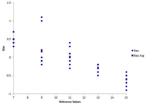
With these calculations, you can now start the linearity chart. At this point, you can plot the individual bias results and the average bias for each part against the reference values. The resulting chart is shown in Figure 1.
Figure 1: Start of Linearity Chart
This chart shows that there is evidence of linearity in the measurement system. The bias is changing as the reference value increases.
Calculate the Best Fit Line Between Reference Values and Biases
The next step is to add the best-fit line between the reference values and the individual bias. So, you want to generate a regression line for the following data in Table 3:
Table 3: Regression Data
| RV | Bias | RV | Bias | RV | Bias | ||
|---|---|---|---|---|---|---|---|
| 7 | 0.7 | 9 | -0.1 | 13 | -0.2 | ||
| 7 | 0.5 | 9 | -0.1 | 13 | -0.2 | ||
| 7 | 0.4 | 9 | 0.0 | 13 | -0.2 | ||
| 7 | 0.5 | 11 | -0.2 | 13 | -0.3 | ||
| 7 | 0.7 | 11 | -0.3 | 13 | -0.2 | ||
| 7 | 0.3 | 11 | -0.1 | 13 | -0.5 | ||
| 7 | 0.5 | 11 | -0.1 | 15 | -0.9 | ||
| 7 | 0.5 | 11 | 0.0 | 15 | -0.7 | ||
| 7 | 0.4 | 11 | 0.1 | 15 | -0.5 | ||
| 7 | 0.4 | 11 | 0.0 | 15 | -0.7 | ||
| 9 | 1.1 | 11 | 0.1 | 15 | -0.6 | ||
| 9 | -0.1 | 11 | 0.4 | 15 | -0.5 | ||
| 9 | 0.2 | 11 | 0.3 | 15 | -0.5 | ||
| 9 | 1.0 | 13 | -0.4 | 15 | -0.5 | ||
| 9 | -0.2 | 13 | -0.3 | 15 | -0.4 | ||
| 9 | -0.1 | 13 | -0.2 | 15 | -0.8 | ||
| 9 | -0.1 | 13 | -0.3 |
The reference values represent the x values and the average biases represent the y values in regression lingo. The equation being fitted then is:
y = bo + b1x
B = bo + b1(RV)
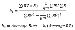
where b0 = y intercept and b1 = slope. You can use Excel’s built in regression to determine the values of b0 and b1. You can also use the equations below to calculate the values.
The following values can be used in the equations above:
- ΣRV*B) =- 77
- ΣRV = 550
- ΣB = -2.2
- Σ(RV2) = 6450
- g = 5
- m = 10
- Average Bias = -0.044
- Average RV = 11
The values of bo and b1 are then:
bo = 1.408
b1 = -0.132
Determine if the Slope is Significant
If there is no linearity in the bias results, i.e., the bias is the same at all reference values, you would expect b1 to be zero. However, because of variation, you will rarely get b1 = 0. The question you have to answer is:
Is the slope (b1) significantly different from 0?
You can do this in a number of ways. One is to calculate the t-statistic and determine the p-value associated with that t-statistic.
The t-statistic is given by:
where s is the standard deviation, which is given by:
The only new term in the equation for s above is Σ(B2) which is 10.14. Putting the values into the above equation gives:
You can calculate the t-statistic. The sum of the RV – average RV for all measurements is 400 so the t-statistic is given by:
The question you ask now is what is the probability you would get this t-statistic if the slope (linearity) is really 0? To find that, we can make use of the TDIST function in Excel. If you enter the following function TINV(|10.43|, 48, 2), it will give you the probability of getting a t value of 10.43 with 48 degrees of freedom when the slope is really zero. If this probability is less than 0.05, you will conclude the probability is small, so the slope must not be zero. In this example, the probability is very small (6.2E-14) so we conclude that the slope is not zero and the bias changes over the operating range of the measurement system.
Calculate the Confidence Interval Around the Best-Fit Line
The calculations now turn to the confidence limits around the regression line. The equations for calculating the lower and upper confidence bands are given below (for 95% confidence):
where RV0 is a given reference value, e.g., 7. You will need to select several reference values over the range to create the line. All the variables in the above equations are defined given above. Using RV0 = 7, gives the following results:
Lower Confidence Bound = 0.3594
Upper Confidence Bound = 0.60863
Create the Linearity Chart
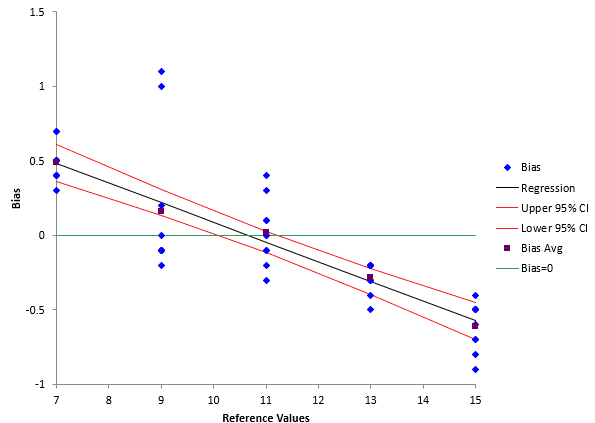
You can now add three lines to the linearity chart: the best-fit line and the two confidence bounds. This is shown in Figure 2
Figure 2: Linearity Chart
A fourth line where bias = 0 has also been added. The linearity chart presents clear picture of what is happening over the operating range for the measurement system. It is clear that the bias is changing. It is decreasing as the reference value goes up.
Summary
This publication showed the major calculations involved in a gage linearity study. The purpose of the study is to determine if the bias changes over the operating range of the measurement system. You can download an example of the linearity gage output from SPC for Excel at this link. This output gives more information, for example, which bias values are significantly different than zero.


Is there a reason why the y-int on the graph does not match the calculated y-int?
The chart x axis stops at 7. It doesn’t go as far the value of Bo.
I am unable to get your values for the upper and lower confidence bounds for reference value equal to 7. Can you confirm these are correct? If so, can you enter the values for each term in the upper and lower confidence bound equations for reference value equal to 7? Similar to what you did for s above.
The values are correct. Here are values used in equation:
bo 1.408
b1 -0.132
xo 7
t 2.0106
s 0.253048
n 50
xbar 11
xi reference values
sum(xi-xbar)^2 400