December 2021
(Note: all the previous SPC Knowledge Base in the measurement systems analysis category are listed on the right-hand side. Select this link for information on the SPC for Excel software.)

This publication compares these two methods to see which one is better for monitoring a test method over time. In this publication:
- Importance of Test Methods
- Separating Noise from Signals in Test Methods
- Example Data
- Levey-Jennings Chart Results
- Individuals Control Chart Results
- Comparing the Results
- Summary
- Quick Links
You may download a pdf version of this publication at this link. Please feel free to leave a comment at the end of the publication.
Importance of Test Methods
We measure to know where we are. Are things improving? Getting worse? Staying the same? We tend to look at a test result as being the “true” value of the sample. Of course, we know it is not. Test methods, like all processes, have variation. You most likely will not get the same result if you test the same sample multiple times.
We want test methods to be accurate and precise. One method of ensuring this is to monitor the accuracy and precision of the test method over time. This is done by testing a standard over time. If the average of the standard results is close to the true “value” of the standard, then the test method is accurate. If the repeat measurements on the standard are close together, then the test method is precise. A standard is something that we know the true value. If you don’t have a standard, you can use a control in its place. For example, in a PVC plant, there is not a known standard that has a certain particle size, moisture, density or some other metric. In this case, you set aside a large sample of the material and use it as a control.
How do we tend to “rate” a test method? Gage R&R studies are used to find out the repeatability and reproducibility of the test method. Then the % variance due to the test method can be found. The basic equation describing the relationship between the total variance, the product variance and the test method variance is given below.
σx2= σp2+ σe2
where σx2= total variance of the product measurements, σp2= the variance of the product, and σe2= the variance of the test method. The % of the total variance due to the test method is then given by 100(σe2/σx2).
Separating Noise from Signals in Test Methods
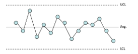
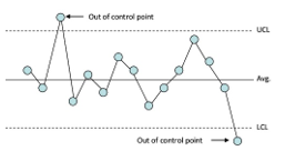
The Levey-Jennings and X-mR charts both use this approach. One difference between the two – and a major difference – is the way the variation in individuals values is calculated. The Levey-Jennings chart uses the “global’ standard deviation. This is the calculated standard deviation, e.g., by using all the data and Excel’s STDEV function. The X-mR chart estimates the variation in individual values from the average range on the moving range chart. This value is called sigma. The other major difference is that the Levey-Jennings chart is one chart – where the individual results are plotted – while the X-mR chart is actually two charts: one where the individual results are plotted and one where the moving range between consecutive points is plotted. These two differences are critical in deciding which method to use.
Example Data
A test method measures a person’s cholesterol level. To monitor the stability of the test method, the lab runs a control daily. The results for the last 45 days are shown below in Table 1. The control has a known value of 200 mg/dL.
Table 1: Control Results
| Sample | X | Sample | X | |
|---|---|---|---|---|
| 1 | 200.0 | 24 | 199.5 | |
| 2 | 189.5 | 25 | 199.0 | |
| 3 | 202.0 | 26 | 202.5 | |
| 4 | 211.0 | 27 | 199.5 | |
| 5 | 181.5 | 28 | 202.5 | |
| 6 | 189.0 | 29 | 199.5 | |
| 7 | 199.5 | 30 | 203.0 | |
| 8 | 199.5 | 31 | 204.0 | |
| 9 | 199.5 | 32 | 199.5 | |
| 10 | 224.5 | 33 | 201.5 | |
| 11 | 199.0 | 34 | 210.5 | |
| 12 | 196.0 | 35 | 211.5 | |
| 13 | 196.0 | 36 | 224.5 | |
| 14 | 187.5 | 37 | 193.5 | |
| 15 | 205.0 | 38 | 188.5 | |
| 16 | 194.0 | 39 | 206.5 | |
| 17 | 198.0 | 40 | 218.5 | |
| 18 | 187.5 | 41 | 198.0 | |
| 19 | 219.5 | 42 | 200.5 | |
| 20 | 208.0 | 43 | 200.5 | |
| 21 | 209.5 | 44 | 200.0 | |
| 22 | 203.5 | 45 | 202.0 | |
| 23 | 200.0 |
These results will be used to compare the Levey-Jennings chart and the X-mR chart. The Levey-Jennings chart will be considered first.
Levey-Jennings Chart Results
The Levey-Jennings charts begins by plotting the individual sample results over time. The average is then calculated and added to the chart. Since the value of the control is known, you could use that value instead of the average. You could also use the known value to determine if the test method is accurate. We will use the average value for our purposes here. The control limits are then calculated and added to the chart.
Let k = the number of samples. In this example, k = 45. The average is given by:
X=∑Xi/k
where Xi is the ith test result for the control. The average for the 45 test results in Table 1 is 201.43.
The control limits for the Levey-Jennings chart are given by the following:
UCL =X + 3s
LCL =X– 3s
where s = the calculated standard deviation of the test results for the 45 controls and is given by:
The standard deviation is 9.07. This is the value you will get if you use the STDEV function in Excel. The control limits are then:
UCL =X+ 3s = 201.43 + 3(9.07) = 228.64
LCL =X– 3s = 201.43 – 3(9.07) = 174.22
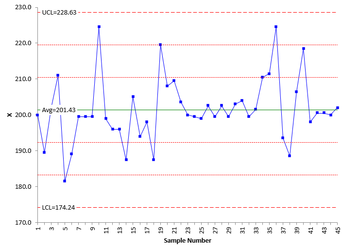
The finished Levey-Jennings chart is shown in Figure 1.
Figure 1: Levey-Jennings Chart
The chart contains the individual test results, the average, and the control limits. The UCL and LCL are +/- 3 standard deviations from the average. There are also two other lines plotted above the average and two other lines plotted below the average. These lines represent +1 and +2 standard deviations above the average and -1 and -2 standard deviations below the average. These lines are used to help interpret the Levey-Jennings chart.
The chart is now finished, and it is time to interpret the chart – i.e., look to see if signals are present or if there is just noise present and the test method is consistent and predictable. To discover this, you apply some tests or rules. For the Levey-Jennings chart, these are called the Westgard rules. A signal occurs if one of the following patterns exists:
- A point falls outside one of the three standard deviation limits
- Two successive points fall outside one of the two standard deviation lines
- Four successive points fall outside one of the one standard deviation lines
- Ten successive values all fall on the same side of the central line
- Two successive values are on opposite sides of the central line and are both beyond the two standard deviation lines
None of these patterns exist in Figure 1. The conclusion using the Levey-Jennings chart is then that the test method is consistent and predictable. For more information on the Levey-Jennings chart, please see our SPC Knowledge Base article Levey-Jennings Charts.
What does the X-mR chart tell you about this test method?
Individuals Control Chart Results
The X-mR is really two charts: the X chart and the moving range (mR) chart. The individual test results (the X values) for the control are plotted on the X chart. In addition, the moving range between consecutive points is plotted on the mR chart. There is no moving range for the first sample since you need two results to calculate the moving range. The first sample result in Table 1 is 200. The second sample result is 189.5. The first moving range is then |189.5 – 200| = 10.5. Note the moving range is always positive. The third sample result is 202.0. Thus, the second moving range is |202.0 – 189.5| = 12.5.
Once the X and the moving range values are plotted on their respective charts, the averages and control limits are calculated and added to the charts. The control limits are calculated differently for the X-mR than for the Levey-Jennings chart.
The calculations for the moving range chart are given below:
R=∑Ri/(k-1)
UCLr = 3.268R
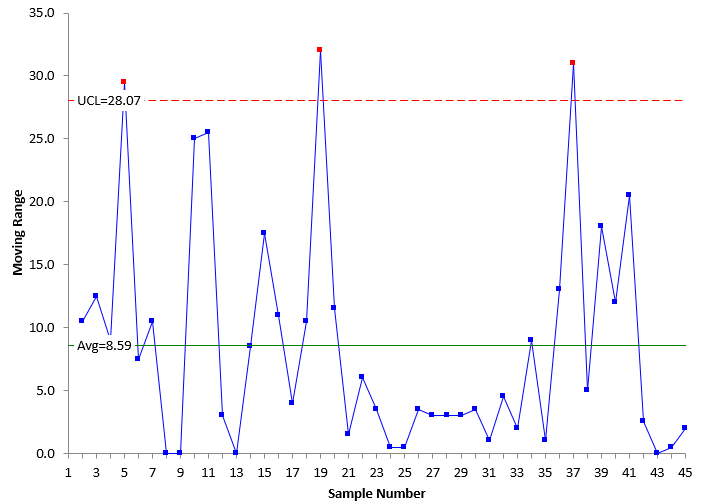
where R is the average moving range, UCLr is the upper control limit for the range chart. There is no lower control limit for the moving range chart when a moving range of 2 (between consecutive points) is used. The average moving range is 8.59. The
UCLr is then:
UCLr = 3.268R = 3.268(8.59) = 28.07
The calculations for the X chart are given below.
X=∑Xi/k
UCLx =X + 2.66R
LCLx =X – 2.66R
where UCLx and LCLx are the upper and lower control limits respectively for the X chart. The 2.66 and 3.268 used in the equations above are constants based on using a moving range of 2 in the analysis. The average (201.43) for the X chart is the same as the average for the Levey-Jennings chart . However, note that the control limits on the X chart are calculated differently than for the Levey-Jennings chart. The control limits for the X chart are:
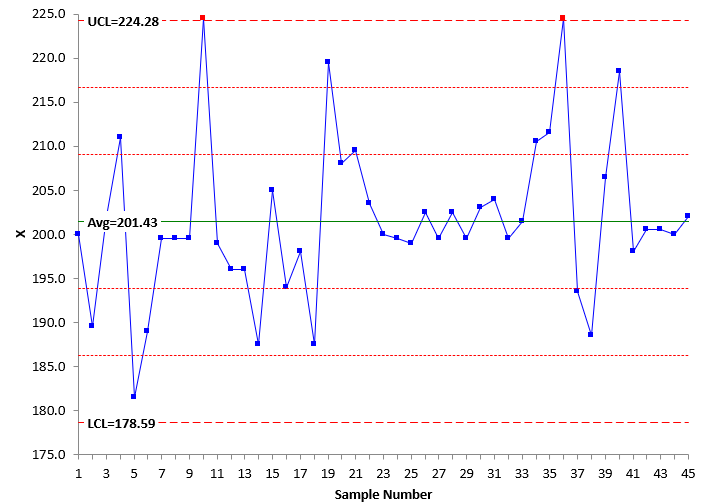
UCLx =X + 2.66R = 201.43 + 2.66(8.59) = 224.28
LCLx =X – 2.66R = 201.43 + 2.66(8.59) = 178.58
The X chart and the moving range chart are shown in Figure 2 and 3, respectively.
Figure 2: X Chart
Figure 3: mR Chart
Now, the charts can be interpreted for signals. There are rules for looking for signals with the X-mR as well. The most common rules are the zone tests. These are based on dividing the X chart into three zones above and below the average line. Each zone has a width of one sigma. Zone C is the zone between the average and 1 sigma, Zone B is the zone between 1 and 2 sigma, and Zone B is between 2 and 3 sigma. These zone tests are also called the Western Electric tests and are given by:
- One point beyond the LCL or UCL
- Two out of three consecutive points in Zone A or beyond
- Four out of five consecutive points in Zone B or beyond
- Eight or more points in Zone C or beyond
The Westgard rules are actually variations of these tests. There are additional tests for interpreting the X-mR for stability. For more information on interpreting the X-mR chart (as well as other control charts), please see our SPC Knowledge Base article Applying the Out of Control Tests. You can also learn more about X-mR chart with our SPC Knowledge Base article Individuals Control Charts.
In Figure 2, you can see there are two points beyond the control limits on the X chart and, in Figure 3, three points beyond the control limits on the moving range chart. These are signals that the test method has changed. The X-mR picked these signals up. Note that the moving range picked up three out of control points. This points to the importance of using both the X control chart and the moving range control chart when monitoring a test method. The Levey-Jennings chart did not pick up these signals. Why is that?
Comparing the Results
Why does the Levey-Jennings chart show that the test method is consistent and predictable while the X-mR chart shows there are signals that something has changed? The difference, of course, is in the control limits. The Levey-Jennings chart uses the calculated standard deviation (for example, from STDEV in Excel). The equation is repeated below.
The individuals chart uses what is called +/- three sigma limits (not three calculated standard deviations). The three sigma limits are defined as 2.66R from the control limit equations above. This can be written as:
3σ= 2.66R
where σ is called sigma – the estimated value of the standard deviation using the average moving range. This can be rewritten as the way you normally see it:
σ=R/1.128
The values of s and sigma are different: s = 9.07 and sigma =σ=R/1.128= 8.59/1.128 = 7.62. Sigma is less than the calculated standard deviation. The value of the calculated standard deviation (s) takes into account all the data at one time and forms one subgroup. On the other hand, sigma represents the within subgroup variation as it is based on the moving range between consecutive points. There is a significant difference between these two values: one is incorrect to use when trying to separate the signals from the noise, and one is correct to use.
Dr. Donald Wheeler has shown that that is always wrong to use the “global” standard deviation (the calculated standard deviation) to try to separate signals from noise. Please see Dr. Wheeler’s article Separating the Signals from the Noise for more information (www.spcpress.com). If you use the global standard deviation, you are making the assumption that the data are homogeneous. That is not always the case, as shown above. The out of control points inflate the calculated standard deviation, which leads to a wider range of control limits for the Levey-Jennings chart – and potentially missed signals. This implies it is better to use the X-mR chart than the Levey-Jennings chart because of potentially missing signals that the test method has changed.
This implies then that, if there are no out of control points, the calculated standard deviation is not inflated, and you should get similar results for the Levey-Jennings chart and the X-mR chart. Let’s see. Table 2 represents data from a process that is in statistical control.
Table 2: In Control Process Data
| Sample | X | Sample | X | |
|---|---|---|---|---|
| 1 | 212.0 | 11 | 186.0 | |
| 2 | 186.0 | 12 | 185.5 | |
| 3 | 194.0 | 13 | 199.0 | |
| 4 | 194.5 | 14 | 201.5 | |
| 5 | 193.5 | 15 | 203.5 | |
| 6 | 197.0 | 16 | 197.5 | |
| 7 | 183.5 | 17 | 221.0 | |
| 8 | 187.5 | 18 | 188.0 | |
| 9 | 194.0 | 19 | 178.0 | |
| 10 | 222.0 | 20 | 210.5 |
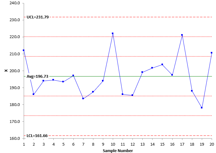
Figure 4 shows the Levey-Jennings chart for the data in Table 2. This chart does not show any signals.
Figure 4: Levey-Jennings Chart for In-Control Data
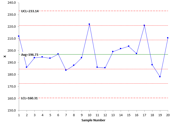
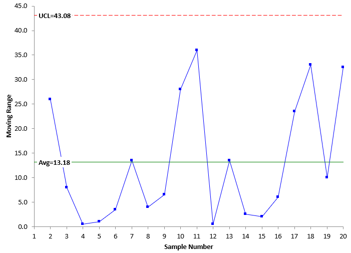
Figures 5 and 6 are the X and moving range charts, respectively, for the data in Table 2. Both these charts are in statistical control
Figure 5: X Chart for In-Control Data
Figure 6: Moving Range Chart for In-Control Data
Compare the Levey-Jennings chart to the X chart. They are almost identical. You reach the same conclusion: the test method is consistent and predictable – no problems seen. This is because the test method is in statistical control.
The calculated standard deviation of the data in Table 2 is 12.14 . This is the value that was used to set the control limits for the Levey-Jennings chart in Figure 4. Sigma is estimated from the average range in Figure 6: sigma = R/1.128 = 13.18/1.128 = 11.68. These two values are very close – as expected since the process is in statistical control. The control limits are essentially the same in this case for the Levey-Jennings chart and the X control chart. This will be true when the test method is consistent and predictable – no signals present. It may not be true if there are signals present.
Summary
It is important to monitor the stability of test methods – just like it is for any key process. Two methods of doing this are the Levey-Jennings chart and the X-mR chart. These differ in the variation used to separate a signal from the noise. The Levey-Jennings chart uses the calculated standard deviation while the X-mR chart uses the estimated sigma, based on the average range. The problem is that the calculated standard deviation is inflated if the test method is not in statistical control. This leads to signals being potentially missed. This is not the case with the X-mR chart.
For monitoring the stability of a test method, the X-mR chart is preferred because of the way the X-mR chart separates the signals from the noise. Also, the moving range chart gives additional information about the stability of the test method, and it should always be used when monitoring the consistency of a test method.

I would like to add the following:
To my knowledge, labs often use the global standard deviation to chart and monitor the performance of Quality Control samples, hence of an analytical method. The NORDTEST Report 569 ( Version 5.1, 2018, available in the web) for environmental laboratories use a Levey-Jennings chart for control samples and a Range-chart to monitor method repeatability only when control samples or test samples are tested in replicates. Westgard rules which are widely used in clinical/medical labs are also all based on the global standard deviation (Levey-Jennings charts). It seems to me that the global standard deviation is perceived as representing better the variation of an analytical method applied in real-life circumstances.
It seems to me that the X-mR chart, like Shewhart charts, are ideally suited to evaluate a manufacturing process whereby simple items are made sequentially or continuously in a production line. In the pharmaceutical industry, batches of a drug product are made one after the other, but with varying time durations in between (days, weeks or even months) and varying lots of same ingredients. Under these conditions, industry experts have recommended to use only the global standard deviation, because this captures better the long-term variation of the real process ( i.e. Levey-Jennings chart) and thus, lowers the rate of false alarms (See: An Industry Position Paper with Example Plan, BioPhorum Operations Group (2014), Chapter 12, P. 84, http://www.biophorum.com/cpv-case-study).
So, I would say that the need to adjust SPC rules to real-life data – laboratory or process data- is worth considering.