May 2021
(Note: all the previous SPC Knowledge Base in the control charts basics category are listed on the right-hand side. Select this link for information on the SPC for Excel software.)

To understand when to adjust a process and when not to, one has to look for signals in the data that could indicate an adjustment is needed. If you learn to look at the data properly, you will be able to separate the process noise from the process signals. Control charts are at the heart of this approach.
A control chart is the way a process communicates with you. It will tell you if everything is alright in the process (just noise present) or if there is a problem that needs to be addressed (a signal is present).
This publication examines how control charts are used to determine when to adjust the process. There are two Chief Chemists (Sam and Mary) monitoring the same test method at two different labs by running a standard on a regular basis. They both are “doing” the same thing, but their two processes are different – and this difference leads to one process having much more variability than the other.
In this issue:
- Introduction
- A Tale of Two Chief Chemists
- Chief Chemist Sam’s Process
- Chief Chemist Mary’s Process
- Comparing the Two Approaches
- But the Result is Out of Spec?
- Comparison to the Funnel Experiment
- Simulation to Create the Data
- Summary
- Quick Links
Please feel free to leave a comment at the end of this publication. You can also download a copy of this publication at this link.
Introduction
A long time ago, I worked in a PVC plant. I was in charge of the plant lab. Part of the production process involved drying the resin through a rotary dryer. You didn’t want the resin too dry or too wet. So, a goal was set for % moisture for the various resins, e.g., 0.10% moisture. If the lab result from a sample was too far away from 0.10%, the process was adjusted. If it was too wet, the dryer temperature was raised. If it was too dry, the dryer temperature was lowered. Eventually, some internal specifications were created. If the % moisture was not between 0.09% and 0.11%, the process was adjusted. Many of the processes had similar internal specifications. This seemed like a reasonable approach to determining when to adjust a process. Of course, I hadn’t heard of control charts yet.
The lab I was in charge of had many measurement processes. A similar question existed for the lab processes as well – when to adjust or calibrate. Most lab measurement processes were set on a time basis for calibration – daily, monthly, twice a year, etc. Time dictated when to adjust a measurement process in the lab. This seemed like a reasonable approach for keeping the measurement processes accurate and precise. Again, that was before I had heard of control charts.
Then my knowledge base changed significantly. A major customer was requiring that we begin to use Statistical Process Control (SPC), whatever that was. I spent a significant amount of time learning what SPC was. And I discovered that there was an entirely different way to approach when to adjust and when not to adjust a process – both lab and production processes. And it all revolved around this simple tool called a control chart.
A Tale of Two Chief Chemists

Sam and Mary also knew that a special cause of variation represents a signal from the process that something has changed. They both knew the tests to discover if a special cause of variation existed, such as points beyond the control limits.
The companies Sam and Mary work for happen to make the same product. The color of the product is critical. The two labs use the same test method to monitor the color of the product. And both Sam and Mary test a standard on a regular basis to ensure that the test method is in statistical control – a particularly good use of control charts.
But there is a major different between the two approaches used by Sam and Mary in monitoring the test method. One shows a deeper understanding of control charts and when to adjust a process.
Chief Chemist Sam’s Process
Sam understands it is important to monitor the consistency of a test method over time. This is done by routinely testing a standard or control over time and monitoring the results using an individuals (X-mR) control chart.
For the color test method, a standard plate is measured daily. The color value of the standard plate is 100. Of course, test methods have variability like any other process, so the test result is not always 100. Suppose today, Sam gets a value of 101 as the observed result. It is off by 1 from the standard plate with a value of 100. Is this difference significant?
The supplier of the color test method recommended to Sam that he calibrate the test method daily. If the lab test on the standard is not within +/- 0.1 of 100, the test method should be adjusted to account for this difference. In this way, the test method is always fine-tuned for those small differences. This is what Sam did – after all, it is the recommended approach from the test method supplier.
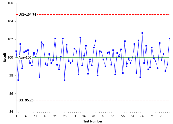
Sam monitored the color standard test results over time using the X-mR chart. The X chart he created for the last 80 test results is shown in Figure 1. Sam had to adjust the test method almost daily.
Figure 1: X Chart for Sam’s Process
The value of the standard for each test is plotted on the X chart. The average and control limits are then calculated. The chart can now be interpreted for statistical control. There are no points beyond the control limits or any patterns, so the lab test is in statistical control. It is consistent and predictable. The average of the 80 tests is right at 100 – the value of the standard. Sam is happy that he controls the color test method so tightly to the value of the standard.
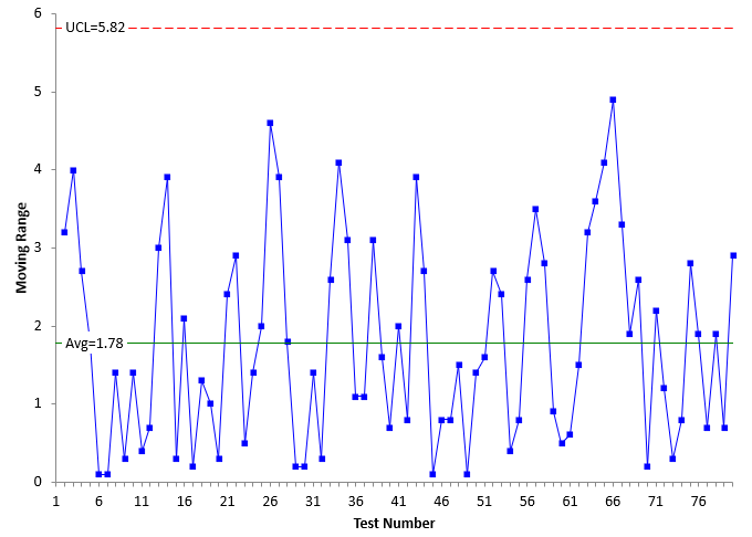
The moving range between consecutive points are plotted on the moving range (mR) chart. That chart is shown in Figure 2.
Figure 2: Moving Range Chart for Sam’s Process
The average moving range and UCL are calculated. The mR chart can now be interpreted. There are no points beyond the control limits and no patterns in the moving range values. The mR chart is in statistical control.
Sam is extremely happy. The test method is in statistical control. The lab is providing good data to production to control their process!
Since the mR chart is in statistical control, Sam can estimate the measurement system standard deviation (σms) from the average moving range:
σms=R/1.128= 1.78/1.128 = 1.58
This value is a measurement of the variation (precision) of the test method.
Chief Chemist Mary’s Process
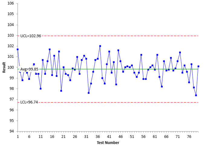
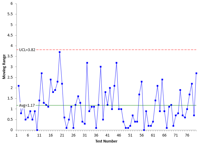
Mary also monitors the color test method. Mary, though, had learned more than Sam about SPC. She had sought to really understand control charts, learning that a control chart will send you a signal if a process needs to be adjusted or investigated. Mary also ran the standard on the daily basis, but unlike Sam, she did not adjust the test method unless there was a signal. Mary also constructed a control chart for the results. The X and mR charts are shown in Figures 3 and 4.
Figure 3: X Chart for Mary’s Process
Figure 4: mR Chart for Mary’s Process
The X and mR charts are in statistical control. The average on the X chart is close to the standard – not as close as for Sam though. Since the mR chart is in statistical control, Mary can estimate the standard deviation (σms) from the average moving range:
σms=R/1.1288 = 1.17/1.128 = 1.04
Comparing the Two Approaches
Both Sam and Mary are monitoring the color test method using a standard and the X-mR control chart. Both processes are in statistical control. The averages of both X charts are very close to the standard plate value of 100. Both have estimated the standard deviation of the measurement system. All is good in both cases. Or is it?
Compare Figure 1 to Figure 3, the two X charts. The scales are the same on both charts. What do you notice that is different between the two figures? The width of the control limits is different. Figure 1 (Sam’s process) has wider control limits that Figure 3 (Mary’s process). The same is true for the mR chart. There is more variation in Figure 2 (Sam’s process) than Figure 4 (Mary’s process).
The reason for this can be seen by the value of σms for each process. The value is 1.58 for Sam’s process and 1.04 for Mary’s process. Table 1 summarizes the differences in the two processes.
Table 1: Comparing the Two Processes
| Metric | Sam | Mary |
|---|---|---|
| X | 100.00 | 99.85 |
| LCLx | 95.26 | 96.74 |
| UCLx | 104.74 | 102.96 |
| R | 1.78 | 1.17 |
| UCLr | 5.82 | 3.82 |
| sms | 1.58 | 1.04 |
Why is there so much less variation in Mary’s process? The answer is simple. She understands the proper way of adjusting a process when using a control chart. You do not adjust a process unless there is a signal from the control chart that something has changed. If there is a signal (a special cause), you have to find out what happened in the process to cause that signal and eliminate it from coming back. You may or may not have to actually adjust the process. But, if you have to, the only time you should do that is when there is a signal from the process. There were no signals from Mary’s charts, so she never adjusted the process.
Sam, on the other hand, didn’t realize that you don’t adjust a process unless there is a signal. What Sam did does create a process that is stable, in statistical control. But Sam’s process has much more variation. Adjusting a stable process, simply increases the variation in a process.
Some may ask why the adjustments don’t show up as out of control points on Sam’s charts. After all, the adjustments are special causes, right? If a special cause essentially occurs all the time – is always present – the result is that the control limits are wider, and the special causes are hidden. Just what we saw with Sam’s chart.
If the process is in statistical control, leave it alone. Do not make any adjustments until there is a signal that an adjustment might be needed.
But the Result is Out of Spec!
Your process is in statistical control. The last result is out of specifications – but within the control limits. What do you do? It is out of spec – you have to do something, right? Adjust the process to get it back within spec?
The answer is that you should do nothing. If the process is in statistical control and still producing out of spec material, it simply means that your process is not capable of meeting specifications. The next sample result will probably be back in specification. The reality is that, for a process in statistical control, there is no statistical difference in the results. Until you reduce the process variation to make the process capable, the only thing to do is to ship everything. There is no difference in the output. For more information, please see our SPC Knowledge Base article The Problem of In Control but Out of Specifications.
Comparison to the Funnel Experiment
What Sam was doing is called “overcontrolling” a process. This occurs when you adjust a process that is in statistical control. There is an experiment that helps demonstrate what happens when you do this. It is called the Funnel Experiment. The objective of this experiment is to drop a marble through a funnel so that it ends up on a target. There are four rules used:
- Rule 1: Leave the funnel fixed over the target.
- Rule 2: For every drop, the marble will come to rest a distance “z” from the target. Rule 2 is to move the funnel a distance -z from its last position.
- Rule 3: Move the funnel a distance -z from the target after each drop of the marble that ends up a distance z from the target. Note that Rule 2 moves the funnel based on the funnel’s last position. Rule 3 moves the funnel a distance from the target.
- Rule 4: Rule 4 is simply to set the funnel over where the last drop came to rest.
This publication covered the first two rules. Mary was following Rule 1 – leave the process alone as long as it is in statistical control. Sam was basically following Rule 2 – adjusting the process after each drop. These two rules are stable processes. The difference is that Rule 2 has much more variation than Rule 1 as we saw above.
The funnel experiment is a great way to show what happens when you overcontrol a process. For more information, please see our SPC Knowledge Base article Over-Controlling a Process: The Funnel Experiment. We also have a YouTube video that explains the funnel experiment.
Simulation to Create the Data
The data used in this publication can be downloaded at this link. Mary’s data was generated using the random number generator in the SPC for Excel software for a normal distribution of 100 and a standard deviation of 1. Sam’s data was generated using a macro that used the random number generator with an average depending on the adjustment made and a standard deviation of 1. The adjustment was the result minus 100, the value of the standard. The control charts were made using the SPC for Excel software.
Summary
This publication showed the danger in adjusting a process that is in statistical control. Adjustments should not be made until a control chart sends a signal. This is true for all processes – whether they are production processes, service process, lab processes, etc. Overcontrolling a stable process leads to more variation in the output.
HiI have some opinion regarding the paragraph of "BUT THE RESULT IS OUT OF SPEC", the conclusion might not be suitable for automotive industry as it is asked if the process capability is less than 1.33 or even worse, let's say less then 1 that bad parts might be produced already, the organzation should do 100% sorting to ensure not bad parts are delivered out, follow by a plan how to improve the process till the process can really be improved at PPAP stage, so the conclusion of doing nothing would depend on industry and customer sensetivity about bad parts
That may well be what a customer wants you to do, but the truth is that there is no significant different between a part in spec and out of spec if the process is in control. The customer has already received parts that are out of spec and has used them most likely.
If a manufacturing company has declared a process capability that it is not able to meet despite the fact that the process is under statistical control without signals. For me, it means that someone promised to sell something but is not able to actually keep this promise. Sometimes the voice of the customer is too small compared to the voice of the process. I think that this is a common case because today marketers sell a product and promise miracles just to sign a contract. They often agree to a quality that they are not able to meet in reality, then the company incurs additional costs of complete control and sorting. What I mean is that in such cases it is not the fault of the process but of the people. This is my opinion from my experience.