August 2016
(Note: all the previous SPC Knowledge Base in the control charts basics category are listed on the right-hand side. Select this link for information on the SPC for Excel software.)
So, when do you have enough data? Two samples are obviously not enough. Thousands of samples are probably a few too many. How do you decide when there are enough data? The month’s publication takes a look at how you can determine this. And, of course, our old friend variation is a part of the process. There is always variation present – and you have to account for that uncertainty in determining how much data are enough.
In this issue:
- Introduction
- Our Process
- Impact of the Number of Samples on Control Limits
- Degrees of Freedom and Coefficient of Variation
- Determining the Degrees of Freedom
- Using the Knowledge to Obtain “Good” Control Limits”
- Summary
- Quick Links
Please feel free to leave a comment at the end of the publication. You may download a pdf copy of this publication at this link.
Introduction

To generalize this process, two statistical terms will be introduced: degrees of freedom and the coefficient of variation (COV). Don’t worry – it is done painlessly. Degrees of freedom is simply a measure of how much useful data you have. COV is a measure of the uncertainty in our data. There is a relationship between the degrees of freedom and COV that we will use to generalize the process of determining how much data you need to calculate control limits.
To complete the process, we need two things. One is a method of determining the degrees of freedom. There are simple equations to help us with this. Second, we have to determine how much uncertainty we want to live with. This will be up to you, but typically it is 15 to 20%.
Our Process
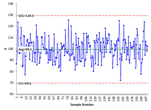
The first step in our analysis is to determine if the process (our dataset) is in statistical control. You can download the data set here if you would like. Figure 1 is the individuals control chart for our data.
Figure 1: X Chart for 200 Samples

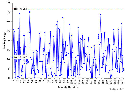
The moving range chart for our data is shown in Figure 2. The moving range is the range between consecutive samples. The moving ranges are plotted on the control chart. There are 199 moving range values since there is no moving range for the first sample. The average moving range and UCL are calculated and added to the control chart. There is no LCL for this moving range chart. It is in statistical control as well. The average moving range is 11.27 with an UCL of 36.81.
Figure 2: Moving Range Chart for 200 Samples
The averages and control limits were calculated using the 200 samples. That is a lot of samples, so we are pretty confident in these values, particularly since the process is consistent and predictable – in statistical control. If we took another 200 samples from our process, we would not get exactly the same results – but they would be close. What if we only took 10 samples? Would the results be as close? Maybe, but probably not.
Think about Figure 2 – the moving range control chart. What variation is this control chart monitoring? It is monitoring the variation in consecutive samples. Thus, the average moving range is a measure of the variation in individual results – what we call the standard deviation or sigma. You can estimate sigma from the average moving range:
σ=R/d2=R/1.128 = 11.27/1.128 = 9.99
where d2 is a control chart constant. For a moving range chart using the range between consecutive samples, d2 is 1.128. Our estimate of sigma, the variation in the individual values, is 9.99. The average moving range is also used to calculate the control limits for the X chart and moving range chart:

UCL = X + 2.66R
LCL = X – 2.66R
mR Chart:
UCL= 3.27R
The “quality” of our estimate of the average moving range definitely impacts how “good” our control limits are. So, how much data do we need to have “good” control limits?
Impact of the Number of Samples on Control Limits

Would you expect the control limits based on 5 samples to be the same as the one based on 200 samples? You probably wouldn’t. Which one has the more accurate control limits? The one with the most data – 200 samples – will give more accurate results.
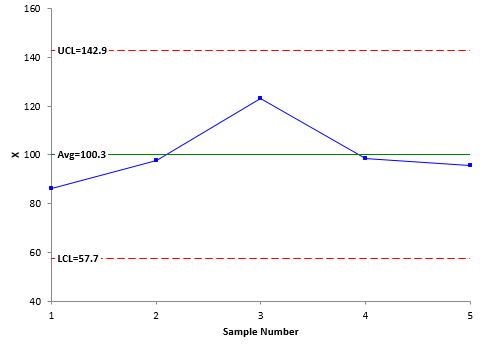
Figure 3 shows the individual control chart based on the first five samples in the data set. The moving range chart will not be shown. The LCL and UCL in Figure 1 are 69.6 and 129.5, respectively. In Figure 3, the LCL and UCL are 57.7 and 142.9, respectively. The control limits based on 5 samples are much wider than the control limits based on 200 samples.
Figure 3: Control Chart Based on 5 Samples
Does this mean that you can’t use a control chart with only 5 samples? Not at all. An out of control point on the control chart based on 5 samples is still a signal – a special cause of variation. You can start a control chart with 5 samples without a problem.
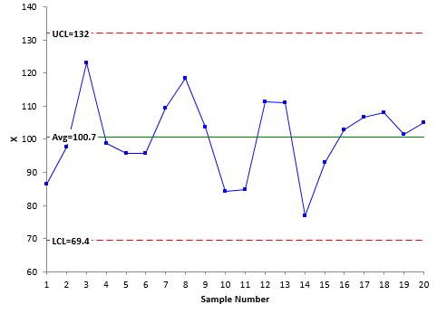
Let’s increase our sample size to 20. Figure 4 is the X control chart for the first 20 samples. What has happened to the control limits? They have gotten tighter from the X control chart for 5 samples. For 20 samples, the LCL and UCL are 69.4 and 132, respectively.
Figure 4: X Chart for 20 Samples
What happens if we continue this process – adding more data to the control chart? What happens to the control limits? Eventually you reach the point of diminishing returns. You reach the point where the control limits don’t change very much anymore. They do change, but not in a significant way.

Table 1 shows that, after about 20 to 30 samples, the control limits don’t change very much. At this point, there is little to be gained by continuing to re-calculate the control limits. The control limits have enough data to be “good” control limits at this point.
Table 1: Impact of Number of Samples on Control Limits
| n | R | X | UCL | LCL | UCL – LCL | % Diff |
| 5 | 16.0 | 100.3 | 142.9 | 57.7 | 85.2 | 42.2% |
| 10 | 13.4 | 101.3 | 137.0 | 65.6 | 71.4 | 19.1% |
| 15 | 14.2 | 99.3 | 137.0 | 61.7 | 75.3 | 25.7% |
| 20 | 11.8 | 100.7 | 132.0 | 69.4 | 62.6 | 4.5% |
| 25 | 11.9 | 100.7 | 132.3 | 69.1 | 63.2 | 5.4% |
| 30 | 11.3 | 100.0 | 130.1 | 69.9 | 60.2 | 0.4% |
| 40 | 11.7 | 100.2 | 131.5 | 69.0 | 62.5 | 4.3% |
| 50 | 11.1 | 100.3 | 129.7 | 70.9 | 58.8 | -1.9% |
| 100 | 11.3 | 98.7 | 128.9 | 68.6 | 60.4 | 0.7% |
| 150 | 11.1 | 99.3 | 128.8 | 69.7 | 59.1 | -1.3% |
| 200 | 11.3 | 99.5 | 129.5 | 69.6 | 59.9 | 0.0% |
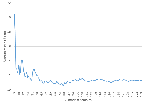
Figure 5 shows the impact of sample size on the average moving range as the sample size increases. The chart shows how the average moving range begins to level off around 20 to 30 samples. This supports the conclusion above that 20 to 30 samples is sufficient.
Figure 5: Impact of Number of Samples on the Average Range
How do we apply this to other situations? The above analysis is for one set of data based on individuals control charts. But, what about other charts like the X-R chart? Are 30 data points enough there? Do we have to go through the same analysis as above for each situation? No, you don’t, but we need to talk about degrees of freedom and the coefficient of variation.
Degrees of Freedom and the Coefficient of Variation

Degrees of freedom are a measure of how much useful data you. The larger the degrees of freedom, the less uncertainty you have in the results. Degrees of freedom is not the sample size (like 200 samples used in Figure 1). But, they are related. As sample size increases, the degrees of freedom increases.
Degrees of freedom are used to characterize the uncertainty in the estimated sigma – and thus the uncertainty in the calculated control limits. Degrees of freedom depend on the amount of data – and the formula being used to estimate sigma. Remember, with the individuals control chart, we calculate sigma using:
σ=R/1.128
Degrees of freedom represent how much data we used to calculate the average moving range. The larger the degrees of freedom, the better our estimate of the average moving range and sigma.
The coefficient of variation (COV) is a measure of variation that describes the amount of variability relative to the mean. It is defined as:
COV = sigma/mean
COV, like degrees of freedom, is a measure of the uncertainty in sigma. There is a relationship between the two. For any estimate of sigma, the COV is inversely proportional to the square root of two times the degrees of freedom:
COV=1/√(2df)
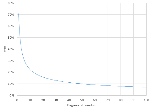
where df is the degrees of freedom. Figure 6 is a plot of COV versus the degrees of freedom.
Figure 6 COV rapidly changes when the degrees of freedom are less than 10. In the range of 10 to 30, COV begins to level off. Above 30, the COV slowly decreases. At this point, there is a trade-off between increasing the sample size (and the degrees of freedom) and decreasing the uncertainty (COV). It takes a lot more samples to decrease the COV significantly at this point. 10 degrees of freedom corresponds to a COV of about 22%. 30 degrees of freedom corresponds to a COV of about 13%.
Figure 6: COV versus Degrees of Freedom
Figure 6 applies for any estimate of sigma, no matter how it was calculated. We just need a method of determining the degrees of freedom for the various methods for calculating sigma.
Determining the Degrees of Freedom
To calculate the COV, you need to be able to calculate the degrees of freedom. Dr. Donald Wheeler provides a method to easily do this in his book Advanced Topics in Statistical Process Control (www.spcpress.com). We will look at the individuals control charts and the X-R control chart here.
The average moving range is used to estimate sigma with the individuals control chart. The degrees of freedom associated with the average moving range can be estimated using the following equation:
df = 0.62(n – 1)
where n is the number of samples.
For X-R control charts, the average subgroup range is used to estimate sigma. The following can be used to obtain the degrees of freedom with the average subgroup range:
df = 0.9k(n – 1) for n less than 7
df = 0.85k(n – 1) for n from 7 to 10
where k = number of subgroups and n = subgroup size. We will use these equations to find the degrees of freedom in the next section.
Using the Knowledge to Obtain “Good” Control Limits
We will start with the individuals control chart. Figure 4 was constructed using the first 20 samples. The degrees of freedom associated with the average moving range is:
df = 0.62(n – 1) = 0.62(20 – 1) = 0.62(19) = 11.78
The COV for 11.8 degrees of freedom is:
COV=1/√2df= 1/√(2(11.8))= 20.6%
Figure 6 shows that this value of COV is just as the curve is beginning to level off.

Table 2: Degrees of Freedom and COV for Various Sample Sizes
| n | df | COV | UCL | LCL |
| 5 | 2.48 | 44.9% | 142.9 | 57.7 |
| 10 | 5.58 | 29.9% | 137 | 65.6 |
| 15 | 8.68 | 24.0% | 137 | 61.7 |
| 20 | 11.78 | 20.6% | 132 | 69.4 |
| 25 | 14.88 | 18.3% | 132.3 | 69.1 |
| 30 | 17.98 | 16.7% | 130.1 | 69.9 |
| 40 | 24.18 | 14.4% | 131.5 | 69 |
| 50 | 30.38 | 12.8% | 129.7 | 70.9 |
| 100 | 61.38 | 9.0% | 128.9 | 68.6 |
| 150 | 92.38 | 7.4% | 128.8 | 69.7 |
| 200 | 123.38 | 6.4% | 129.5 | 69.6 |
Looking at Figure 6, it appears we may want to go a little further than 20.6% on the COV. Suppose we decide that 15% is a good value. You can rearrange the COV equation to calculate the degrees of freedom you need for a COV = 15%:
df = 1/(2COV2) = 1/(2(.15)2) = 22.2
A COV of 15% corresponds to 22.2 degrees of freedom. Now, you can use the degrees of freedom formula for the individuals chart to determine how many samples you need:
Rearranging df = 0.62(n – 1):
n = (df/.62) + 1 = (22.2/.62) + 1 = 36.8
With an individuals control chart, you will need about 37 to 38 samples to get a COV of 15%.

df = 0.9k(n – 1) for n less than 7
22.2 = 0.9(k)(5 – 1) = 3.6(k)
k = 22/3.6 = 6.2
About six subgroups of size 5 (30 total samples) will give you a COV of 15%.
Suppose you want a COV of 10%. That corresponds to 50 degrees of freedom. The number of subgroups required for a COV of 10% is about 14, a total of 70 samples. You almost triple the number of samples you need while only reducing the COV by a third.
So what COV should you use to determine when you have enough data? That decision is up to you. But, from Figure 6, something in the range of 15% to 20% probably is a good trade-off between samples needed for “good” control limits and minimizing the uncertainty.
Summary
This publication has looked at how much data you need before you have “good” control limits. It was shown how the averages and control limits change for an individuals control chart as the sample size increases – and that there is point where adding additional data to the control limit calculations has very little impact. It was also shown that there is a critical relationship between the coefficient of variation (COV) and the degrees of freedom. This relationship can be used to determine how many degrees of freedom you need for a certain COV. And, from this, how to determine how many samples you need for the individuals and X-R control charts.
In the end, the decision is really yours. But the guidelines presented in this publication will help determine how much data you need when working with individuals and X-R control charts. It is based on finding the data that will give you an appropriate value for COV. This is usually in the range of 15 to 20%.
As mentioned before, our earlier publication said you can start an individuals control chart with as few as 5 points; recalculate the control limits with each new point and then lock the control limits in place after 20 points. Then recalculate after 100 points. Was that good advice? For the most part, it is good advice. I might change the value to 30 points to lock the limits the first time.
And, this same approach will work in determining how many samples you need for a process capability analysis. Very often, people use 30 samples for a process capability analysis. What is the uncertainty for 30 samples? You now know how to determine that.
Many thanks Dr Bill. It was an excellent article on the subject. Hope we will have more such articles on attribute data as well.
As usual, when I don’t know how to do something, I reach out to someone who does. I asked Dr. Wheeler. He said that the interpretation is the same when it comes to COV (the equation above holds). He also said:
“I am not certain on this, but I remember the following formula:
d.f. = (2/9)* (sum of the squared counts).
Whether this formula is exactly right or not, I know that zero counts do not increase the d.f. Only positive counts do that. So, when the data satisfy the conditions for either a binomial or Poisson distribution, the limits for the attribute charts will gel much more rapidly than the limits for an XmR chart. But if the counts do not qualify as binomial or Poisson, then the limits rapidly converge to the wrong values. In most examples that I get to see, the failure of the assumption of binomial or Poisson counts is the problem with using attribute charts.”
Hi, if we have large data sets of continuous individual data e.g. above > 300 values, should will still use estimated deviation or we can use normal deviation over the whole data to calculate UCL and LCL?UCL / LCL based on estimated deviation (CL+/-2.66MR) in our case are more conservative than actual deviation over general population. Due to technical advancement, we can calculate deviation on the fly for large date sets with millions of measurements.
Lots of data for sure. I would stick with the average moving range – but i imagine with all those points, a few out of control will not matter. The question you have to answer is "is my process in control". I believe you always use the control limit equations to judge that. But i have not dealt with millions of data points.
Dear Dr. Bill McNeeseFor determining the oil density in an oil field, a sample per week is taken. Do you consider approppriate to take an average of the samples taken over a time period as the oil field density value, and evaluate with control charts if a new measurement (n) is in or out the control limits. Then check with a new measurement (n+1) if the previous value (n) was wrong or if the field oil density has changed?In this case how many density samples should you consider appropriate to take the average and to conform the control limits?Thank you
Yes, you can plot the weekly result as in individuals control chart. If it has changed, keep taking samples until you have five new ones. Calculate limits then, then update the limits with each new point until you have 20.
Hi Bill, thanks for sharing the knowledge about control chart. It’s really helpful for the project I am working on. I have some questions regarding the euations. How do you derive the equation of degree of freedom, df = 0.62(n – 1) for the average moving rangeand df = 0.9k(n – 1) for n less than 7df = 0.85k(n – 1) for n from 7 to 10 for the average range? Thank you.
I have not dervied them. I used the information from Dr. Wheeler's book referenced above.
Hello Bill,I am trying to set a control limits for a thickness value measurements, I picked a sample size of 40 subgroups , each subgroup is 5 samples ( with total number of samples = 200 readings) so that I could obtain a diff % ~ 0.0% . However when I tried to calculate the sigma (x) in order to obtain the LCL & UCL , I obtained a very narrow tolerance limit (0.002) , which is too strict in my measurement ( usually my tolerance is 0.0x). I need to understand what mistake I made? is that because I picked too many subgroup size?Please help , thanks in advance !
Hello, are you saying the control limits are very tight? That may be because it does not make sense for your within subgroup variation to be the same as the between subgroup varatiion. Please see this link;
https://www.spcforexcel.com/knowledge/variable-control-charts/xbar-mr-r-betweenwithin-control-chart
Hi. Does this number of points guide apply to all phases (learning phase, testing phase)? Thanks.
Hello,
Yes, I would think so.
Thank You Dr. Bill,It is very enlightenment article on control chart. I am working on process which have more variation not meeting yield spec limit(93-103) and I have 22 data point over 3 years of run. Data range is 16 (min81-max97) with overall st.dev. 4.02, when I plot I-MR Chart, all data were within control limit, UCL =104.29, LCL =78.91. My objective was to assign new yield limit as 11 data points were lower than 93 and production claim there is no special cause (it is attributed to common cause of material and equipment). As control limit looks too wide 79-104, is it due to large variation and small sample size? Can I say this process is predictable as all points are within control limit? Also, Can you please elaborate in more detail of the following from your previous publication on control chart…“Individuals control charts are not as sensitive to changes as Xbar-R charts. In addition, values of X and R can have significant variation (even though the process is in control) until the number of individual data points reaches 100.”Much appreciation and thank you in advance!
Hello,
Three years is a long time. If the control chart is in control, then it means that the process is consistent and predictable. There are no special causes. Individuals control charts sensitivity can be increased by applying the other out of control test (such as the zone tests). Now, I do not worry about the difference in sensitivity between Xbar-R and X-mR control charts.
Thank you again Dr. Bill, How can i (at what point) say my process is more precise? if the moving range is in control means process is precise?
Not precise, but it means it is predictable and consistent. If the range chart is in control, it means the width of hte histogram is staying the same, that hte value of sigma is consistent over time.
Thank you so much Dr. Bill-really appreciate your time. Do you have any suggestion on how to know a process is precise or not?
Not sure what you mean by precise. If you mean repeatable, then if the range chart is in control, I would say it is as precise as it can get for the current process.
Hi Bill. Thank you for the article! It sheds light on a question I have been thinking about. I would like to ask you, just to be certain: Is the advantage of locking control limits after 20/30 data points just that it saves time as compared with calculating the limits after every single measurement? Obviously, the difference in COV isn't much if we increase the number of data points, but is there any other advantage in locking the control limits after a certain amount of data points and not just calculating the limits based on the entire dataset?
Thanks for the comment. The reason you lock the control limits is to create baseline data to judge any future changes against. If you recalculate each time, those changes could become part of the control limits and be masked. Please see this article from our SPC Knowledge Base:
When to Calculate, Lock, and Recalculate Control Limits
Hi Dr. Bill,This article was very helpful! I am currently working on a project where the control limits are being determined based on average subgroup standard deviation. How do I determine the degrees of freedom when using this method of estimating the standard deviation?Best regards,
Thanks David. There is a table in Dr. Wheeler's book "Advanced Topics in Statistical Process Control" that list the degrees of freedom. What you can do to estimate it is to use df = k(n-1) where k = number of subgroups and n = subgroup size. For example, if you have k = 25 and n = 4 then df = 25(4-1) = 75. The table value is 70.4 So, they are close.
Hello,I want to evaluate the capability of my process by measuring de brigthness in the final product. The process is batch and every month I make 1 batch and one batch takes normally 2 days. So I have 12 subgroups with diferent sizes (goes from 12 to 30 values per group). What should I do to get a control chart with diferent sizes of the subgroups? Please, help me out.
You can make a control chart with different subgroup sizes, just use the different values of A2 for the different subgroups. Our software will do it autmatically for you.